How Semiotic Communication Occurs in Current Automobiles
Background
There are three levels of driver–car interaction: primary, standardised interactions, directly related to driving functions, for example controlling the direction and speed of the car; secondary interactions used to increase the safety of the driver, environment and vehicle through turn signals, mirrors, or wipers; and tertiary interactions related to comfort and infotainment features such as climate, media control or navigation (Kern and Schmidt, 2009).


While primary and secondary tasks are mostly automated and have low cognitive load on the driver, they can require more attention based on driver distraction or road conditions. These interactions are mostly standardised through law and norm, and little variance is found across car manufacturers and models. These interactions relate to muscle memory, and can be performed, or even enhanced by non-driving tasks such as being engaged in a conversation or listening to music (src, year). In general, these interactions are both brief and frequent.
Tertiary tasks however, require more attention to be performed, and are often only done once per drive. Depending on the task, they can vary in effort, frequency and time. While setting the air conditioning or adjusting the volume might be automatic tasks for the driver, deciding what music to play or setting the navigation would demand more attention and cannot be safely performed in parallel with driving.
Kern and Schmidt (2009) have compiled a list of input and output modalities for various interactions. However, since then new technologies such as gesture or voice input have become common, and touchscreens became ubiquitous (source, year). Each level of interaction has different input methods (button, rotary knob, stalk, slider, touchscreen, pedal, thumbwheel, gesture or voice) and output modalities (analog or digital gauge, indicator lamp, LED, screen, sound or voice). In modern cars, tertiary interactions are often combined into one touchscreen for both input and output.
Car manufacturers have consistently pushed new technologies into the market. What the market once perceived as a gimmick evolved into a standard. A modern car is unthinkable without safety features like the airbag (1953), seatbelts (1959), the crumple zone (1959), ABS (1978); or comfort features like power steering (1951), air conditioning (1953), cruise control (1958), electric windows (1966), a touchscreen infotainment system (1986), GPS navigation (2000), bluetooth connectivity (2001), parking assistance (2002); or efficiency features like automatic transmission (1939) and electric propulsion (2008).
Invention years retrieved from source (year). It should be noted that the years corresponding to the innovations listed above are not definitive. Some might relate to a patent, others to a first market appearance. None of these technologies have remained unchanged since their introduction, and have been adopted by the entire industry, been refined and iterated upon.
How semiotic communication occurs in current automobiles
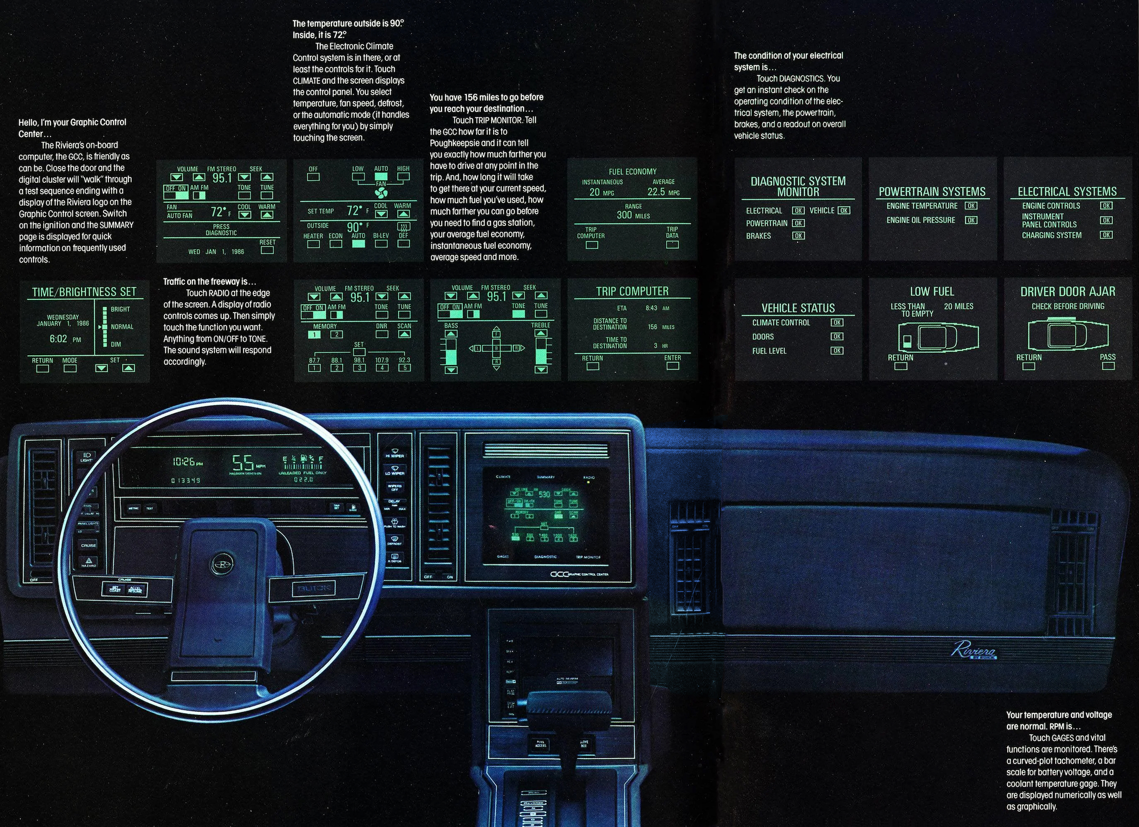
The Buick Riviera was introduced in 1986 with the “granddaddy” of touchscreen infotainment systems (Encina, 2022). It featured a display in a green-and-black colour scheme akin to computer terminals of the time, producing a high-pitched beeping sound for user feedback (the alert could be changed and disabled). This system, called the Graphic Control Center (GCC), was composed of a 9-inch phosphor monochrome CRT Mylar-capacitive touch-responsive monitor, with six buttons surrounding it, incorporating 91 traditional functions into once touchscreen.
The car was described as a “luxury performance techno car” (Motorweek, 1986), and retailed for around $20,000 (equivalent to around $55,000 today). Its touchscreen was the main selling point and to help customers understand how to use the GCC system, the car’s manual had over 30 pages dedicated to it (Buick, 1988).
The U.S. Bureau of Transportation Statistics (BTS) published a paper in the following year (Esterberg et al., 1987), analysing automotive displays and controls, comparing existing technology to trends. The authors predicted the introduction of heads-up displays (HUD), maps and navigation integrations, voice-activated telephone control. They were able to foresee trends, but not specific technologies, as they insisted “that CRT use will increase […] in five to ten years”.
The bureau’s publication (1987) highlights several design requirements for future car development (p. 25):
- The “traditional” location of controls must be respected
- Controls should require minimal driver movement
- Secondary, high-frequency controls should be as convenient to reach as primary controls
The document uncovers usability best-practices which are commonplace today, such as the insight that the mode of operation (push, slide, turn) affects the attention span of the driver: “A multi-function rotary switch may require the driver to observe its position to determine its current operating mode, whereas the mode of a simple on-off switch can be determined […] by its position”. The authors also described what was known in HCI as Fitts’ law (1954): interaction elements should be arranged in a hierarchy of frequency of use, function, size and shape: “Headlights are usually turned on and off once each trip whereas the radio or HVAC controls could require frequent attention”. Cluttered user interfaces are more difficult to use: “Small, densely packed, push-buttons require the driver to focus attention on the correct button selection”, where “many densely arrayed switches […] result in a distraction from driving”. Another finding from the report is that using “controls which provide little […] tactile feedback or even simple visual indication of function [has] become common” — a complaint often heard in contemporary cars such as the Tesla Model 3.
Evolution of infotainment 1986, 2003, 2017
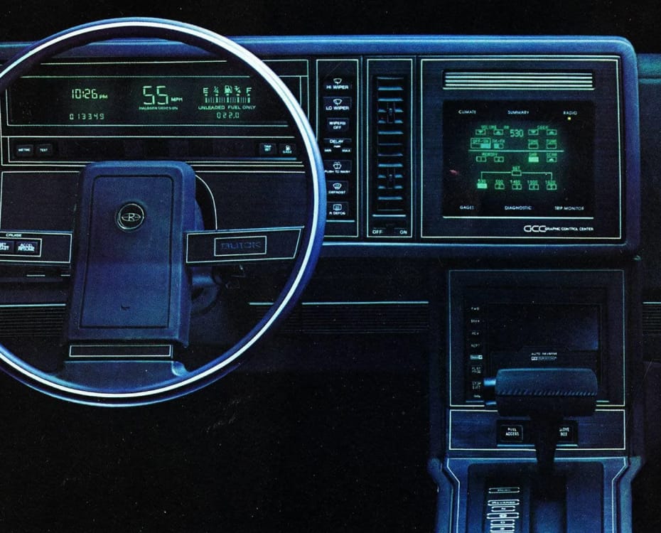
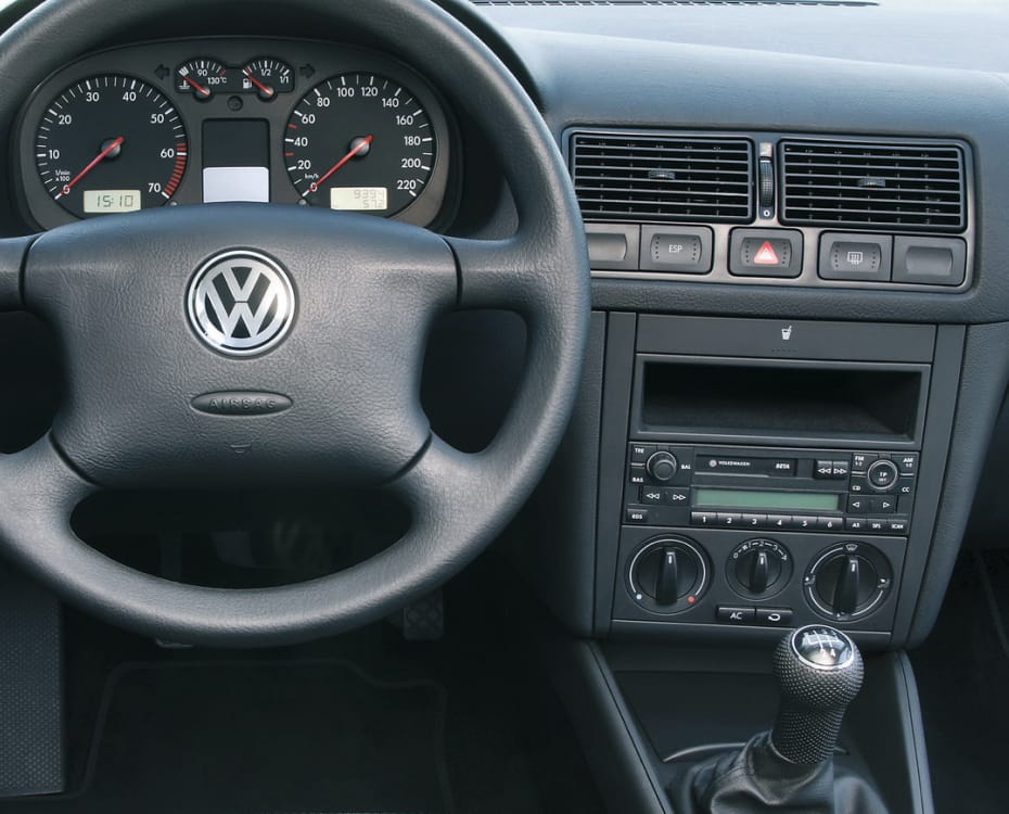
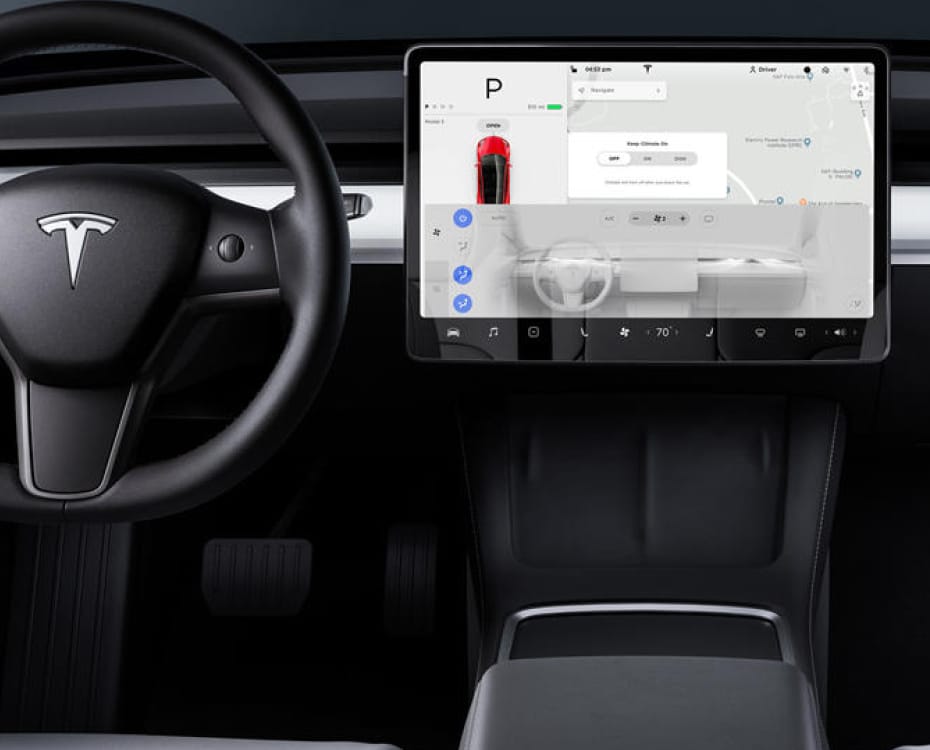
In summary, because the touchscreen CRT could only be interacted with by taking their eyes off the road, drivers faced usability and safety problems (BTS, 1987, p.25).
The Rivera was discontinued just three years after its introduction, and with it disappeared touchscreen infotainment systems. Customers complained about the distraction caused by the screen, and the removal of buttons and dials in favour of the touchscreen as the sole means of input and output, which took too much time to learn. In 1990, the Graphic Control Center was cancelled.
Across the pond, a decade earlier, at the London Motor Show of 1976, Aston Martin announced the second series Lagonda. This car featured touch button controls and a digital LCD screen, with buttons separate from the display. Like the Riviera, the Lagonda had a similar fate: just one year after its release in 1979, the screens and buttons were replaced with more traditional interactive elements — physical dials and mechanical switches.
For a few years it seemed like technology in cars should be limited to its invisible functions found in assistive functions such as parking sensors or ABS — features that don’t have to be configured and are automatically engaged, without distracting the driver. The market consensus was that dashboards crowded with buttons and dials were bad, and that relying on screens only made the experience worse. A good car should not overwhelm the driver with input methods, the focus should be on the road.
There was peace in the world of driver–car interaction. Until BMW.
Cars of 2002
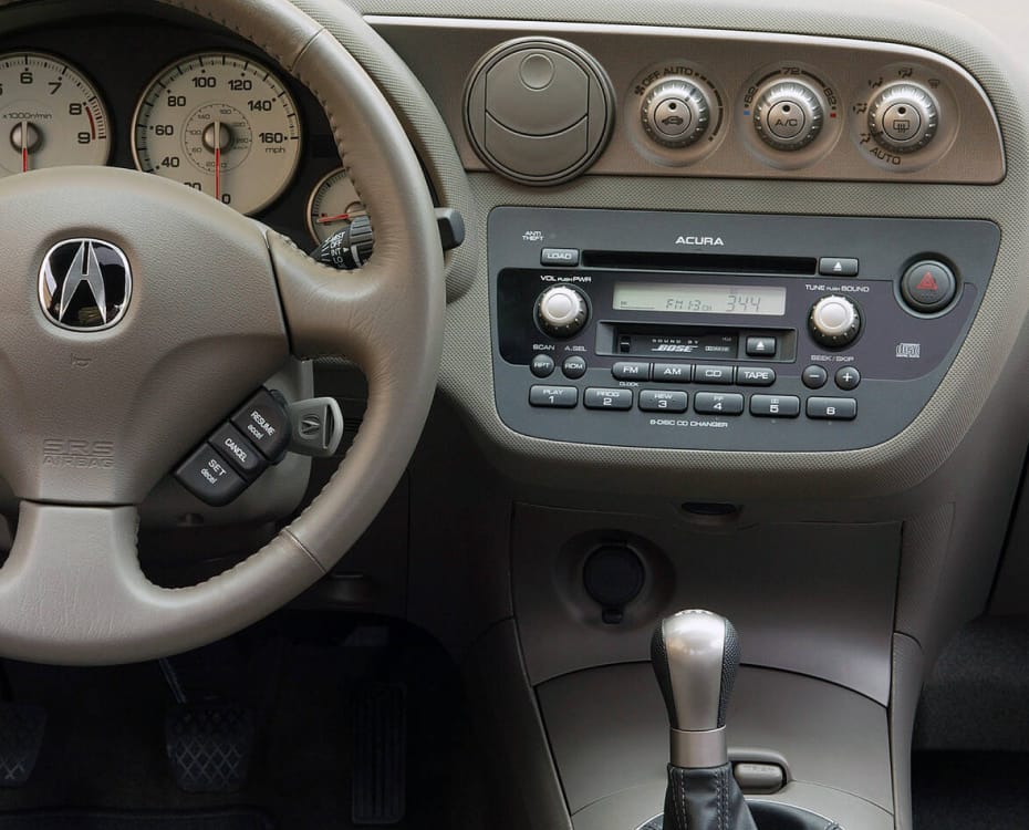
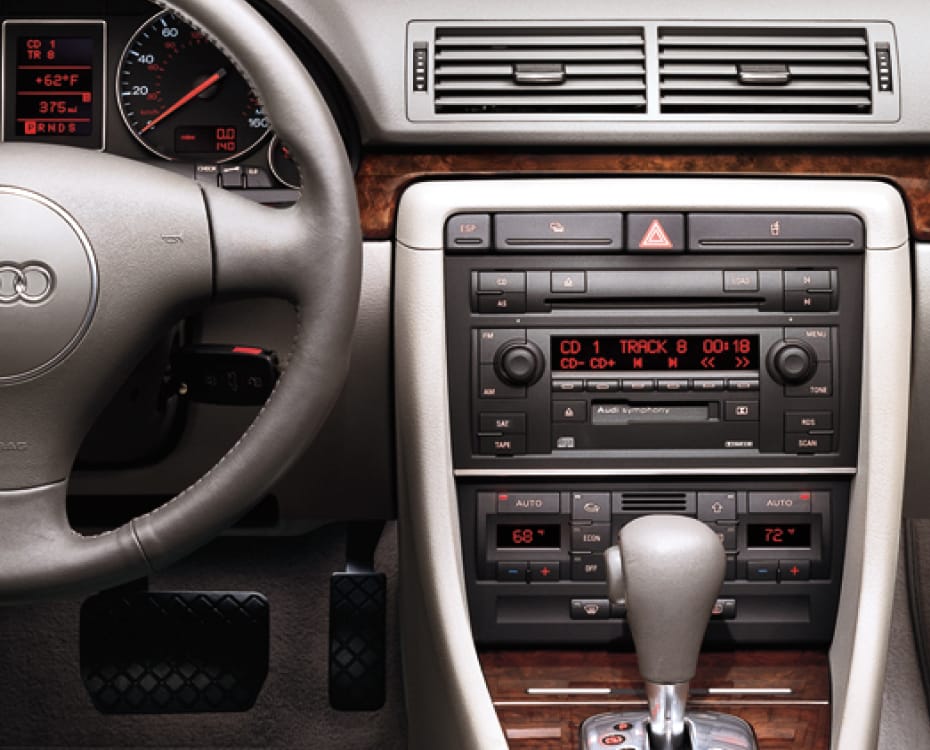
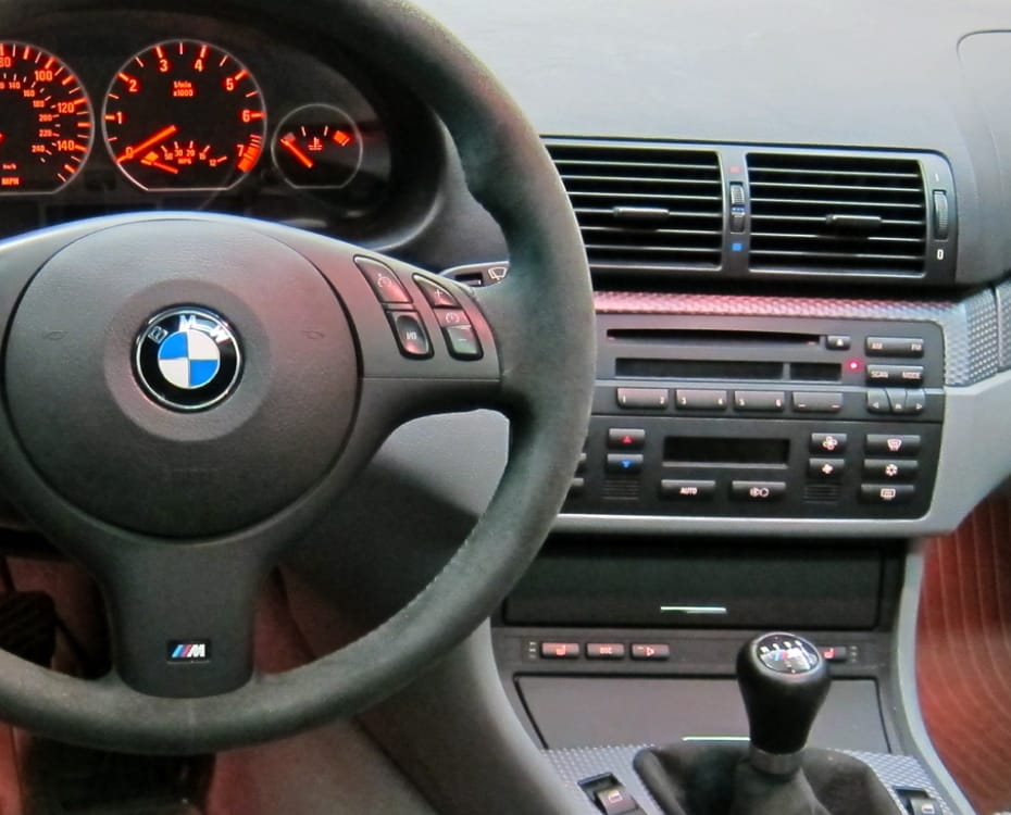
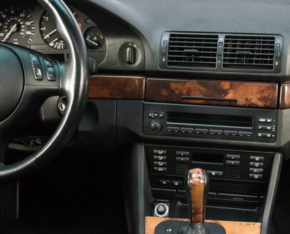
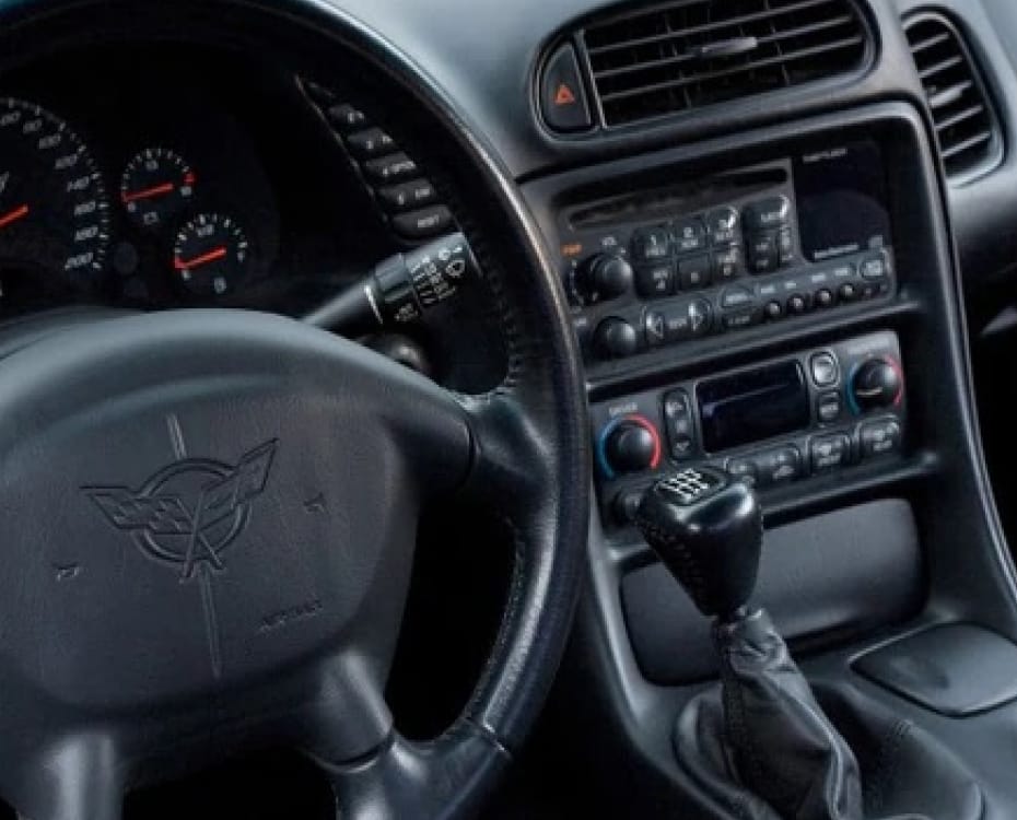
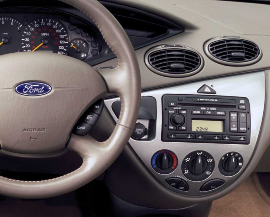
Car and Driver (C/D) was founded in 1955 as Sports Cars Illustrated, and is widely regarded as providing honest reviews and instrumented tests, providing technical data (J.D. Power, 2023). Since 1983, they summarise each year’s most popular cars in their “Best10” list. Throughout this chapter, the top six cars of the corresponding year are used as a benchmark to visualise the tertiary interactions of the car. While C/D are focused on the American market, their photos of car interiors are used here to illustrate trends in automotive evolution and to establish a picture of the mainstream of the market.
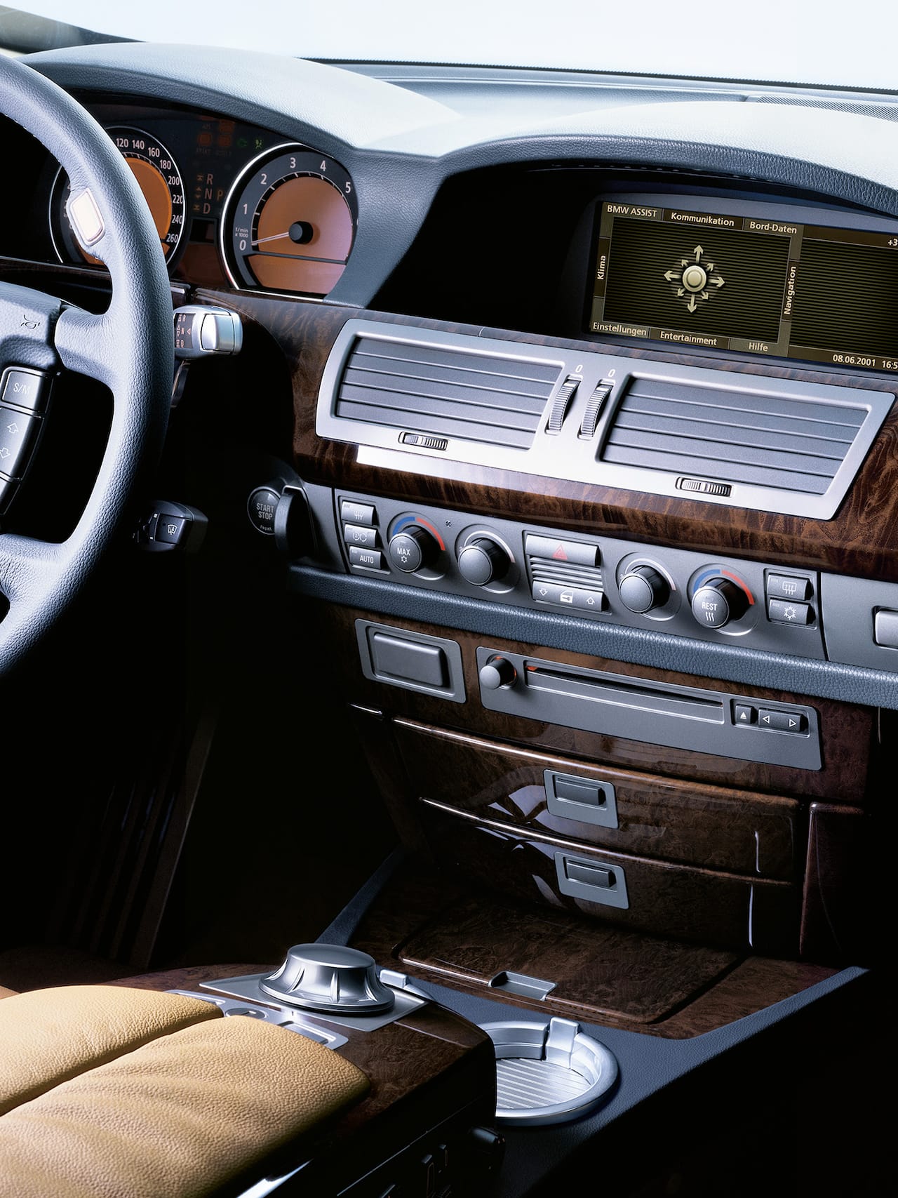
In 2002, screens in cars were small seven-segment displays used to show the time or the currently playing song on a cassette or compact disk, and yet car interiors had evolved into places for storage and infotainment, besides being the cockpit of the driver. The center console being the most common area of item storage (Bhise et al., 2005), it shared its space with important user controls, like the drive mode, gear shift or window buttons.
It would not be until the introduction of the iDrive system in the 2002 BMW 7 Series that manufacturers dared adding screens into their vehicles again. iDrive was initially disregarded by drivers, but over the decades evolved into a renowned infotainment system with a usability-focused balance of digital and physical controls and will be studied in detail later in this document.
Jeff Bartlett (2002) of MotorTrend magazine describes the principle of iDrive as simplification of controls “for safety and convenience”. Tertiary interaction elements for navigation, climate control, entertainment and telephony were integrated in “a central display and controlled through an intuitive input device, inspired by video game controls”, with shortcuts on the steering wheel for driving modes and media buttons. These were embedded into the wheel for “convenient control [with] minimal driver distraction from road and traffic conditions”, according to the manual of the 745i (BMW AG, 2001).
However, reception of iDrive was lukewarm from both industry and users. Andrew Bornhup (2002) of Road and Track called iDrive “downright difficult — and frustrating — to accomplish some intended tasks”, and that “clearly, the i in iDrive does not stand for intuitive”. While in a side-note the author mentioned the dashboard being elegant and uncluttered thanks to iDrive, he mainly complained that the system forced the driver to think too much, and required time to learn. When talking about the UI needing improvement, Bornhup rhetorically asked about the relevance of this computer science term in the context of a car.
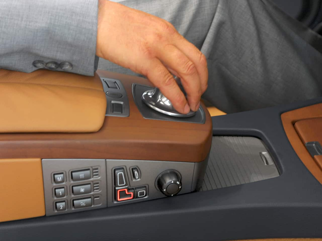
Writing for Car and Driver, Aaron Robinson (2002) called iDrive a “lunatic attempt to replace intuitive controls with overwrought silicon”. The tactic feedback of the dial was lauded thanks to its “clicks like a ratchet” which, after three days of practice, allow the driver to use the system while keeping their eyes on the road. Frank Markus questioned the customer value of “comprehensively changing the way everything [worked]” in favour of a single dial, and Daniel Pund called iDrive “strange”. Nonetheless, the reviewers agreed, it worked well once learned, Csaba Csere even called it “easily the best scheme for controlling countless complex electronic functions”.
A spokesperson for BMW, Dave Buchko, defended iDrive by saying their customers expected cutting-edge technology from the company, and that it would simply “take a bit of time” to become familiar with this new interaction system. Joe Ivers, executive director of quality and customer satisfaction research at J.D. Power, countered that it was possible to add new technology without making the car less user-friendly (J.D. Power, 2006). He argued that the worst design issues in a car were related to ergonomics and technology. Bob Lutz of General Motors spoke of the importance of familiarity, that customer were “used to having certain vehicle controls in certain places”, and criticised a single knob to navigate through nested menus.
Drivers of the car called the implementation of iDrive disastrous (DeMuro, 2022), and changing the radio station was particularly frustrating. The controversy of this early iDrive implementation made the competition reconsider their designs for more integrated infotainment solutions. But this technological marvel wasn’t the only thing strange about the car: in placing the iDrive dial in the center console, BMW decided to move the shifter to the column of the steering wheel, which was unusual at the time. Also unfamiliar to customers was the electronic parking brake engaged by pushing a button, rather than pulling of a lever. The 2002 7 Series also had voice control and an early adaptive cruise control system. In the annual quality survey by J.D. Power (2006), BMW’s poor performance was attributed to iDrive.
In a technical paper published by the Society of Automotive Engineers (SAE), Young and Zhang (2015) described the situation at the time: customers demanded more features, and automakers wanted to answer their users’ needs. The two main design implications related to safe driving are to use basic principles of ergonomics, considering the driver’s limited visual, manual and cognitive capacity; and to thoughtfully reduce UI complexity.
The first implementation of iDrive made the BMW 7 Series stand out in the market of 2002. Five years later, the landscape had changed.
Cars of 2007
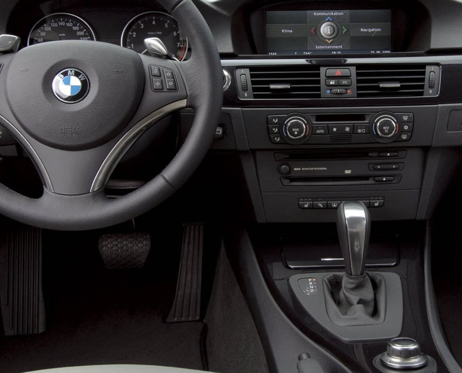
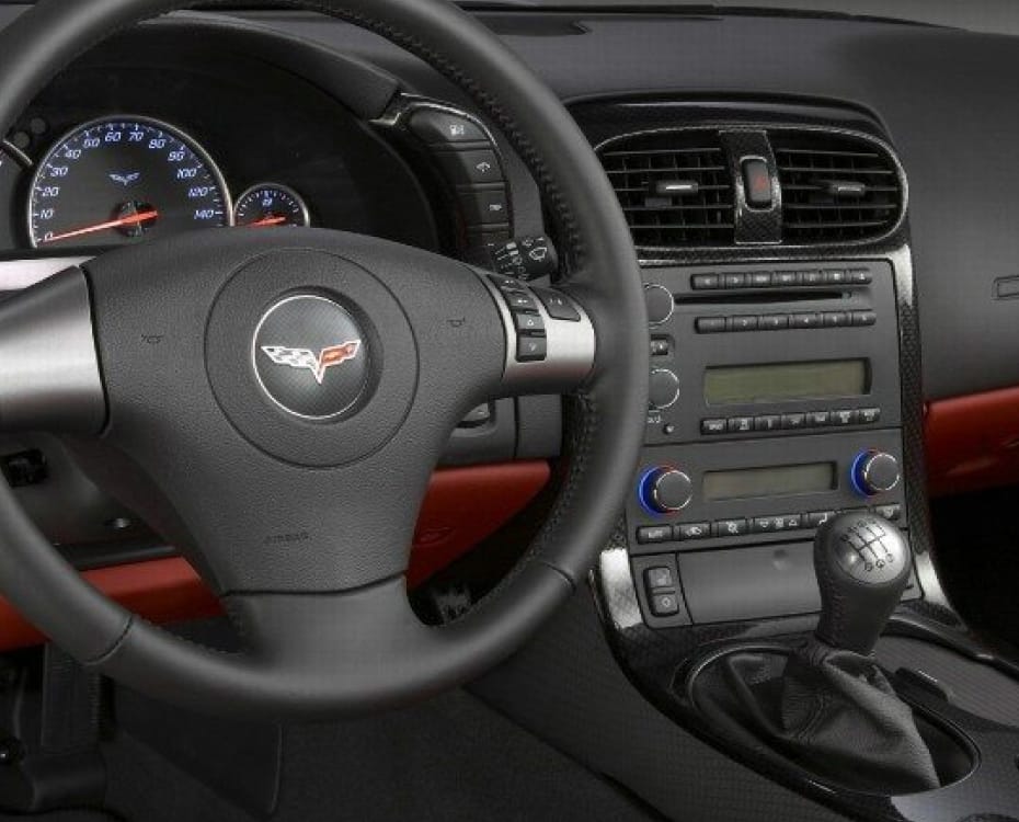
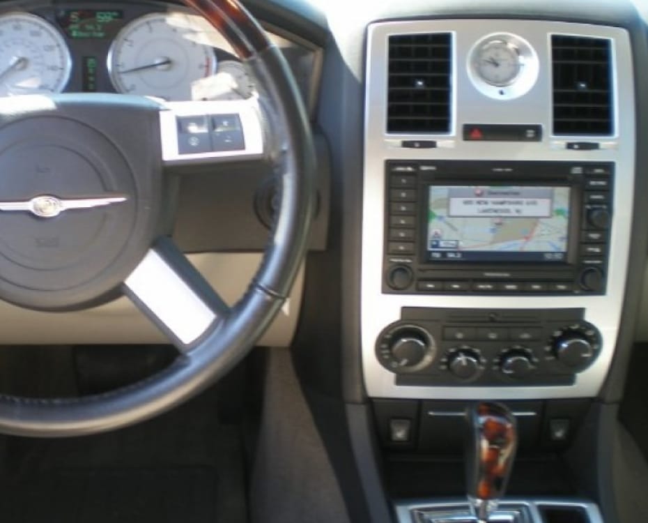
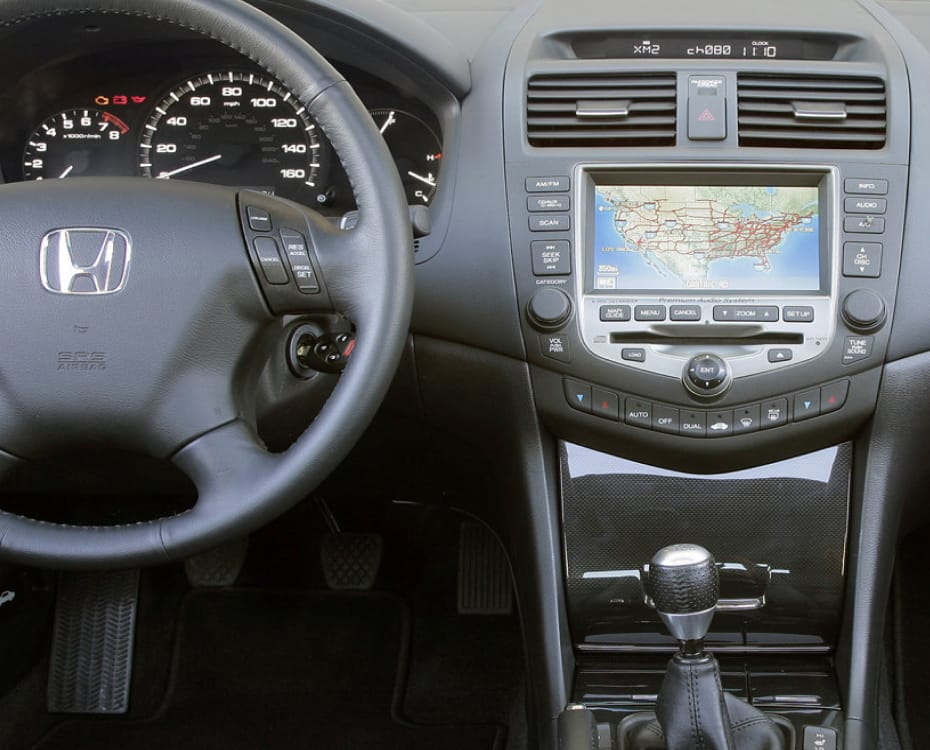
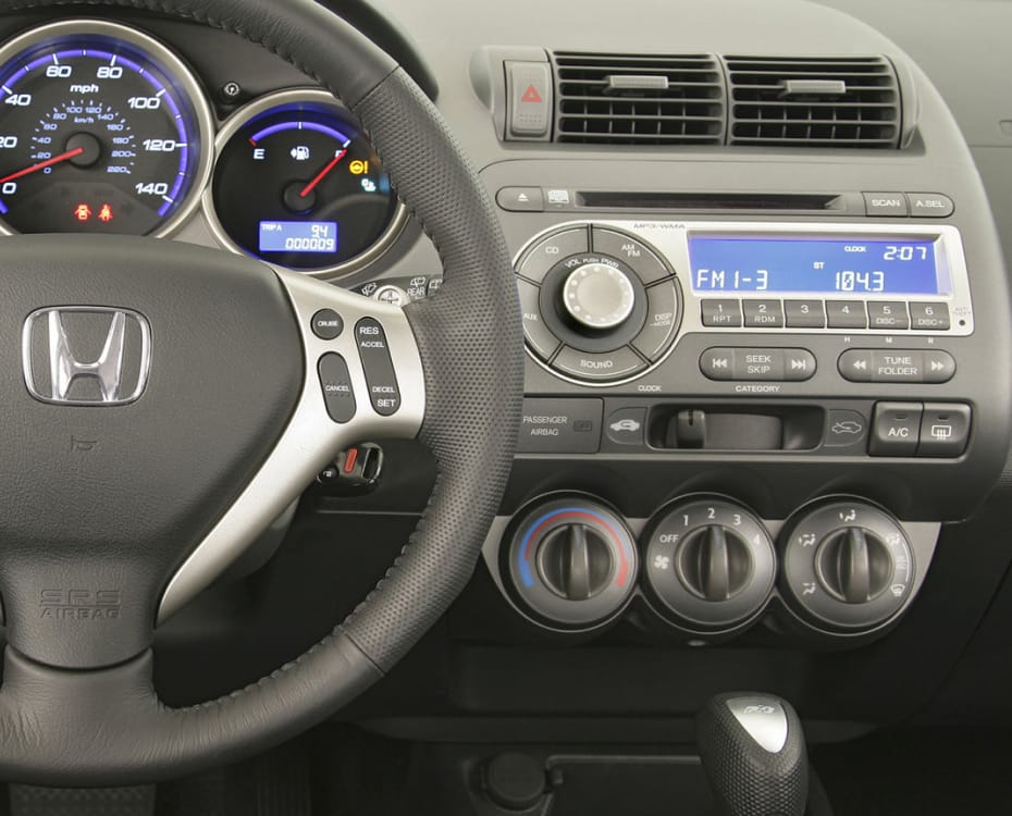
In 2007, a BMW became one of the most popular cars of the year. The BMW 335i learnt from the mistakes of the 2002 745i: the 3 Series returned the gear shift to its original position and iDrive became an $1800 optional feature rather than the default (Massy, 2007).
Meanwhile, in 2009, iDrive had evolved into its second generation. In addition to the dial, the system had shortcut buttons around it, for the frequently-used functions of music, navigation, phone and “back”. The screen size was increased and the volume knob returned to the centre stack. These changes made iDrive an “easier system to learn and use” (Brown, 2008) and MotorTrend columnist Edward Loh wrote to the point “iDrive no longer sucks”. This new version was described as an “acceptable middle ground” between the old world of cluttered buttons and the minimalist future of a single input device for everything (Loh, 2009).
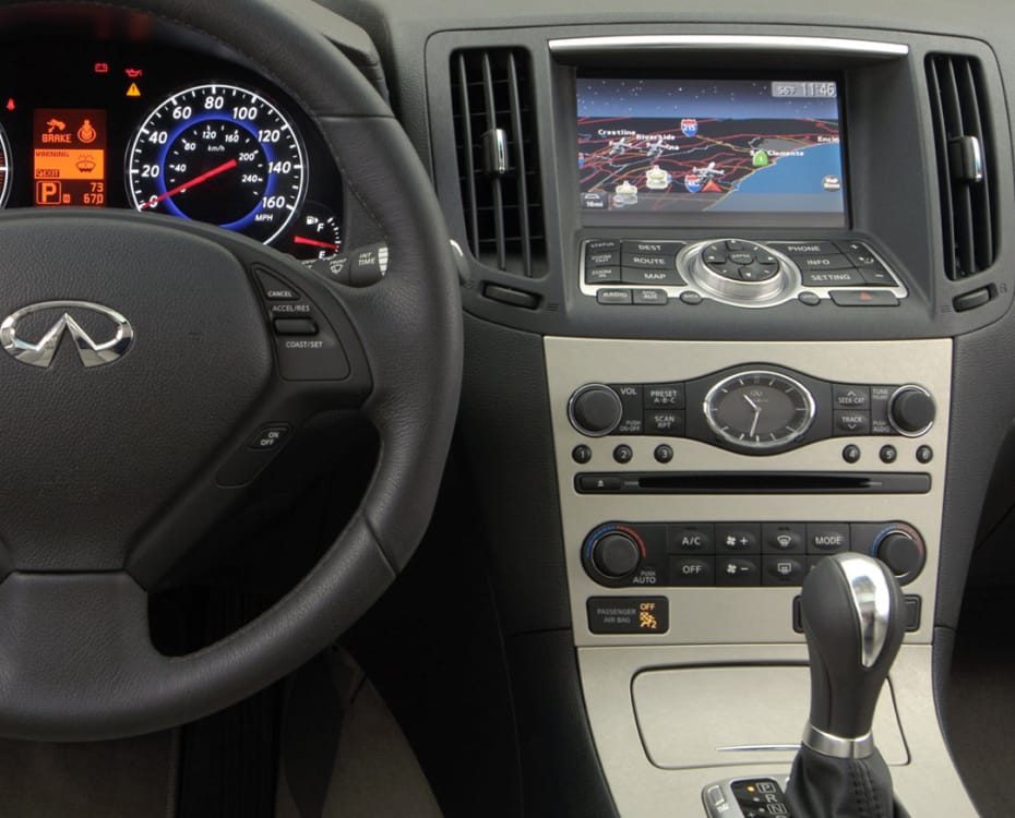
The competition had integrated more direct manipulation with their screens. Often sold as an optional “navigation” upgrade, these screens were not touch-sensitive and rather used a surrounding array of buttons for user interaction (Adams, 2007; Cunningham, 2007). On BMW, these buttons were adjacent to the rotary knob, far away from the screen; other manufacturers placed the buttons right next to their displays. On the Infinity G35 the navigation system was a $2100 option, and did have a touchscreen (Loh, 2008).
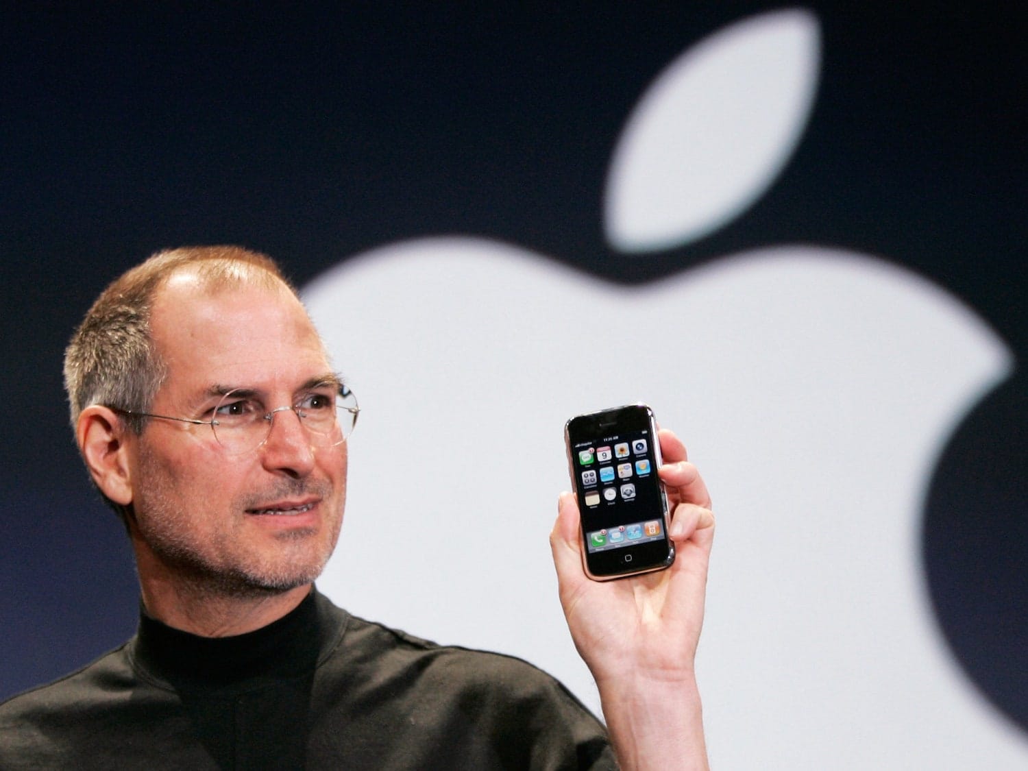
By 2009, people slowly became accustomed to touchscreens in their daily lives (Johnson, 2009), finding them in cash machines, self-checkout kiosks, and, of course, personal smartphones. Back then, however, most of these screens were still resistive (Sherman, 2009), meaning physical pressure was required for user input. The screen had to be depressed into a second layer, which detected the touch. A competing emerging technology, projected-capacitive (pro-cap) screens, such as the one introduced in the iPhone in 2007, reacted quickly to light taps and rely on the electrical properties of the human body. Capacitive screens respond to more subtle touches allowing fine-grained input, gestures and multi-finger input, and, because they are exposed to less physical stress, have a longer lifespan.
Surveying the state of the touch-screen market, Jennifer Colegrove (2010) wrote that by March 2010, the display technology used in the iPhone had become second only to analogue resistive screens. A year later, pro-cap technology was already leading the race, with industry analyst Duke Lee (2011) crediting the market perception of the touchscreen to Apple, calling it the iPhone/iPad Effect.
By 2011 users had become accustomed to responsive touchscreens in their daily lives, and if a screen accepted touch input, it should respond immediately. They knew what made a good user experience — their phones were leading by example — and they also knew what broke the experience: In 2010, Ford ranked amongst the best brands in Consumer Reports’ reliability survey, two years later they were the second worst (Consumer Reports, 2012), and with automotive data analyst J.D. Power Ford plummeted from fifth in 2010 to 23rd in 2011 (Jensen, 2011). What changed? Ford deployed their MyFord Touch UI to overwhelmingly negative reception, being complex, unintuitive and even “aggravating” because of frequent system crashes, according to David Sargent, vice president of global vehicle research at J.D. Power, with the screen being capacitive, and thus slow to respond to user input.
The technological evolution between 2007 and 2012 was significant: in 2007 only 4% of Americans owned a smartphone (Comscore, 2017), of which less than 10% had touchscreens. By 2012, 89% of smartphones had capacitive touchscreens (Lee, 2011), and were adopted by almost 55% of the population (Pimanova, 2012). During that period, the BlackBerry was still an important device to businesses, holding 20% of the market share in 2009 (IDC and Gartner, 2016), however, by 2012 their control dropped to 3% and their CEOs resigned. Famously, BlackBerries didn’t embrace touchscreens and instead focussed on having a physical keyboard, disregarding the iPhone for its digital keyboard (Olson, 2015). In five years, BlackBerry went from $3.5B in profits to $6B in losses, from the dominant player of the market to bankruptcy (BlackBerry, 2023).
The changes in personal phones from 2007 to 2012 brought with it a market familiarisation of operating relatively small, handheld screens in moving environments (while walking, or, even if it was illegal, while driving). With familiarity also came the expectation that screens should be touch-sensitive, and that a medium of information output should also accept direct user input (Jensen, 2011). In essence, by 2012, people expected touchscreens in cars, with capacitive screens being not only subjectively preferred by users, but also leading to faster task completion times (Pitts et al., 2014). Even with apparent usability problems and increased driver distractions, touchscreens had become a “must-be” attribute of cars (Kano, 1993; Pitts et al., 2014).
Cars of 2012
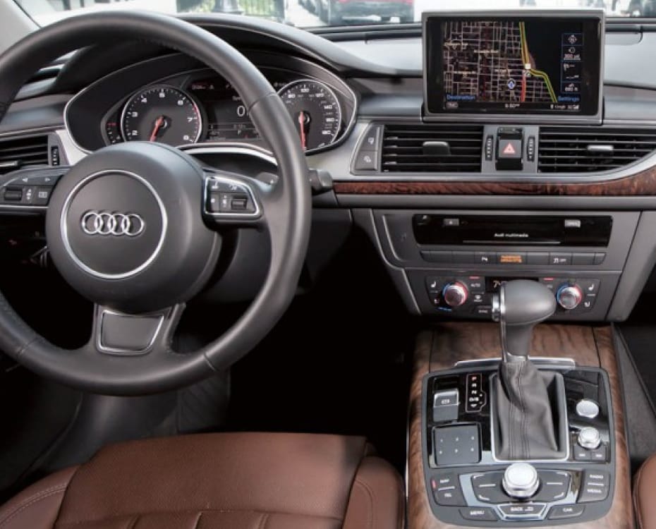
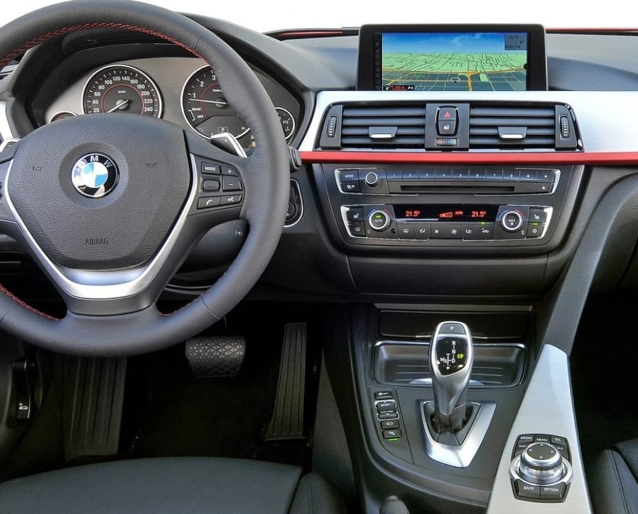
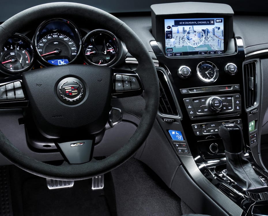
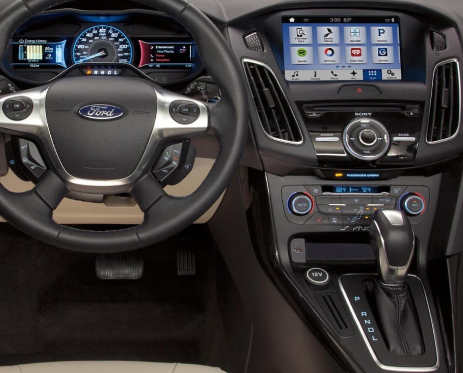
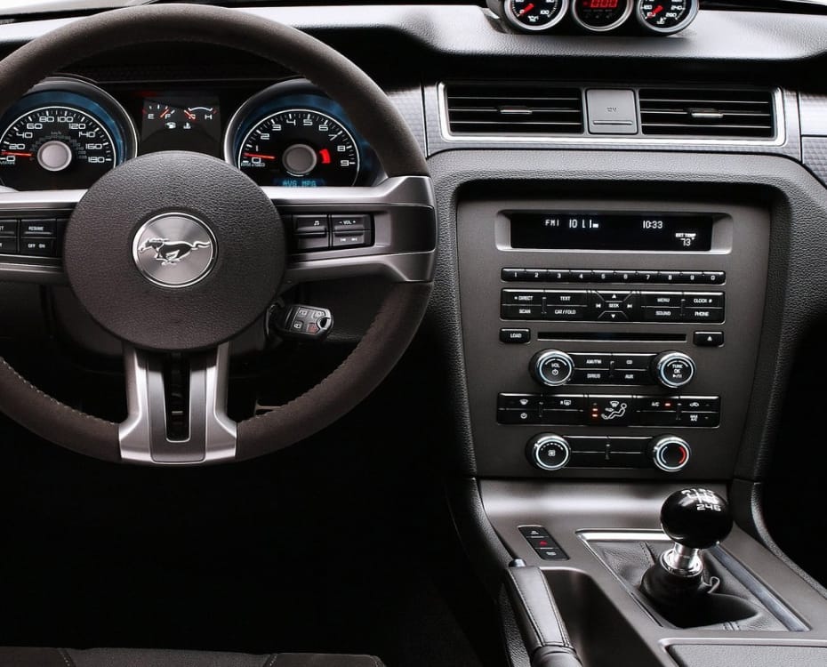
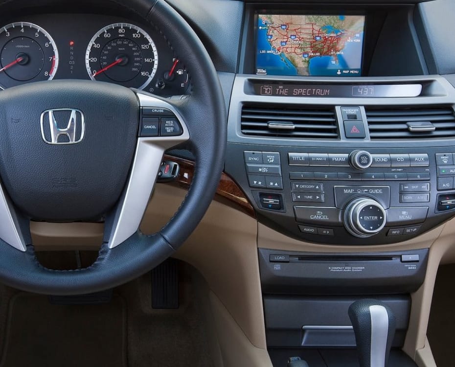
Since iDrive, other companies followed suit and soon, like the airbag and power steering, the screen became a standard sight in car dashboards. Notably, by then, they were usually touchscreens.
By 2012 other German carmakers introduced dials to interact with their infotainment systems — Mercedes with COMAND and Audi with MMI (Multi-Media Interface) — while Asian manufacturers added touchscreens to their cars. In parallel, iDrive kept evolving and with lower latency and improved graphics became “quite easy to use” (Shaffer, 2012).
In 2012 Tesla introduced the Model S with its dominating 17-inch portrait screen to address most driver interactions. However, even this revolutionary car kept some controls physical: stalks on the wheel for turn signalling and wipers, media controls on the steering wheel, and manually-adjustable vents (these features were all incorporated into the screen five years later, in the Tesla Model 3).
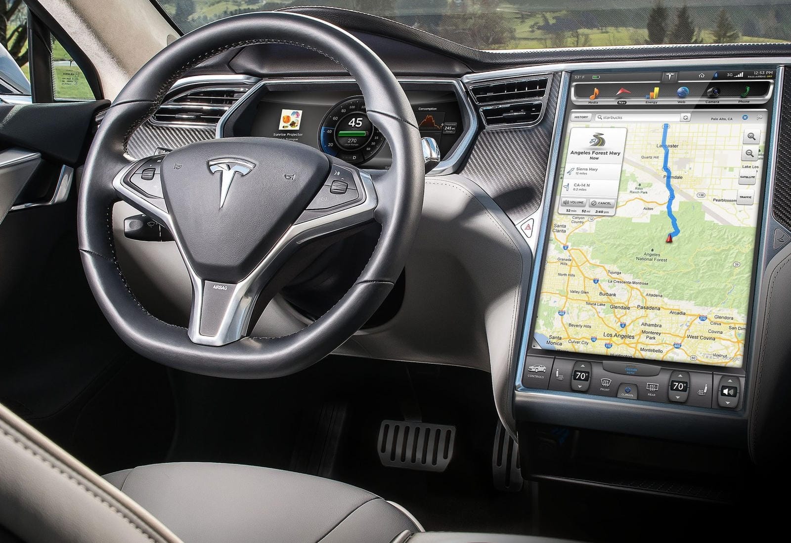
From a C/D review (Csere, 2012), the author was not only impressed how the car performed against a contemporary EV, the Nissan Leaf, but how it held its own against premium ICE sedans like the Audi A7. The Tesla, with its immediate torque beating the turbo-charged acceleration of any Ferrari or Porsche, was comfortable to drive and responsive to road changes. Talking about the interior, Csere compared the vertical 17″ touchscreen to “the area of four to six typical screens” found in other cars. He applauded the permanence of climate controls on the screen, and described the UI buttons as large and “easy to locate at speed”, with the interactions feeling “intuitive […] as on an iPhone”. While Csaba Csere (2012) criticised some functions of the navigation system, and complained about issues with integrating phone contacts, the seasoned author concluded his 1800-word review by writing that the Model S was “not just a good electric vehicle” but simply “a good car”.
Wayne Cunningham (2012) of CNET described the screen as “surprisingly” not distracting, and easy to ignore while driving. The cluster screen, behind the steering wheel, replaces physical dials, and shows not only the speedometer, but the car’s range and regeneration levels, as well as currently playing media or active phone calls. The centre screen is large enough to show media and navigation simultaneously, while permanently keeping climate controls at the bottom of the screen. The top of the screen shows a menu to switch between media, navigation, energy, web, camera and phone. Again, the author compares the responsiveness of the screen to that of Apple products, and another review by Edmunds (2012) agreed that it was “essentially a big and beautiful iPad”. The car offered “a phenomenal driving experience”, and Cunningham (2012) praised the benefits of the car’s 3G connection: with over-the-air updates enabling new features over time. Frank Markus (2012) of MotorTrend similarly had no criticisms for the display.
Looking at the landscape of cars in 2012, a majority of vehicles had screens by then. But these were still for tertiary interactions. Operating the screen was optional: everything could be done with physical controls, with the touchscreen primarily used to scroll and zoom around a map, which was faster done through direct manipulation. Tesla was the only company combining tertiary interactions into one touchscreen for input and output, making use of the screen mandatory for a driver who wants to adjust even the climate controls. The competition was seemingly timid to enlarge the screen, lest they face the backlash BMW received in 2002, or that Ford suffered in 2011.
Few cars had a persistent cellular connection, Tesla was the innovator in that regard, and companies relied on car dealerships to perform system updates, and for the use maps required the owner to buy a CD containing satellite data. The navigational data would not update based on traffic conditions, and was location-specific, needing a different CD depending on the region of the drive. For this reason, many drivers bought additional third-party satnav systems, such as those by Garmin or TomTom, or drivers would, by then, just use their smartphone.
In 2014, the surface of the iDrive dial became touch-capacitive, allowing users to draw letters and gestures onto it. And, finally, in 2016 even the screen in BMWs became a touchscreen. In parallel to the developments happening in the automotive industry, a new model for driver–car interaction was being developed in Southern California.
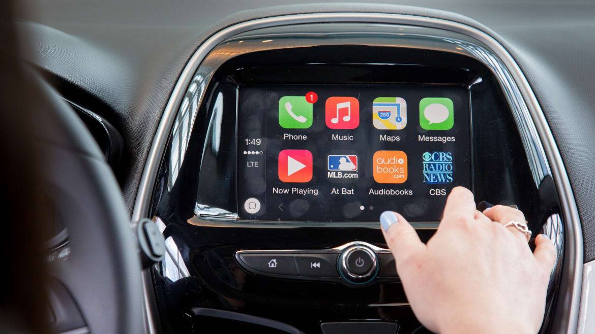
At their developer’s conference in June 2013, Apple introduced a new method of integrating the iPhone into the car (Cue et al., 2013) and finally released CarPlay at the Geneva Motor Show in March 2014 (Apple, 2014). A year later, in March 2015, Google launched Android Auto. Both are telematic technologies allowing the screen of the car to act as a remote for the user’s phone. Both systems project a simplified view of the phone’s content onto the car’s display, with a limited set of apps for communication, media and navigation, designed to minimise driver distraction. These technologies were important, as they replaced the often bad UI of car manufacturers with interaction paradigms users were familiar with. Furthermore, in a joint study between the AAA and the universities of Utah, Pittsburgh, and Windsor, Strayer et al. (2019) demonstrated that the use of these Californian solutions resulted in lower levels of workload and significantly reduced driver distraction. On an average daily basis, people in the U.S. spend 4.5 hours on their phone, while they spend less than an hour driving, of which only seconds are used interacting with the screen (AAA Foundation, 2017 and eMarketer, 2022). Users therefore have more familiarity operating a UI that resembles their phone, and prefer interacting with it rather than the rarely-used interface of their car (Strayer et al., 2019). CarPlay will be a case study later in this document, and will be analysed in detail regarding its function and usability.
Before Google’s Android Auto and Apple CarPlay, manufacturers had developed their own systems to integrate the phone. This was usually done through a wired USB or wireless Bluetooth connection, and was limited in functionality, often only mirroring currently-playing media, reading out turn-by-turn navigation or passing phone calls through the car’s speakers. Since screens had become more common, they were used to display more car controls, independent of the phone. However, these proprietary infotainment systems were often received as a poor user experience for more than basic features such as navigation or climate controls, and even those fundamentals could be difficult to use (Strayer et al., 2019). The frustration about the automaker’s own UI made drivers skip the manufacturer’s system, and use Android Auto or CarPlay instead, using their smartphone as the “brain” of the car.
The concurrent evolution of the personal car and the smartphone overlaps in a key area: user familiarisation with screens. Android Auto and CarPlay let car manufacturers focus on what they did best — building cars — while Apple and Google leveraged their software expertise to provide a good user experience in the car.
And, for a while, this went well.
Cars of 2017
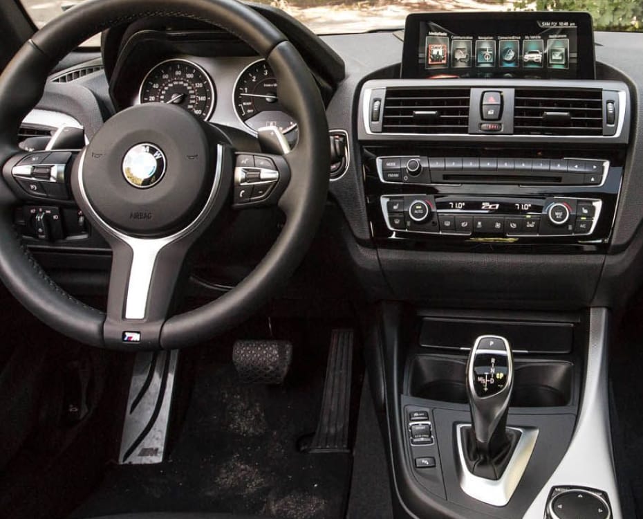
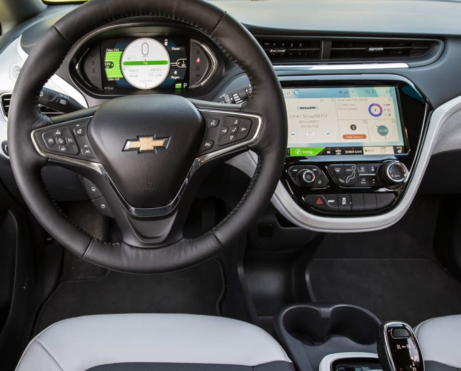
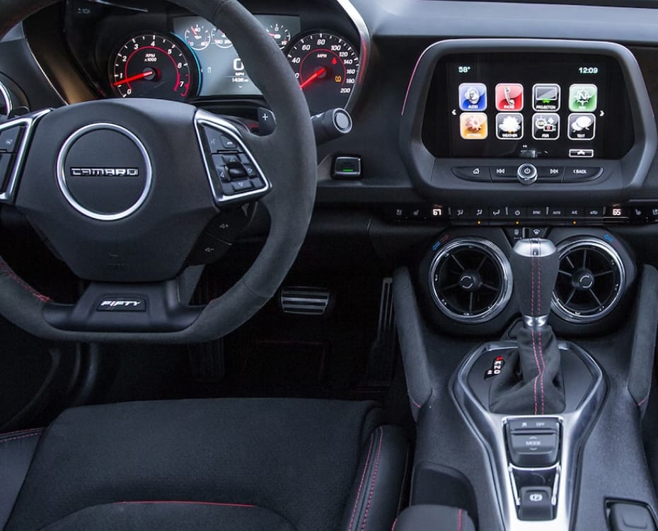
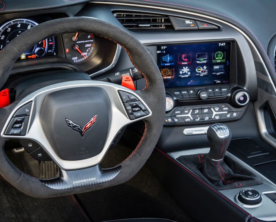
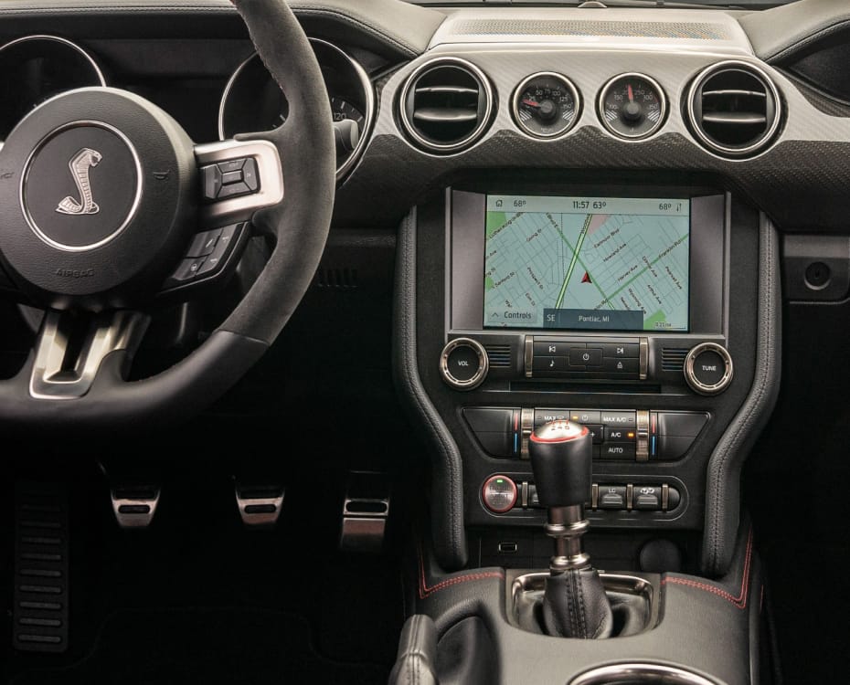
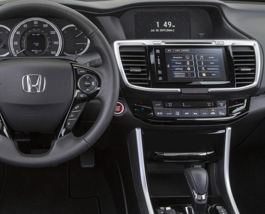
By 2017, the landscape of car dashboards had changed. What 20 years earlier was disregarded as a gimmick, and identified as a trend 10 years earlier, was now the norm in even entry-level models. The touchscreen was nothing new and if the built-in system wasn’t to their liking, customers could use Android Auto or Apple CarPlay to mirror the content and functions of their smartphone onto the car’s infotainment system.
To distinguish themselves, manufacturers came up with new interaction models: BMW introduced a freehand gesture system, which would recognise user input in mid-air (Boeriu, 2018); Mercedes renamed their COMAND (Cockpit Management and Data System) system to MBUX (Mercedes-Benz User Experience), which integrated AR-features with “Hey Mercedes” voice commands, and could be controlled through touchpads on the steering wheel, in the centre console or the main screen itself (Deppe, 2018); and Tesla introduced a car without any physical controls.
When Tesla’s Model 3 launched in 2017, the main criticism was that everything would be controlled through the 15-inch landscape screen, and, as historically with Tesla, it didn’t integrate with Android Auto or CarPlay, forcing the driver to use the built-in UI for everything from switching gears and opening the glove compartment to controlling climate and media.
Car and Driver (2017) noted that on this large screen, changing the temperature required far more steps than a physical control would demand, while the interior was “beautifully simple and uncluttered” (Turner, 2017). Kim Reynolds, Testing Director at MotorTrend, noted that even the car’s speed is displayed on the 15.4″ LCD (Walker et al., 2017). The car had no gauge cluster whatsoever behind the wheel. All publications praise the relatively affordable entry-level price of $36.000 (~ 41.000€ in 2023) and the long standard range of 220 miles (~ 350km).
In a long-term, two-year review, Dan Edmunds (2019) noted that while early problems existed, they were resolved via over-the-air software updates, and their overall experience was positive. The screen would, however, “absorb” the driver’s attention “for too many routine tasks that should be doable without looking [down]”, giving the car a poor “ease of use” score. Although technologically-laden, smartphone integration in the Tesla “lags far behind” the rest of the industry, and voice control was so frustrating, the testers were using their phones instead (Edmunds, 2017, 2019). This was a dangerous conclusion, as 80% of drivers (n=426) reported feeling distracted when using their phone, compared to 36% for using the car’s infotainment system, or 6% for using voice control (Prat et al., 2017).
The complete lack of physical controls ranged from distraction, to nuisance and even danger. The lack of a stalk on the wheel for windshield wipers meant that the driver often defaulted to the car’s automatic rain detection, but found the windshield got too wet before the car “decided to wipe” (Edmunds, 2019). Two months in, they noted an unreliable infotainment system with frequent crashes of the car’s screen. 15 crashes in eight weeks. Normally this would be a nuisance, but if the only way to control the car is via the screen, these blackout situations became dangerous. Sixteen weeks into the review, the testers “started a shared Google Doc to catalog various warning messages, necessary screen resets and general failures”.
Senior road test engineer Jason Kavanagh was not convinced by the “one-screen-to-do-everything approach”: it required too much attention, especially when operating basic tasks such as lights or wipers, which on “any other car” had “hard controls” with “less (or zero) time spent with your eyes averted from the road” (Edmunds, 2019). Caroline Pardilla, using the car for the first time: “Technology is supposed to make things easier, right? Right? That is so NOT the case with the Tesla Model 3. Simple things are hard to figure out at first glance”. On the interior, the “form-over-function” doors use buttons instead of handles to open, which confused every new passenger in the study: “Ugh, why is everything so hard? I just wonder what it’s like for those who actually own this car. It must get easier. It has to”. The “glaring omission” of Apple CarPlay and Android Auto was also noted, especially in relation to the unreliability of the built-in software.
The lack of physical controls for common interactions, the departure from driver habits and the reliance on a single, centre-mounted horizontal 15.4″ screen marred the ergonomics and user experience of the car. The screen being outside the field-of-view of the driver required more time to process information, and because even the speed readout was on this screen and the car lacked straight-ahead gauges behind the wheel, frequent glances away from the road were necessary. The reviewer blamed Tesla of “[ignoring] day-to-day human interaction” (Edmunds, 2019).
Despite its flaws, the Tesla Model 3 became the top-selling EV in the U.S. in 2018 (Pontes, 2019), in Europe in 2019 (Gauthier, 2020) and in China in 2020 (SD China, 2021). Overall, the Model 3 was, by all accounts, a great car, but in this thesis the focus is on human-centred design, not performance or sales volume. Driver interaction irritations were diametrically opposed to the performance praise, specifically in terms of user experience related to tertiary controls.
There was another technological aspect, perhaps more important to the future of automotive evolution: Tesla’s Autopilot. It, along with the Full Self-Driving mode were part of the company’s mission for their cars to be fully autonomous. CEO Elon Musk promised this future being imminent multiple times (Tesla, 2016; Marshall, 2019; Hart, 2023). Depending on the road condition and geographical location (linked to local road safety legislation), a Tesla could, to an extent, drive itself: not only did the Tesla automatically keep to the speed limit and distance to the car ahead, it would switch lanes, take highway interchanges, and come to full stops when required. In practice, while officially in beta, Autopilot has been received as “dangerously underdeveloped” and “thumbs-down”. It fell “out of sync with [the driver’s] instincts”. It felt “nervous”, and overreacted like a “paranoid student driver”, while at the same time being aggressive, unnecessarily occupying the fast lane, with Dan Edmunds (2019) having “zero confidence in it” — “Seriously, this should not be on public roads […]. Beta is OK for a phone but not for a car”.
How driver–car interaction is affected by autonomous vehicles (AV) will be discussed in detail later in this document. Currently, true AV don’t exist, and according to various studies (Rödel et al., 2014; Bimbraw, 2015; Van Brummelen et al., 2018; Canis, 2019; Faisal, 2019; Litman, 2023), won’t exist, if ever, before 2045 or 2060 — an exact timeline is unclear due to varying definitions of the expectations of vehicular autonomy. What is clear, is that Elon Musk’s predictions about self-driving Teslas is at best optimistic, and more likely misleading customers through false advertising (Ewing and Metz, 2023).
When it comes to modern cars and EVs in particular, despite the deficiencies and flaws listed above, Tesla is the market leader in performance and technology. While their UI is mandatory, the in-house solutions of the competition is worse. Many manufacturer’s apps for remotely controlling the car, for instance to pre-heat the cabin in the winter or to lock the car from the living room, charge a monthly subscription for these functions, while Tesla’s app is free and beloved (Edmunds, 2019). Other companies, seemingly relied on the ability to switch to Android Auto or CarPlay, and didn’t bother designing good interactions themselves. While Tesla’s experiences could be negative, the competition didn’t even try.
Cars of 2022
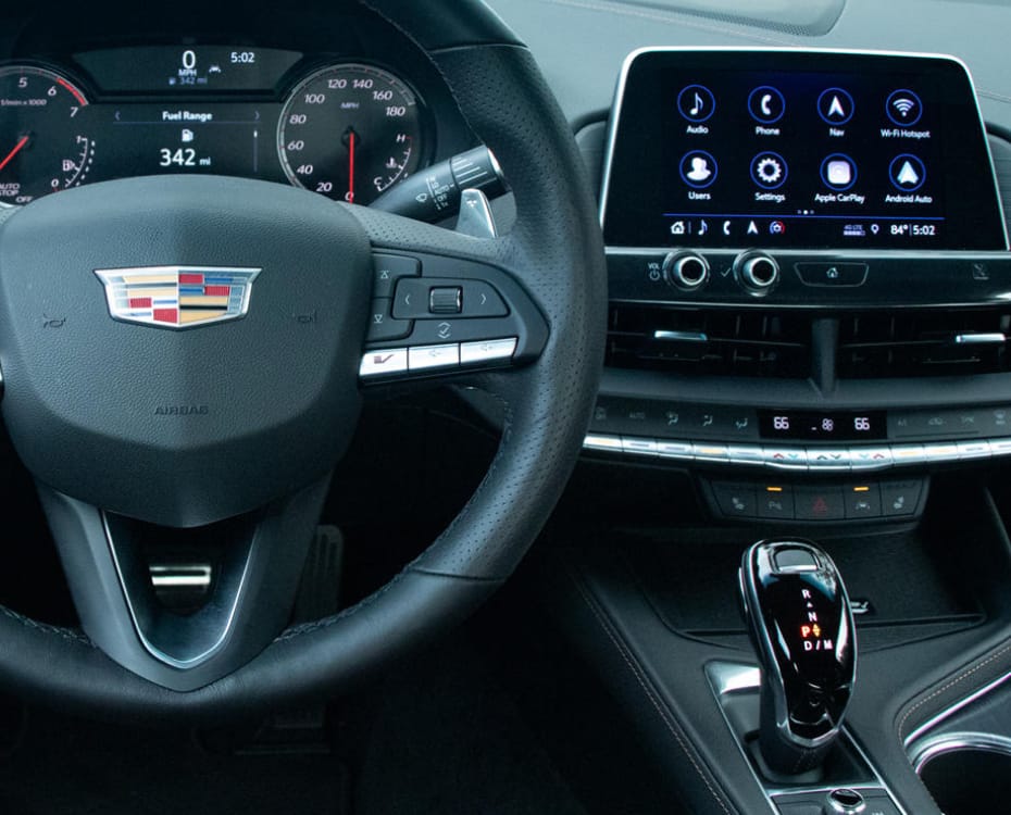
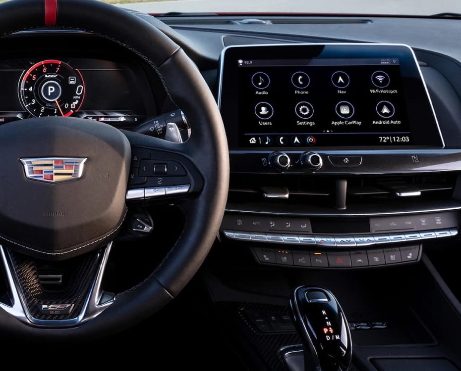
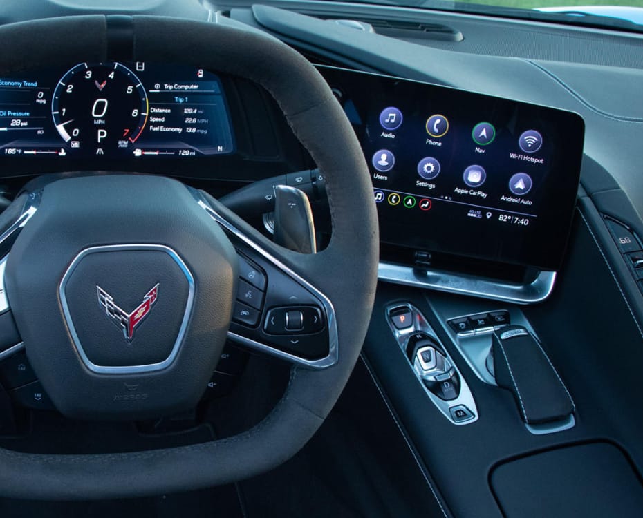
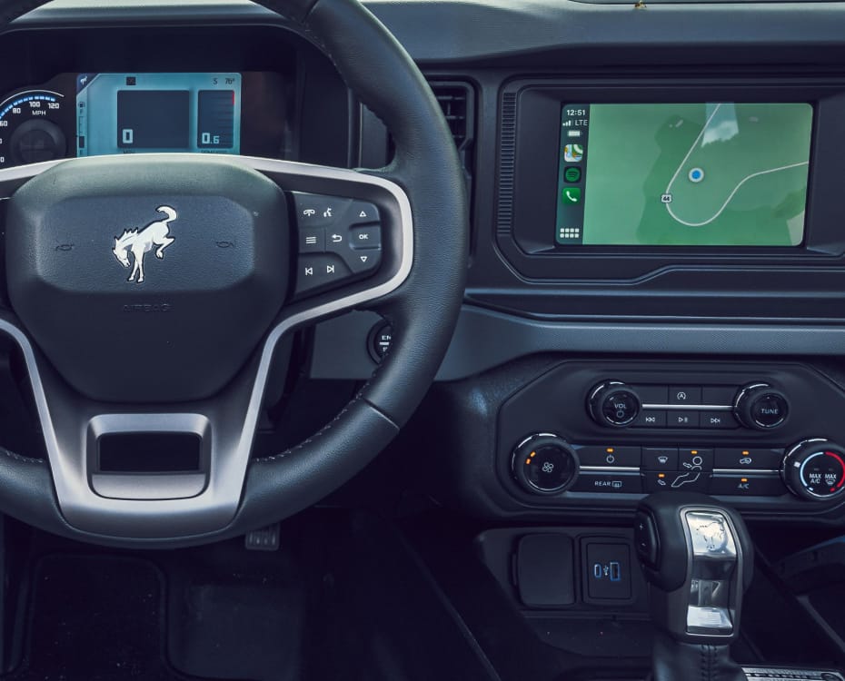
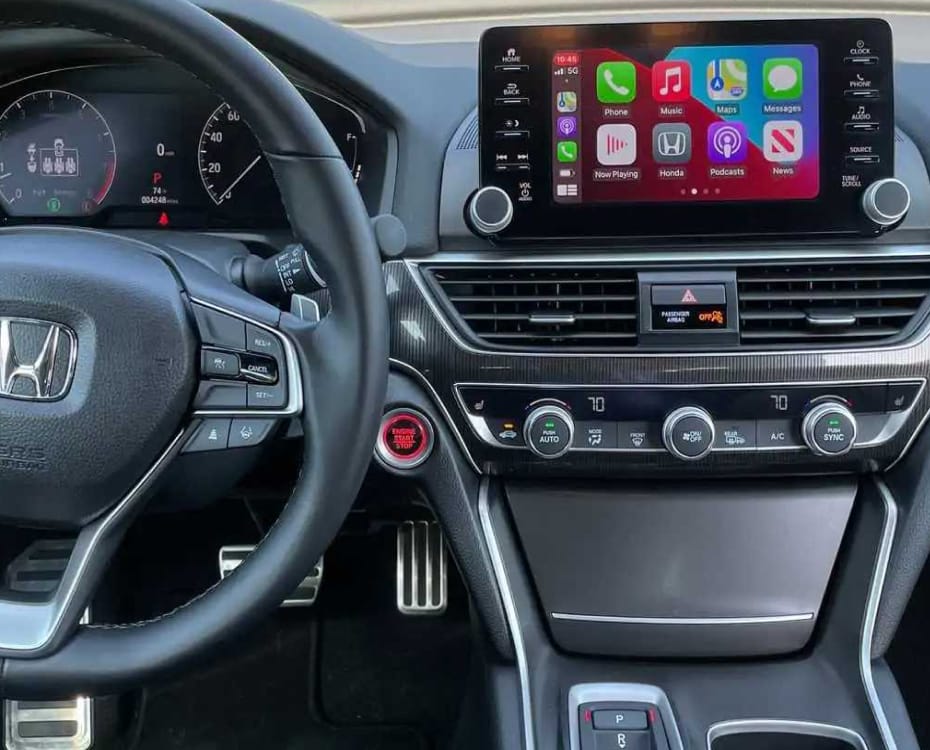
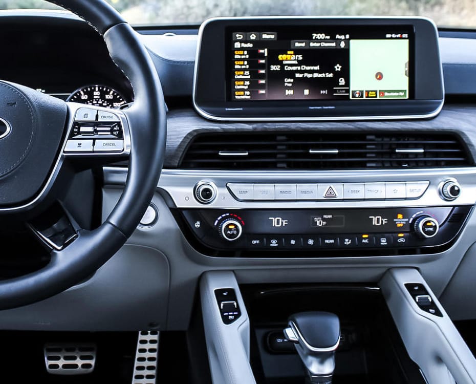
At the conclusion of Edmunds’ 25.000 word review (2019), the author wrote the experience of owning a Tesla was more comparable to using a phone than driving a car.
“Fans of the Model 3 praise it for being such a ‘high-tech’ vehicle, but here’s my take: A big touchscreen does not equal high-tech. Nearly every control in this car involves the driver taking their eyes off the road, which is not safe. In other cars, I can do things such as adjust the fan speed, turn on my lights, activate the wipers, all by feel. Many automakers learned this lesson years ago and have since re-added physical controls for a number of features. Then there’s the Model 3’s lack of Android Auto and Apple CarPlay. Smartphone connectivity is the best way to get drivers to put down their phones while driving and a truly high-tech way of integrating your smartphone in your vehicle.”
— Edmunds, 2019
Mercedes introduced their 56-inch MBUX Hyperscreen in the EQS luxury sedan, spanning almost the full dashboard, composed of two OLED screens and an LCD instrument cluster with haptic feedback. The Hyperscreen shows a view of the car with simulated 3D-depth, lets passengers watch TV, and dims the passenger display when the car detects that the driver is looking at it. For the driver to focus on what’s important, contextually-relevant information is placed on what Mercedes calls the Zero Layer which “proactively displays the right functions at the right time […] only ever a tap away” (Deppe, 2020; Harrison, 2021).
Doug DeMuro (2021) called the Hyperscreen a “sight to behold”, and praised the persistent climate control buttons on the screen, similar to what the original Tesla Model S had. While having the buttons on a screen wasn’t as intuitive as physical controls, DeMuro said, at least they were always visible and available. He was impressed by the use of a fingerprint sensor to load and save driver profiles with individual preferences for seat adjustment, lighting or climate control. Another biometric sensor: The EQS used facial tracking to determine driver awareness. Besides monitoring cabin air quality, the EQS can add fragrances to the multi-sensory driving experience, enhanced by various sound effects. The driver was delighted by the “humorous and fun” graphical “quirks” of the interface — as their review was on Halloween, and the car showed pumpkins, ghosts, spider-webs and other thematically-related images throughout the screen. The interior lighting could be customised with multi-coloured LED strips “swooping” through the interior, which affected the perceived atmosphere of the vehicle.
The screen was “fantastic”, “incredibly responsive”, “easy to use”, MBUX was the “best infotainment system on the market […] better than Tesla”. The screen was not only “usable” but “excellent”. Besides personal entertainment, the passenger screen could be used to change the media or navigation on the main screen, thereby reducing driver tasks.
In the review (DeMuro, 2021) the HUD was described as not only useful for displaying basic driving statistics like speed, or augmented-reality navigation, but also showing a visual indicator of the car ahead, confirming to the driver that the EQS was aware of its surrounding, which was perceived as comforting. This type of feature is an example of the car communicating its understanding of the world to the driver. Additionally, DeMuro approved of the 360º camera system, helping the driver see around the car in tight spaces, for example in a parking lot.
While the passenger screen was off when driving alone, the reflections and glare from the blank screen were disorienting to the tester. DeMuro (2021) negatively noted the lack of tactile feedback when pressing the seat control buttons, which did not indicate any response to user input by moving.
BBC’s TopGear (2021) described the use of the car’s about 350 sensors as telepathic: there was no need to flick a switch to the left or right to select which mirror the driver wanted to adjust. The mirror was activated merely by looking at it. The rest of the interior felt “tasteful” and “jaw-dropping”, with sound-cancelling technology isolated the cabin from road noise. Concluding, what the car lacked in performance, it made up in comfort with “all the charm of a traditional luxury car”.
Cruz and Stafford (2022) of C/D, while praising the luxurious interior, commented that the Mercedes-Benz EQS felt more like a living room than a car, complaining about the drive-feel lacked response and that the brakes didn’t feel natural.
Weintraub (2022) of electric vehicle news-site Electrek first noted the benefits of an EV: low noise levels thanks to a silent electric drivetrain and better aerodynamics, instant linear acceleration instead of gears, regenerative braking enabling a smoother deceleration, more interior and storage room thanks to fewer parts, the ability to charge at home, and, of course, much lower levels of pollution. The author preferred the built-in Mercedes infotainment UI to CarPlay, because of the quality of the navigational system and its integration with the HUD.
Overall, it seemed that the screen, while dominating, could easily be ignored while driving. Essential information was displayed on the HUD, and for frequent interactions there were physical volume controls on the steering wheel, and persistent climate controls on the main screen. If the driver needed more, contextually-aware interactions were displayed in large easy-to-reach widgets on the screen. The EQS was well-received because it struck the right balance between featuring a futuristic screen, and relying on it as little as possible through permanent digital and physical controls.
Moving on from the luxury sedan to a sporty ICE Benz: The Mercedes SL. Ollie Kew (2023) of TopGear wrote that it felt “like a greatest hits compilation of everything we detest about modern car”, and lamented the lack of physical buttons. Mercedes stood for “all that was tasteful and sensible”, but, seemingly inspired by Tesla, “got themselves into such a mess with tech-obsessed design [it] comes close to ruining the SL”. Kew’s complaint (2023) is that this particular vehicle is a sports car, and should therefore enable driver focus to eke out maximum performance. The 12-inch screen in this car, smaller than the Hyperscreen of the EQS, was “bafflingly complicated” to use, “brimming with puzzles [and] frustrations” and overall “disastrously unhelpful”. It made the ~150.000€ car “feel cheap”.
At CES 2021, BMW showed off their AI-powered voice assistant
The lower end of the BMW product range is dropping the physical iDrive controller and relies solely on the display (Hiltscher, 2023).
Screens are still getting bigger, taking over the majority of the dashboard, especially in electric and luxury cars. This is going against all studies related to driver distraction, but addresses the customer’s desire for futuristic-looking, clean dashboards. This desire might be purely aspirational, because, as reviews show (xx, year; xx, year; xx, year), once drivers experience these spaceship-like interfaces, they long for less screen and a return to physical controls.
Contemporarily, there exist two concurrent trends: a return to (physical) form for manufacturers such as X, Y and Z (src, year; src, year; src, year), and the further dedication to digital screens from A, B and C (src, year).
[compare screens of EV against ICE]
Discussion: Uses of Screens, and the importance of getting it right
Beginning in the mid-1980s, primary driving functions had become enhanced by computers. Acceleration, brakes, lights, or steering evolved into their respective “smart” counterparts of cruise control, ABS, automatic headlights, or power steering. The BTS report (Esterberg et al., 1987) mentioned the introduction of the navigation system. While navigation does not affect the vehicle directly, it requires a high degree of driver attention. The authors list the following driver tasks:

Over the past decades, drivers have become familiar with touchscreens in cars. Some drivers follow the best practices and mostly ignore the screen, only glancing at it for navigation, and only interacting with it when stationary. Distracted driving incidents have risen, from xx in 1980s, to xx today. This thesis is not a report on the cause of accidents, and we won’t argue that it’s because of the touchscreen that road fatality has increased — and yet the trend is obvious and the critics are loud: these screens are distracting and difficult to use. Manufacturers are naive if they believe people won’t use them in motion. And yet! People are getting used to them, they are becoming an accepted technology, no longer a gimmick. And if drivers don’t use the built-in touchscreen of the car’s infotainment system, they bring their own: their smartphone.
The use of the phone in the car has risen. It’s the most personal device. It knows our contacts. It knows where we want to go. It’s often faster and easier to use the phone. We use it every day and are profoundly familiar with it. New car buyers in the U.S. 75% (source) want system-level integration of their phone into their car, be it through Android Auto or Apple CarPlay. People replace their phones more often than their cars, therefore using telematic applications that mirror smartphone content is an easier way to have recent technology act as the “brain” of the car’s infotainment system.
Mirroring the familiar concept of a tablet in a car has the immediate benefit of being intuitive: users understand the associated interactions. The mental model of using a tablet is understood. It gives manufacturers flexibility in their interface and lets them incorporate complicated and nested functions like settings or rarely-used controls into one place along with everyday interactions. However, it is a detriment to safety and usability, as the driver needs to take their eyes off the road to interact with the screen to find the touch target. Instead, a physical button or knob can be reached by the driver by feel alone, without relying on vision (Kessels, 2018).
And yet, cars today not only have screens in the infotainment centre, but screens are replacing side mirrors and speed gauges in the dashboard too. This is primarily attributed to being a financial measure by manufacturers: cost-saving because fewer mechanical parts that could potentially fail and faster manufacturing and repair times, and revenue-generating because over-the-air updates let companies upsell the driver on features after the initial vehicle purchase (Bhalla and Bhalla, 2010; Greengard, 2015 and Abel et al., 2019). This integration is widely-accepted by consumers because of familiarity and because of the “clean” (Pitts et al., 2012) and “futuristic look” (Martínez, 2021) of the interiors facilitated by increased technology.
Modern infotainment systems are built on top of Android Automotive OS (AAOS). Not to be confused with Android Auto, Android Automotive is the operating system of the car itself and does not require a phone. AAOS can run natively on its own, like it does in Polestar or Renault cars, or be used to power Android Auto or Apple CarPlay. Google Automotive Services (GAS) are an optional package that enhances AAOS with Google’s apps through the Play Store, their navigation system through Google Maps and their AI voice bot through Google Assistant.
Companies such as Snapp Automotive are building custom operating systems on top of Android Automotive. SnappOS can be adapted by the carmaker to suit their brand, while still using AAOS as the backbone. It bridges the gap between OEMs wanting custom interfaces for their car, and the familiarity and reliability that people know from their phones. From the beginning, SnappOS was conceived with a companion mobile app that drivers can use to control relevant features from a distance (Snapp Automotive, 2023).
However, while some car companies are adopting Android Automotive as their car’s OS, most existing systems are still built on top of BlackBerry QNX or a Linux OS, with every manufacturer having their own software stack and set of apps. An app that runs on one manufacturer’s system is incompatible with another’s, without developmental efforts of rewriting and recompiling their code (Kessels, 2022). Therefore apps that users are familiar with on their phone, like Spotify, would not only have to be specifically developed for Apple’s iOS and Android, but also for all the various automakers operating systems. This fragmentation makes it difficult for software companies to scale their apps to different platforms. Additionally, the user interface, which is the part that drivers interact with, would be different from company to company. Some brands share a similar or same layout, like Honda and Acura, Toyota and Lexus, or Kia and Hyundai, because these pairs belong to the same company (Bartlett, 2023).
And, while most modern vehicles will let the driver use Android Auto or CarPlay as their interface, there are notable exceptions like Tesla, Rivian and GM, who insist that their proprietary systems provide a better user experience and integration with the vehicle (Hayes, 2023; Miller, 2023 and Mossberg, 2023). Phone mirroring systems are useful for common tasks, but don’t currently support deeper system integration, like controlling the sunroof, check tyre pressure, engage the seat massage, or change the drive mode. For these interactions, drivers need to switch back to the car’s built-in system, which is a poor user experience. In terms of cognitive load, Android Auto and CarPlay perform well for automised and common tasks, while other tasks might not even be possible.
In an online-forum about Rivian cars, a potential buyer (Bulloak, 2023) described their phone as being at the “center of their digital lives”, and their “connection to just about everything we choose to connect to” The decision by car companies to “purposefully severing that connection is going to be an increasingly bad move for carmakers”.
Manufactures, especially luxury companies like Mercedes, want to provide an encompassing branded feeling to their customers, and are therefore motivated to improve their own solution, based on AAOS or not. Ideally, the driver could then decide to use the built-in system over CarPlay, not because they have to, but because they choose to. As it stands today, only 4% of customers prefer using the car’s native software (Leswing, 2021).
Underlining the market demands for Android Auto and CarPlay systems in particular, GM’s announcement in April 2023 for dropping support of these platforms in favour of their own, proprietary system, was met with widespread backlash (Farrell, 2023; Foote, 2023; George, 2023; Hawkins, 2023). While these telematic mirror apps aren’t flawless in their usability, they are better than manufacturer’s own systems. One explanation is that for Apple and Google, software is at the core of their business, whereas car manufacturers have only recently begun developing their own operating systems. Regarding Apple CarPlay in particular, customers value the data privacy and ease-of-use. General Motors claim they can provide a better experience, but critics insist the brand’s reason is to increase the amount of user data GM can collect, and monetise. GM admitted the decision is part of their push into recurrent revenue streams through in-car subscription services (Sozzi, 2023).
Although brand loyalty is strong in cars, J.D. Power (2022) write about two main current challenges for manufacturers: pandemic-related supply-chain limitations making it difficult for customers to find an available car with their preferred brand, and the fast evolution of EVs, making customers reconsider their priorities. As a result of GM’s announcement, longtime customers are now planning to switch to rival Ford (Lareau and Howard, 2023). Compounded with the contemporary customer retention obstacles, GM have committed “a huge blunder”, putting company profits over customer choice (Mossberg, 2023).