Volvo XC40 (2024) Review
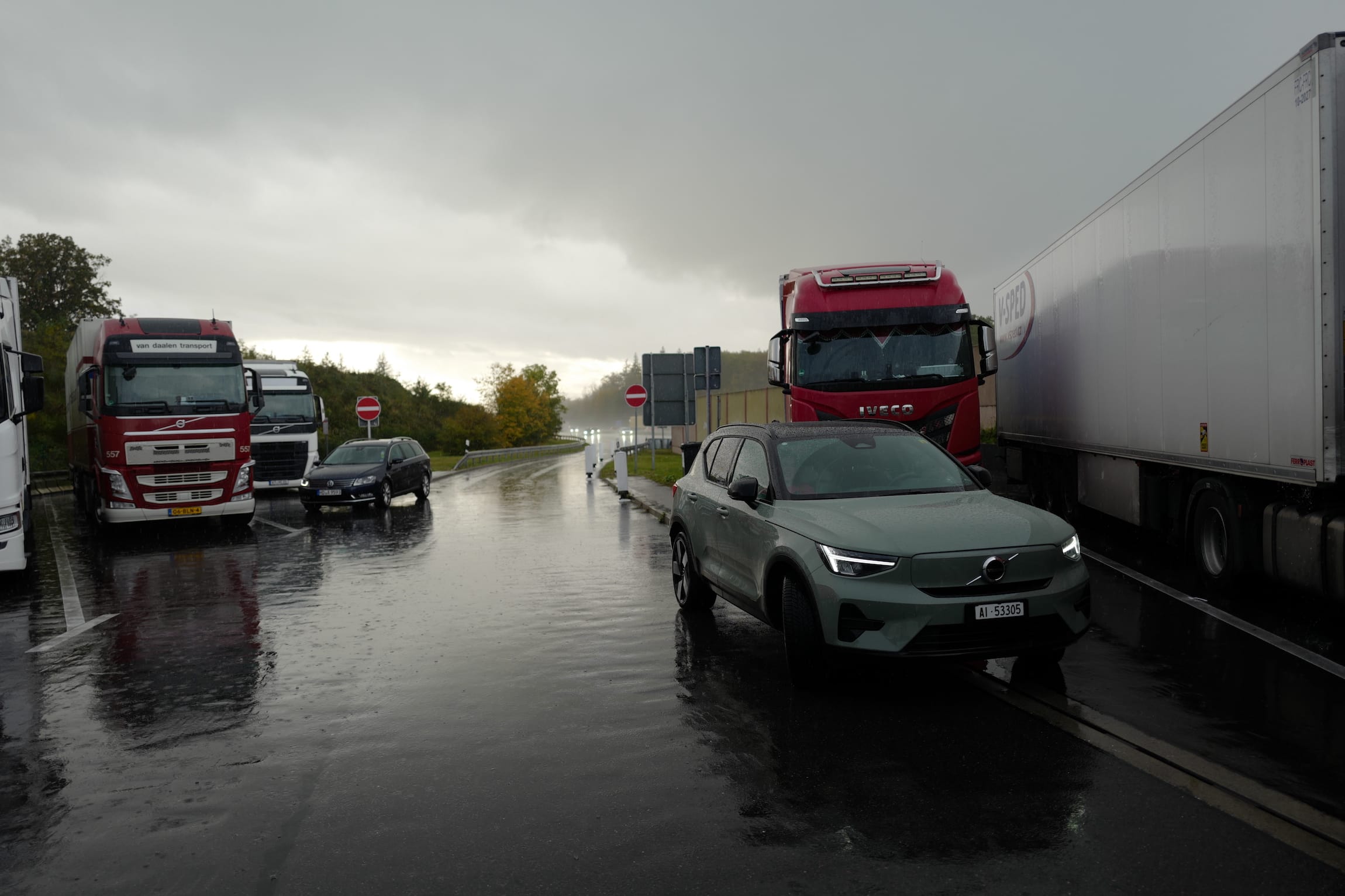
At its introduction in 2017, this car was a diesel-powered ICE vehicle. A plug-in hybrid version came in 2019 and the fully-electric Recharge model in 2020. The Volvo XC40 shares its CMA (Compact Modular Architecture) platform its coupe-style SUV C40 sibling, the Polestar 2, hybrid Lynk & Co cars, and models by their parent company, Geely.
As I had previously driven the Polestar 2, I expected this car to immediately feel familiar — and I was wrong. Because the platform is shared with ICE cars, there is a transmission tunnel, which makes the interior feel somewhat crammed. The Volvo EX30, a newly-released ground-up EV, has a dedicated SEA (Sustainable Experience Architecture) platform, and makes use of its height to accommodate the batteries in its base. The XC40, like the Polestar, has its batteries in the transmission tunnel and under the rear seats. While the XC40 is already small in the world of SUVs, the EX30 further stretches the definition of this most popular vehicle class. The EX-line is Volvo’s pure electric range. The EX30 bookends the lineup with the EX90, a huge six-figure seven-seater.
What does the platform have to do with naturalness? It makes you think while you drive, what could have been. I wonder if we will see an EX40, and if/when the Polestar 2 will get its deserved SEA platform. The perceived interior space matters, and while extra storage for the driver is important, the extra space in the rear is crucial, especially if the industry wants to sell smaller cars again.
This was a rental from Europcar, for a week. I drove about 2000km through Germany, through rain and mud, cities and highways, charging on the road and at home. I entered the Model 3 with low expectation and was pleasantly surprised, and I was looking forward to testing the XC40, but was let down.
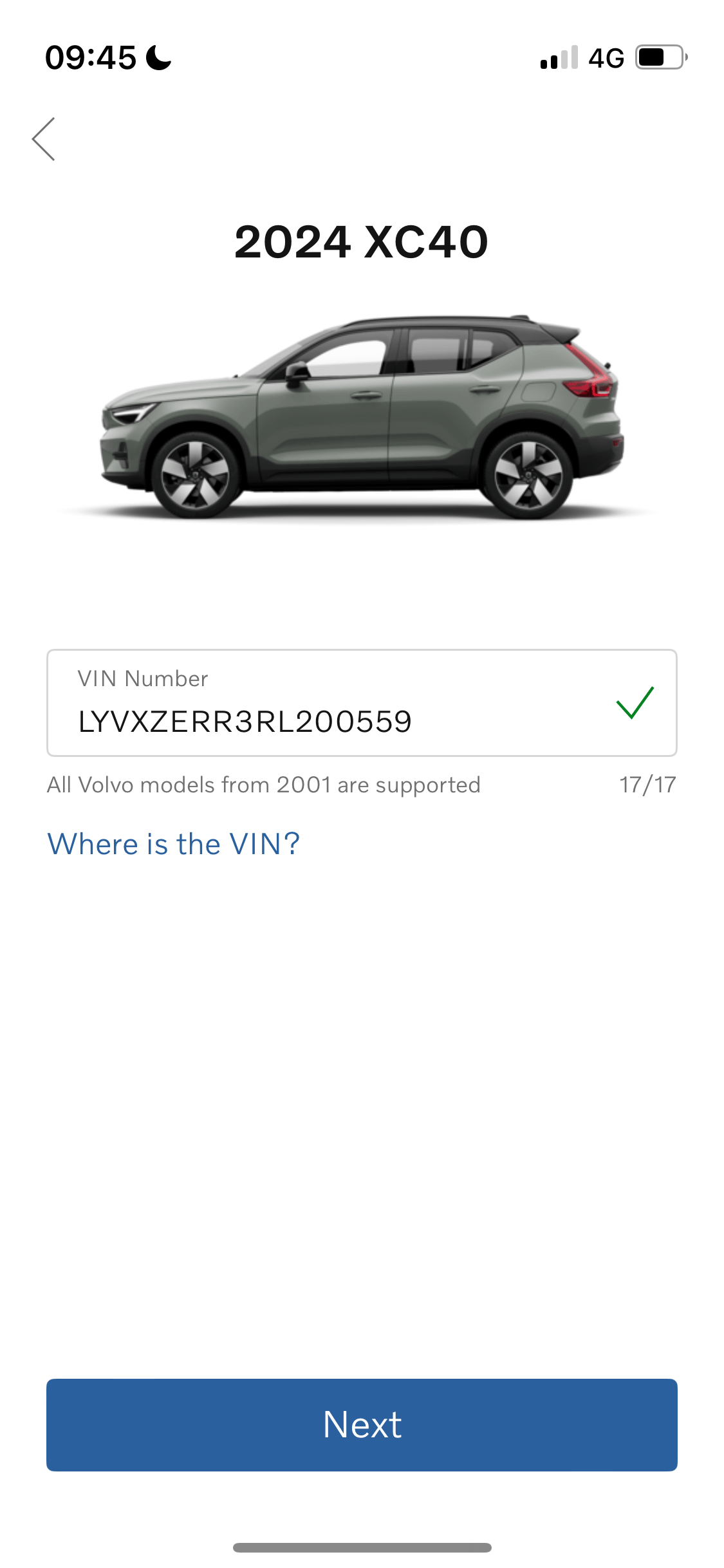
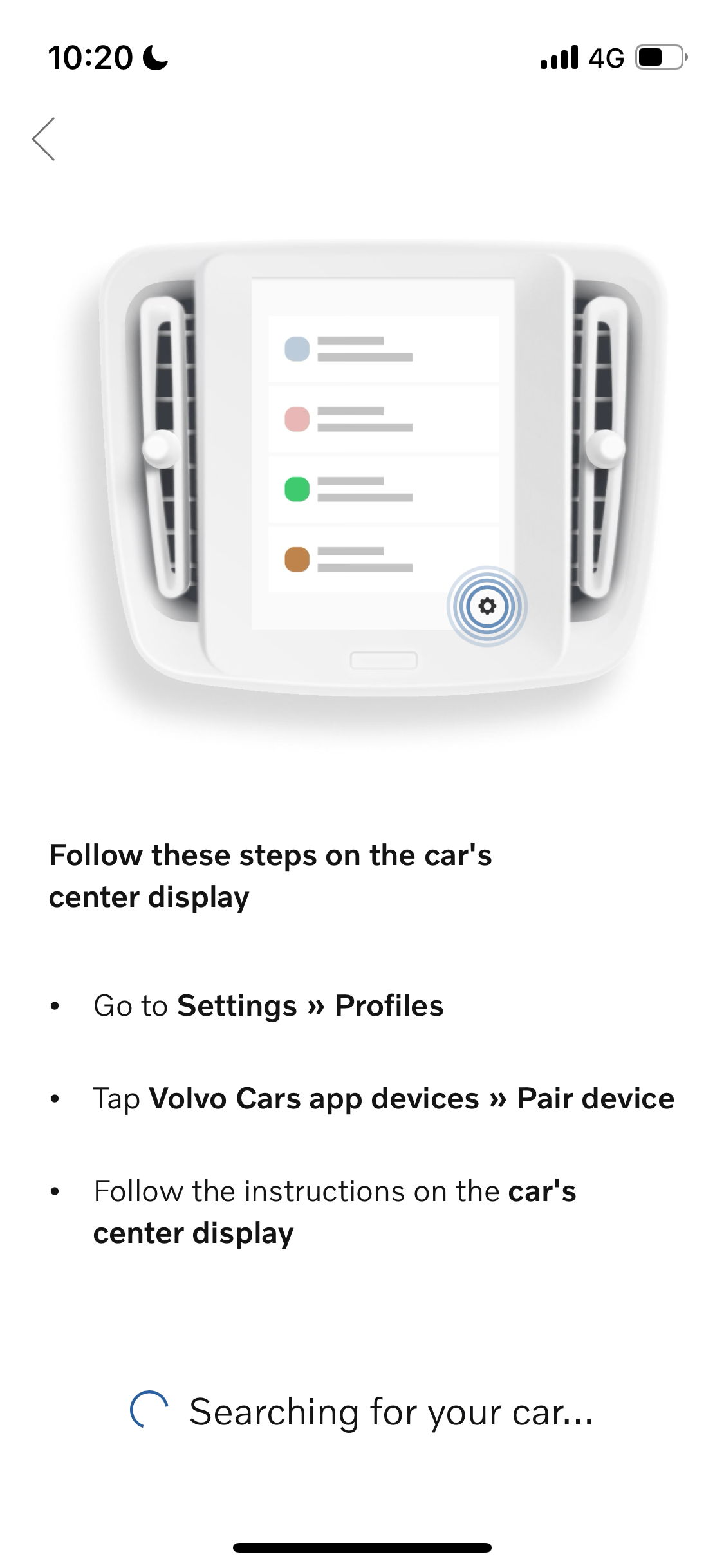
Like the Polestar, because of a policy either from Europcar or Volvo, I could not use the app. I knew this much. A surprise was that the infotainment system in the XC40 was considerably worse than in the Polestar, even though this car was two model years ahead (2022 vs. 2024). The Polestar’s screen isn’t large (11.2″), especially compared to Tesla’s 15.4″ landscape monitor, but it’s sufficient. I like that it doesn’t dominate, while still being useful. But at 9″, the screen in the XC40 is too small to be useable in a navigational context.
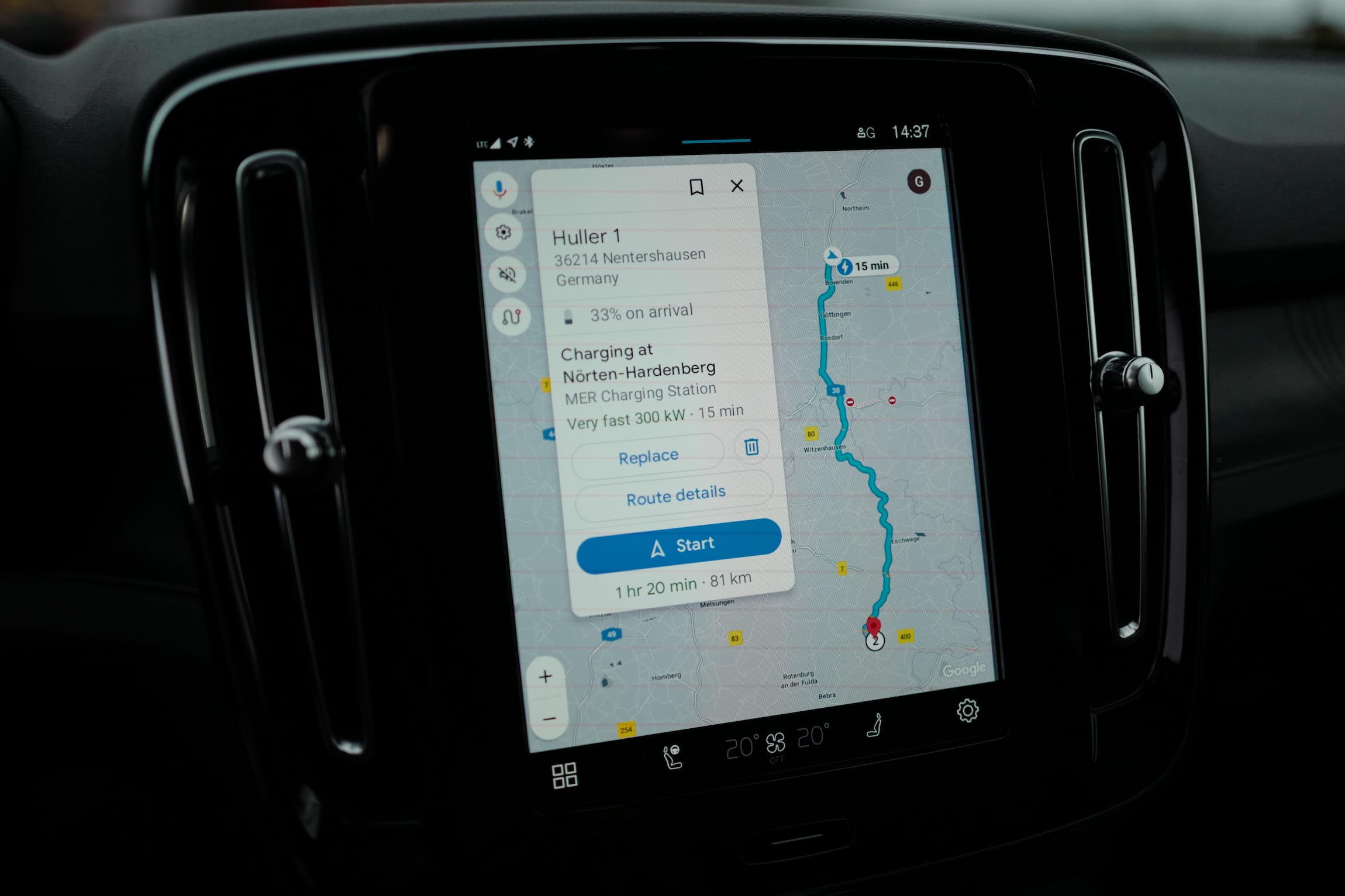
Search results obfuscate most of the map, and the display’s response to touch input is so sensitive that it’s difficult to zoom into the map without extreme zoom accidents. It was only after driving the Tesla and using its built-in route planning paired with the Supercharger network that I noticed how bad the suggested charging stops on the Volvo were. Not only did it recommend 50kW chargers where only one of two plugs was active, but it also sent me to Tesla Superchargers, which I could not use. Or, if I could have used them, I didn’t figure out how. This means that a long drive requires either proper premeditated planning, or a passenger who can adjust stops on-the-go, which the finicky screen made difficult.
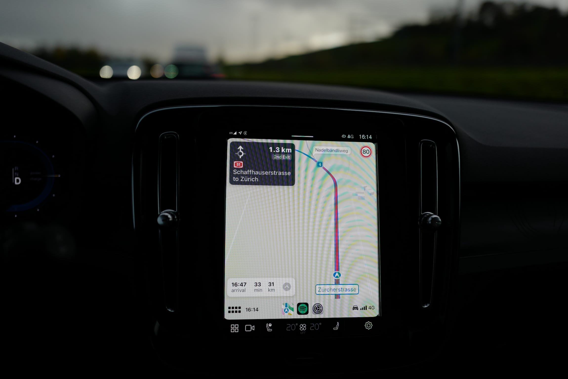
On the return drive, around 100 km before our destination, the onboard navigation shat the bed, right as I was driving through a city with complicated onramps. The center and cluster screens still showed the map and my position, but no longer the route or driving directions. Re-entering the destination didn’t help. Exiting the navigation didn’t help. Stopping and restarting the car didn’t help. In the end, I could use CarPlay. But with Google Maps I would only see my results on the center screen, and CarPlay’s cluster screen, while at least it worked, was terrible. It doesn’t show me clearly what my next task is. I need to read everything on the screen to filter out what’s relevant. What’s worse, the cluster screen even showed me names of adjacent streets, not part of my navigation. This was unnecessary information that, in combination with city traffic, felt like cognitive overload.
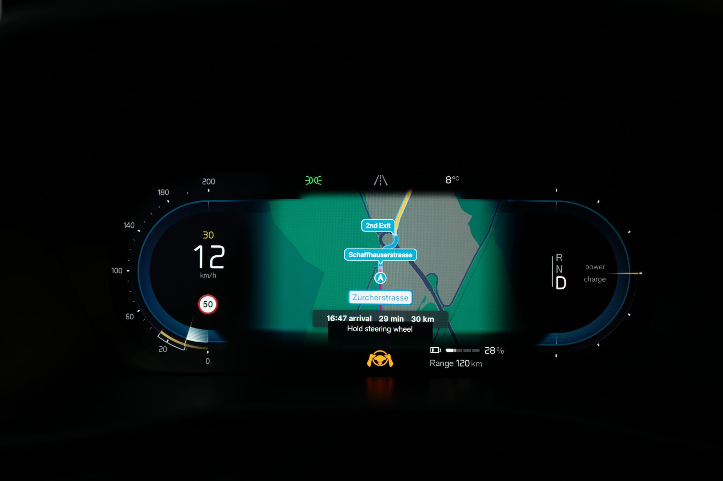
For a car that shares many components with the Polestar 2, the user experience of the infotainment system is considerably worse. One point that the Volvo gets is that the “home button” is physical, rather than capacitive.
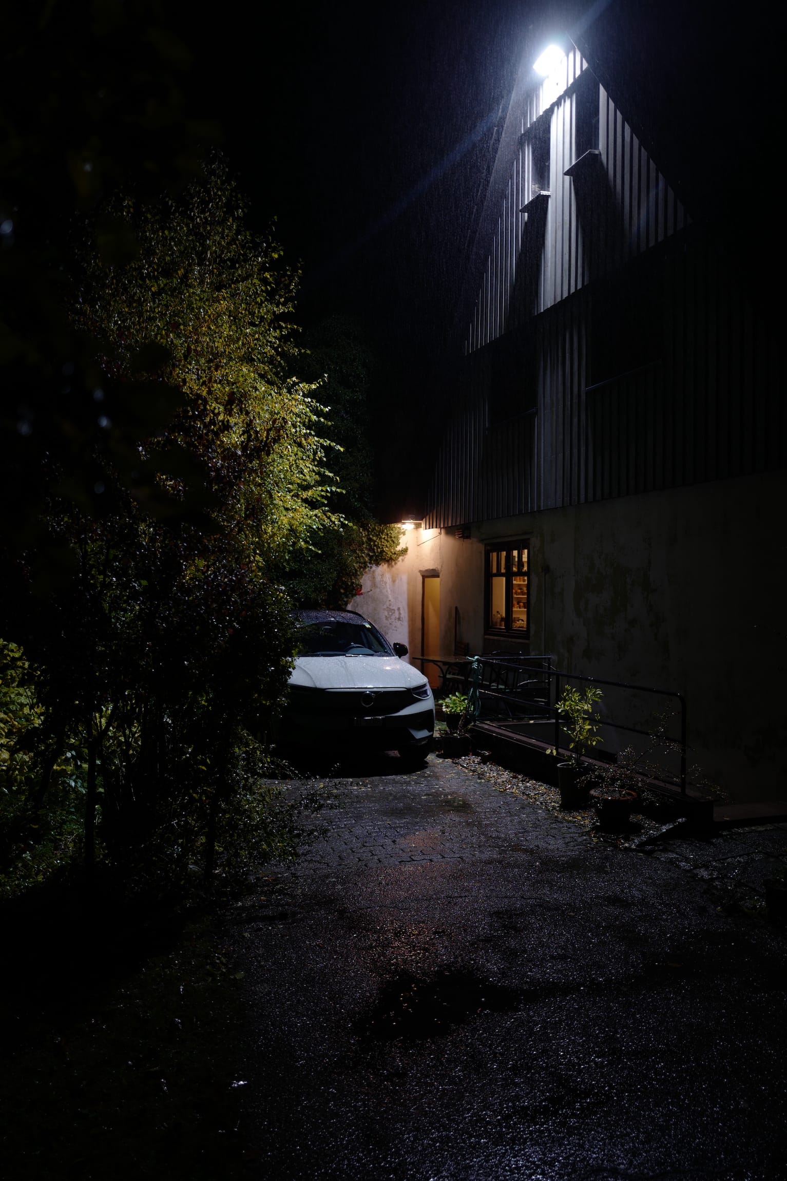
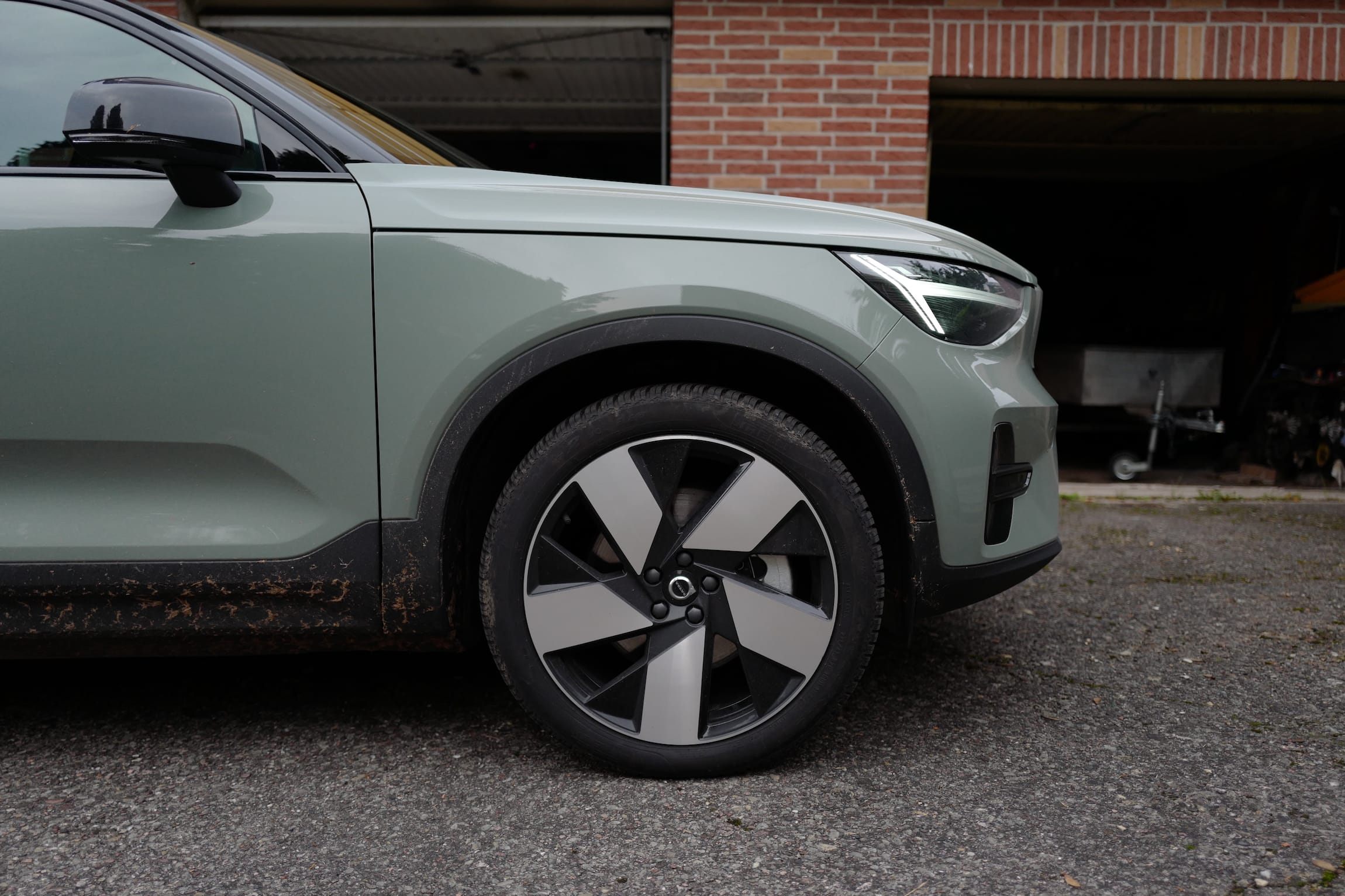
Oh it’s a beautiful car, it’s well-made. It’s quiet. Only at around 110 km/h I would start hearing aerodynamic noise. The model I received was the twin motor 82 kWh (400 V) variant with the Plus package, in (objectively the best colour) Sage Green Metallic. I didn’t have the Ultimate package with panoramic roof, better speakers and 360º cameras.
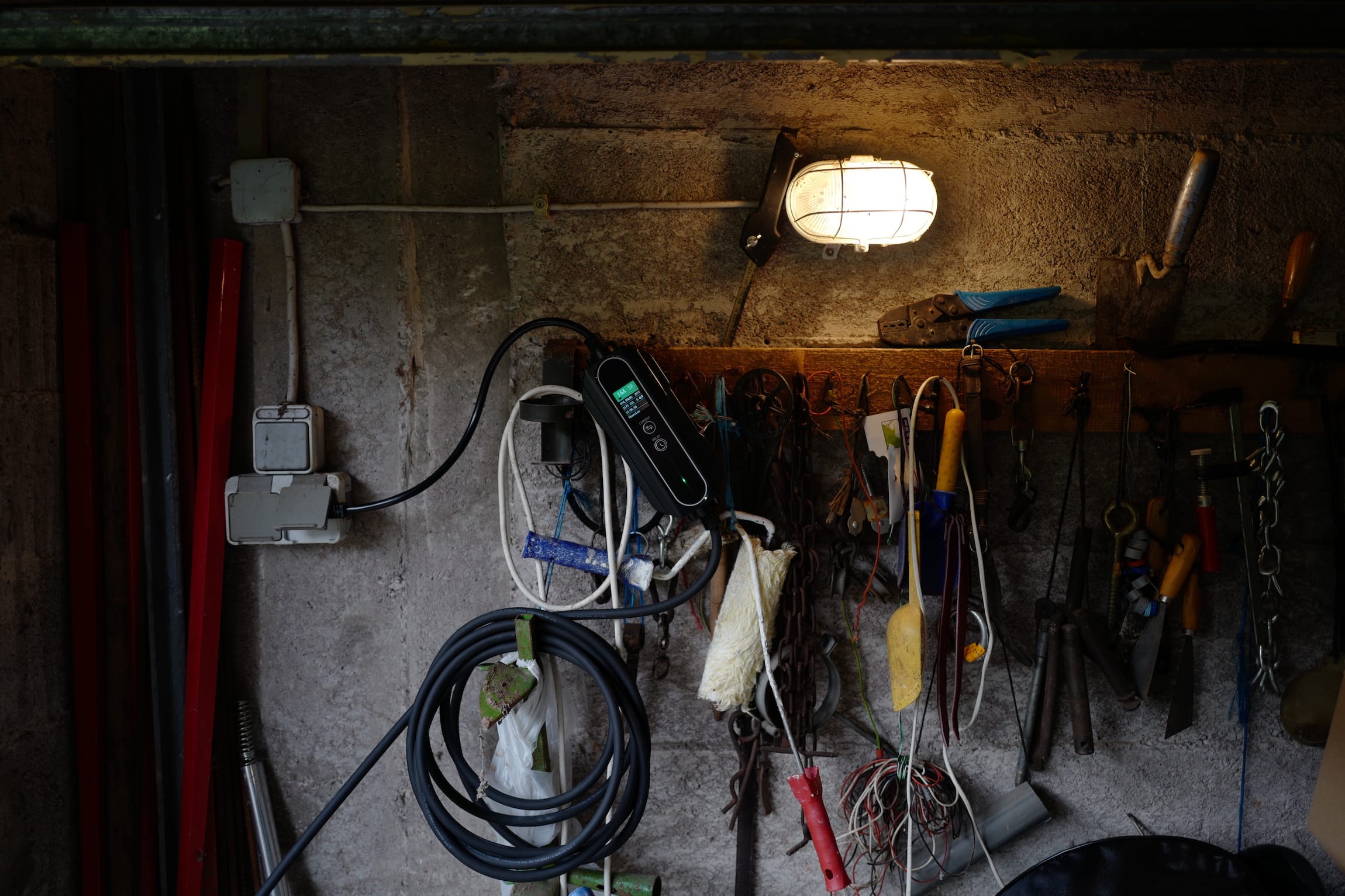
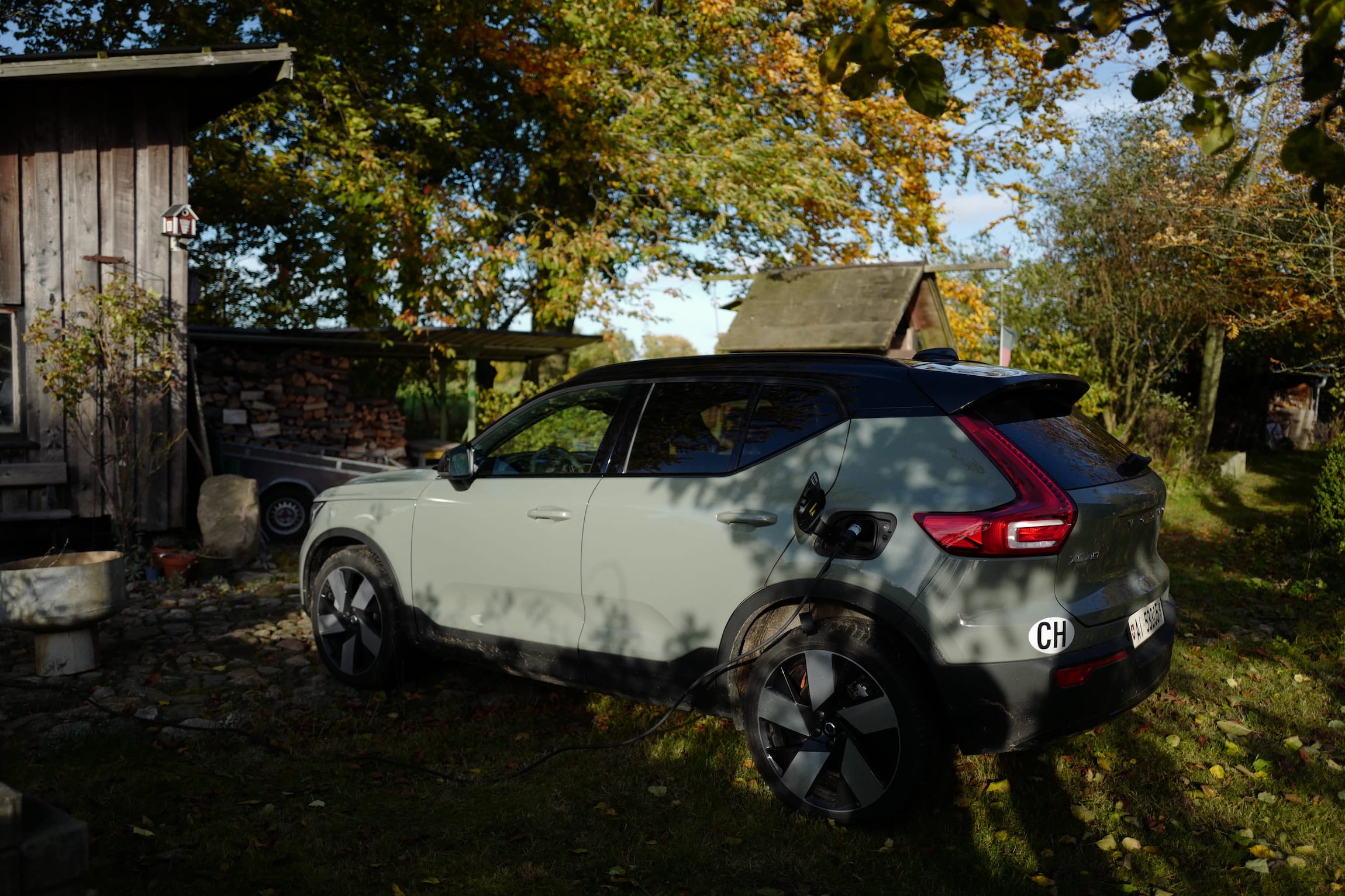
I bought my own Type 2 to Schuko cable for charging at home, since I knew from experience Europcar wouldn’t provide one, and they didn’t (they did include two Type 2 cables, though). Based on rough estimates, the cable paid for itself. I had no issues using it at its maximum 16A setting. I don’t know what influence I had on the energy bill of my hosts, but I paid just over 130€ in fast-charging for over 2000km, and I estimate that I would have spend twice that relying solely on public chargers.
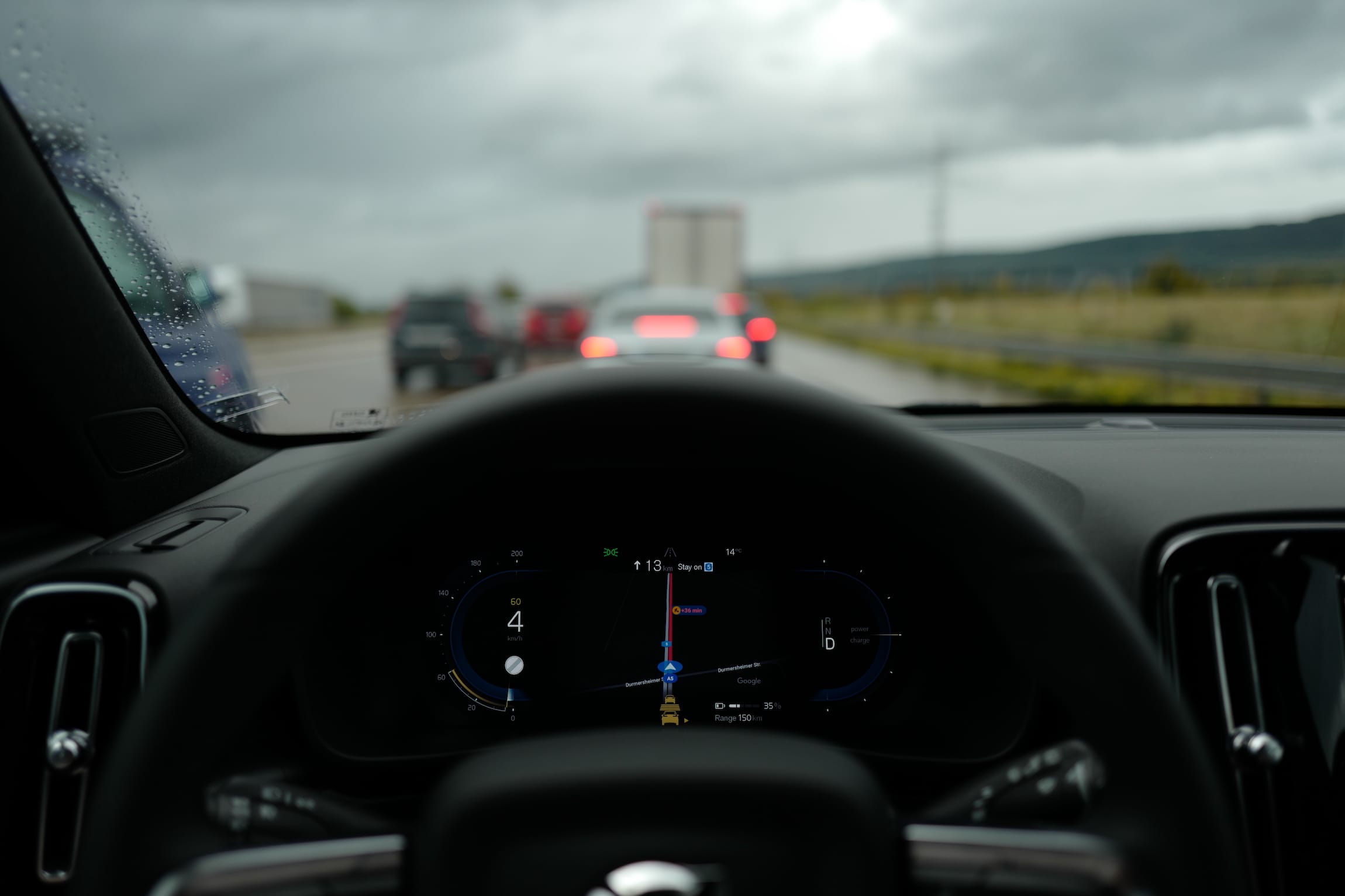
The ride feel was nice. The Android Automotive integration is better than CarPlay, and doesn’t require a phone connection. I just sign into the apps I want to use (Google Maps and Spotify), and the rental car immediately feels more personal. The car’s size is a bit stupid. It’s small for an SUV (is it even an SUV? Yes.), and it’s smaller still on the inside. I love that it’s small, but I wish it was smaller, with better use of the interior (I wish it was an EX30). Nonetheless, the higher ride position, while not personally to taste, improved standing in traffic. Whether it’s the better perspective or the lower noise, I felt more like inside a cocoon, and less connected to the road.
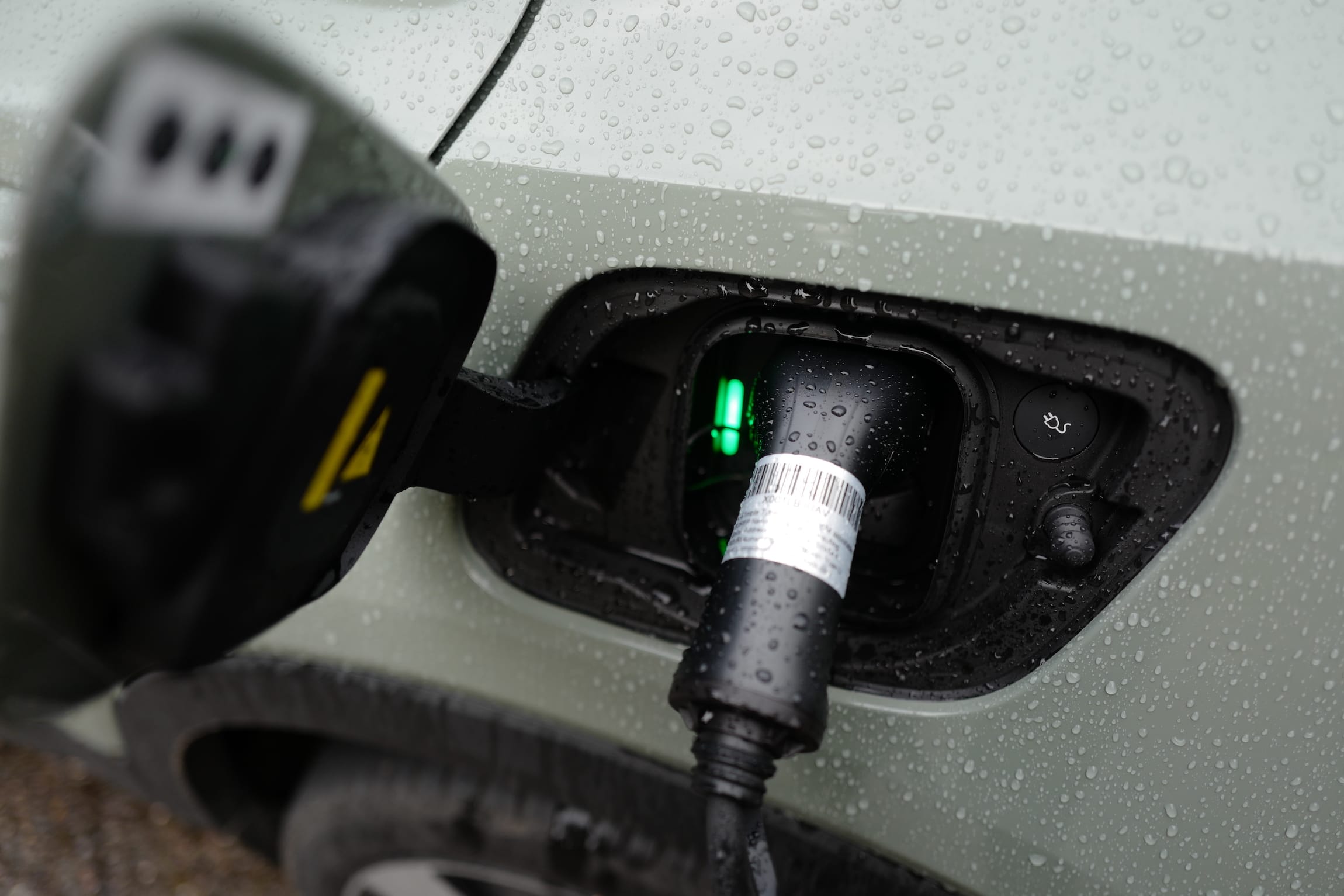
Being able to charge at home completely changed the driving experience. No longer did I have to charge before reaching my destination, and I felt no range anxiety. This is not unique to the XC40, just the first time I’ve experienced it.
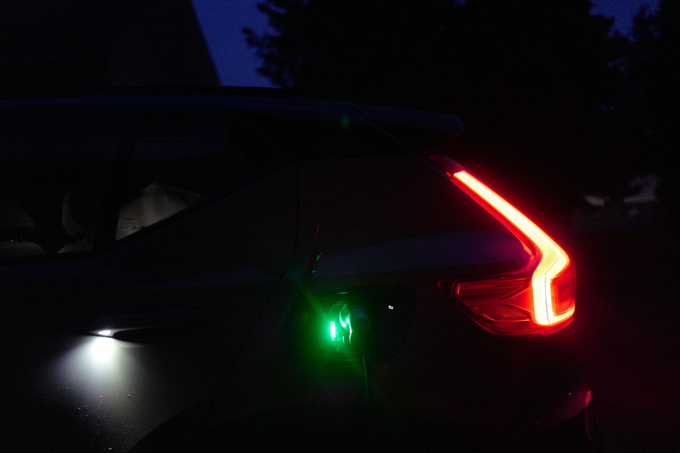
The lights are great. Illuminated handles made it easier to unload the car at night, and I love the shape of both the headlights and taillights. The charging indicator was so bright I could see its pulsating blink in the bedroom at night, this is something to keep in mind for next time.
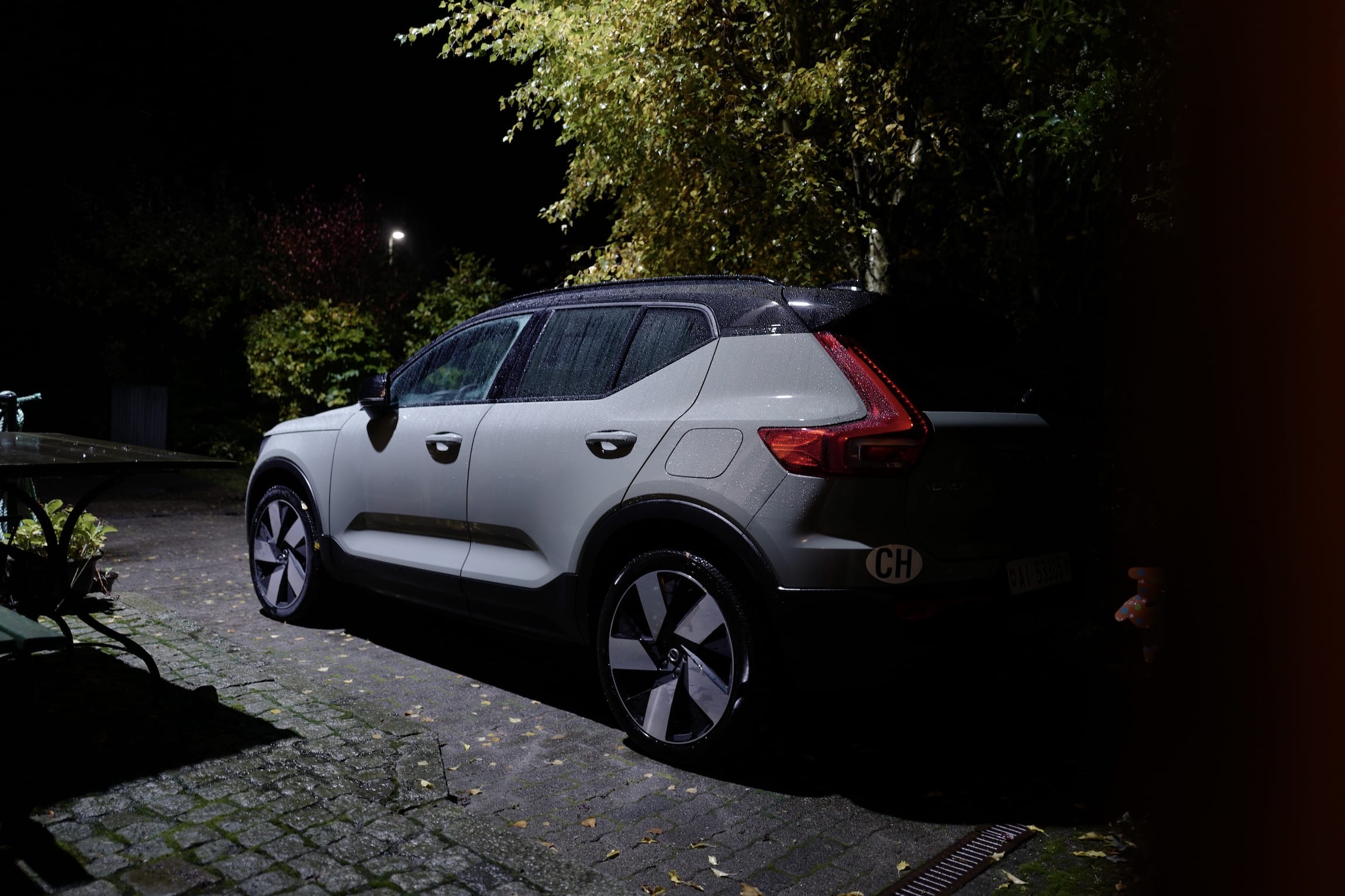
It’s difficult to capture the body colour. It looks different in every light. And it always looks beautiful. It was a joy to walk up to this car and get inside. I had high expectations and was let down in a few areas. Crucially, the car never failed in aspects which could affect safety. The failing map was annoying, but I focussed on the road and stopped as soon as I could to remedy the situation. For its beauty, I’m forgiving of its faults. And while I’m looking forward to trying the EX30 one day, I think the XC40 is the better looking car.
The only question is if the next rental will be the Polestar again (my current favourite), or something different.