Tesla Model 3 (2023) Review
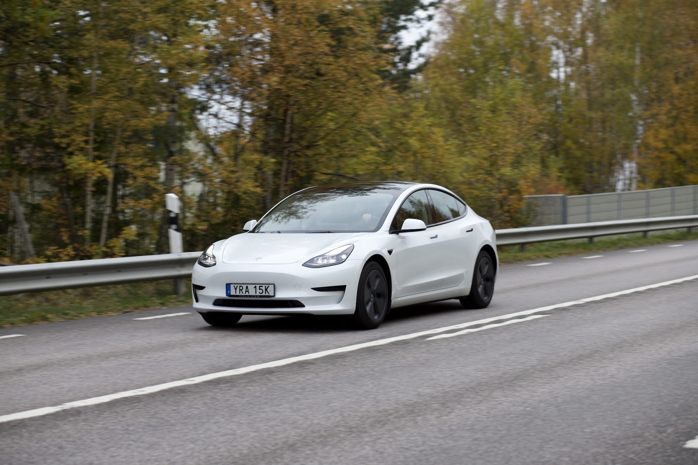
For the second NUXI study, we rented the best-selling electric car in the world, the Tesla Model 3. Through our research we had doubts about the usability of this EV, which only made it more interesting to experience first-hand.
Through SIXT’s user-management tool, we were able to add our own Tesla account to the car, which enabled us to use the app, and use our own payment methods for the Supercharger network. With electric cars, the mobile app is a crucial component: the most practical use-case is to monitor the charging level while the car is out of sight (while having lunch at a highway restaurant), and comfort features such as preheating the cabin, adding stops to the navigation, or opening the trunk (and frunk) were frequently used. Many cars have apps, but we often cannot test them as rentals don’t always allow this level of connectivity.
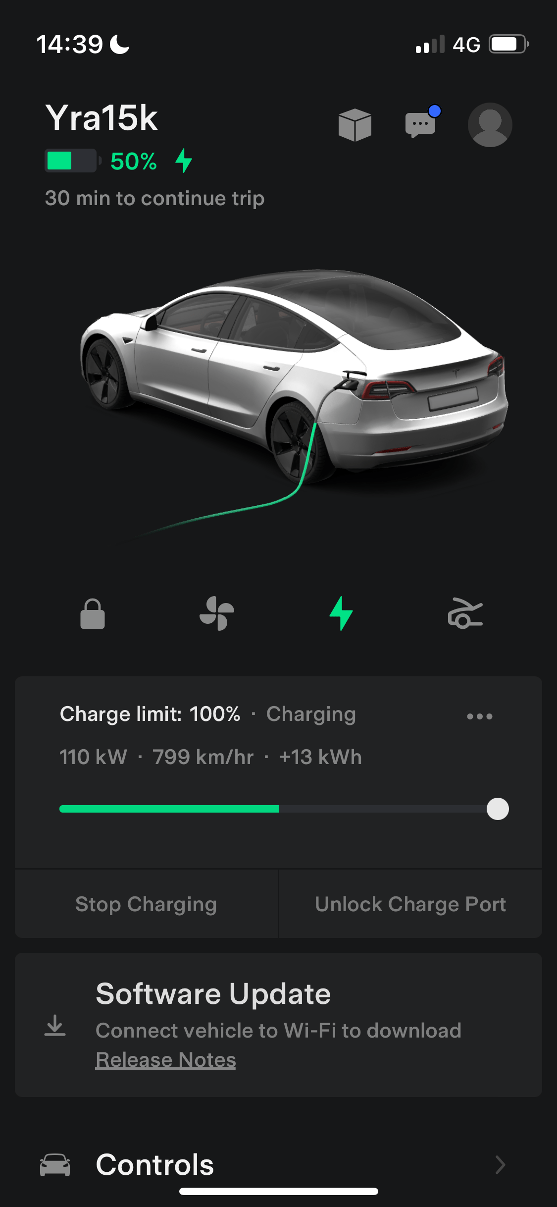
The app feels like an essential extension of the ownership experience. As passenger, we could modify navigation or temperature without interacting with the display and therefore risking to distract the driver. Outside the vehicle, with bags of groceries, remotely opening the trunk was a welcome functionality.
At the top of this review, we want to point out that our experience has been more positive than anticipated.
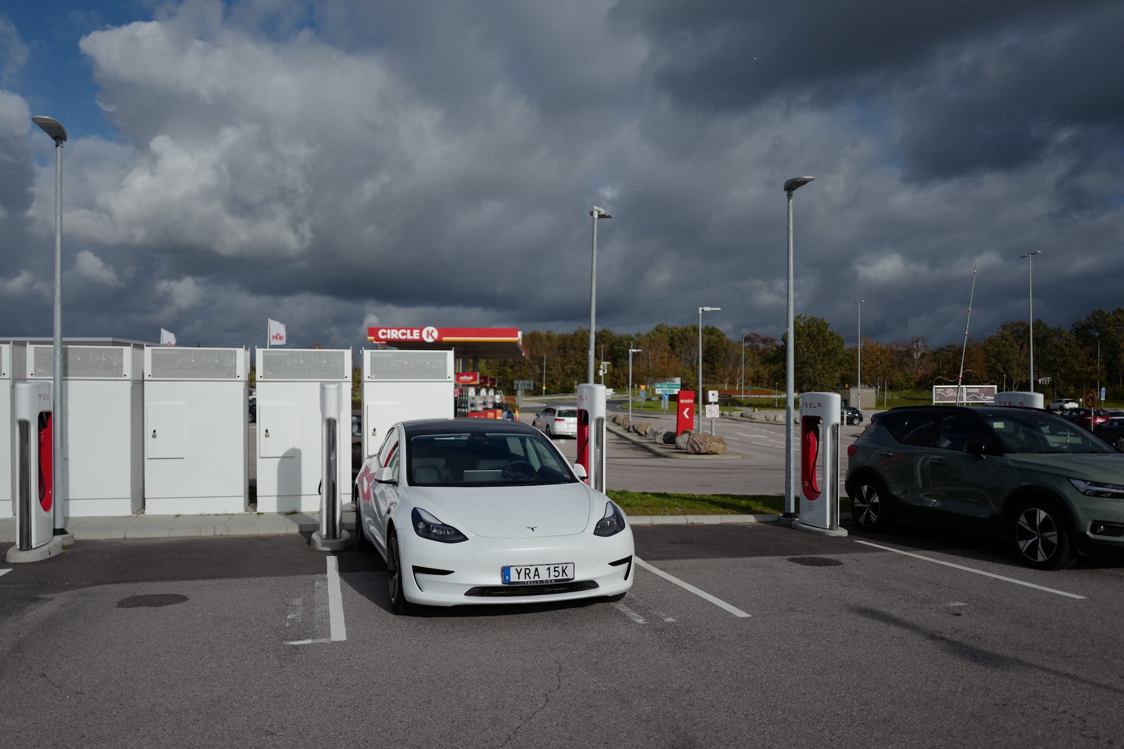
The best thing about the Model 3 is that it can use Tesla’s excellent Supercharger network. Electricity in Scandinavia is cheaper than in other European countries, and there are discounts to using Superchargers with a Tesla. Overall, we paid a little over 75€ to drive about 1.500km. In addition to the cheap charging costs, the charging speeds were good too. At 170kW peak speeds, we never* waited on the car. We scheduled our stops to have lunch, take a bathroom break, or check out the chocolate selection at a Swedish supermarket.
*There was one occasion where the charger stopped working halfway through. We noticed this in the app during a lunch break, and simply unplugging the cable and plugging it back in solved the problem. While it was annoying to have to walk to the car, without the app we would not have been informed about the problem and would have arrived at the car, expecting it to have charged, leaving us frustrated.
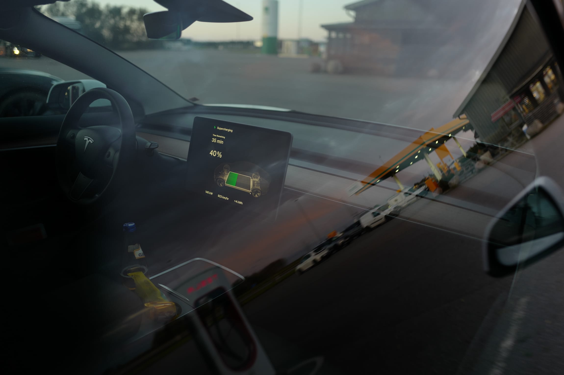
The way the car communicates its charging level is great. From the outside, a simple peek at the screen let us know that indeed the car was charging, and what its numbers were. Automotive user experience is not only about driving tasks, but extend to the exterior of the vehicle, and remotely through the app.
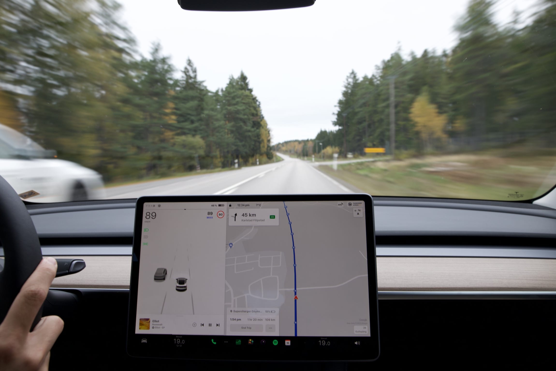
Prior desk research prepared us: this car doesn’t have any dials to indicate speed, nor does it have a cluster screen or HUD. Everything is controlled and shown via the 15.4″ landscape touchscreen. To avoid distractions, it’s best to look at the display as rarely as possible. And, with Autopilot, we trusted the car to maintain speed, so there was no need to monitor the system by glancing away from the road. The Tesla communicates what it “sees” from the outside world: the screen shows other surrounding cars as 3D models, distances to obstacles when parking, a blindspot camera view when exiting the lane, and what impacts energy consumption. The screen size is beneficial while driving, because one third, closest to the driver, displays current driving information, and the next two-thirds are dedicated to the map. The screen is quick to respond to touch, and animations are smooth. When stationary and charging, we watched YouTube videos through the car’s built-in cellular connection (a 9.99€/mo upgrade).
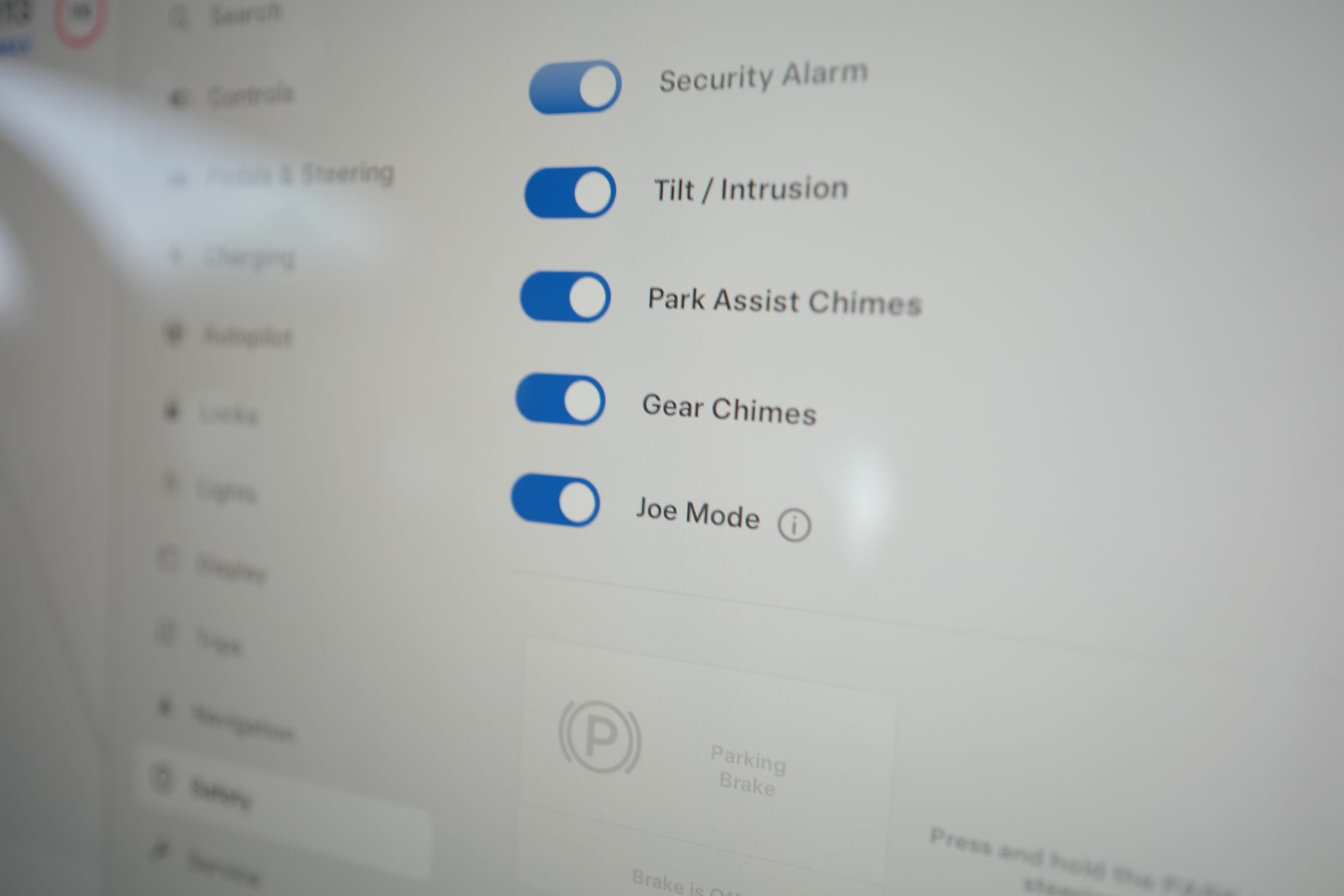
This was Joe's idea. He comes from the Internet. Reduce chime volume to minimize disruption for passengers in the rear seats (i.e. Joe's kids) while maintaining an effective alert volume for the driver.
The interface is not great. It’s clean, it’s visually pleasant, but the way information is laid out and organised throughout the menus is unclear at best, and sometimes deliberately obscure. The purpose of the interface should be to let the driver accomplish their tasks without making them wonder who Joe is, and what his mode might be. A tap on the told us that Joe has kids and likes his car to be quiet. It would be difficult and dangerous for a driver to go through these menus, and if the passenger did it, it would hide the navigation below, which would also impact the driver’s convenience.
We could argue that it’s playful, quirky or whimsical to give features names. After all, IKEA names their products after proper nouns. It’s one thing to stand in front of a table table called Kullaberg, there’s no ambiguity. In the context of a car — and especially when driving — it’s important to let the user quickly process information, without having to read a popup.
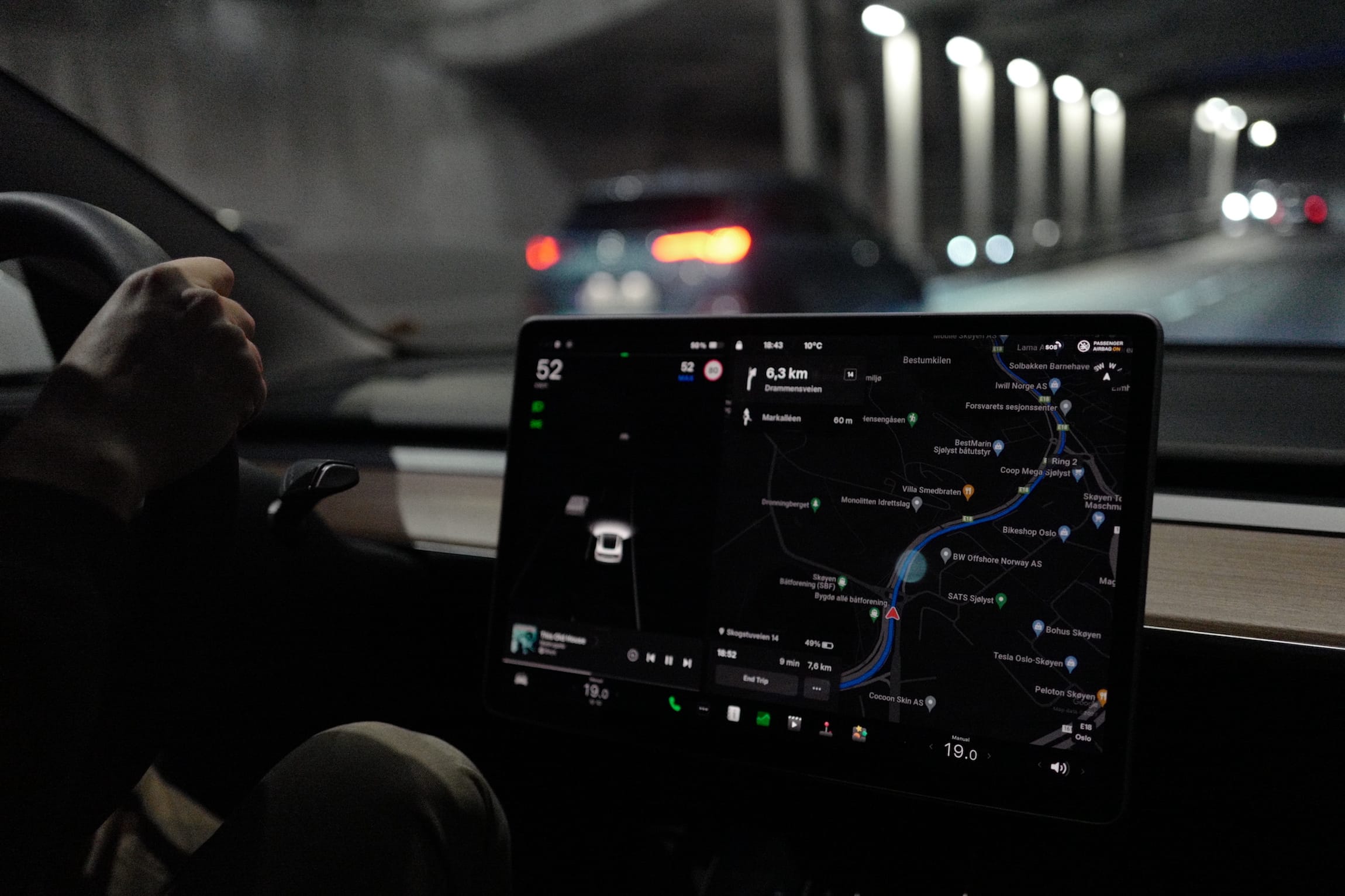
Autopilot in this Model 3 was effectively Advanced Cruise Control — maintaining current speed, distance to the car ahead and lane. Unfortunately, Autopilot disables on lane change, when obstacles are perceived, or simply on a whim. At times, it was unclear what the car thought it saw that made it disable Autopilot. While Google Maps was mostly good, at times the car “thought” we were on another, parallel, road, when this road either didn’t exist, had construction, or just wasn’t the road we were on. Exacerbating the negative experience, the system voice kept giving instructions to “make a U-turn in 300 meters”, “take the exit”, when, in reality, we were on the correct road. The worst part about this was that the Tesla could start braking when our supposed exit came up. This meant that on a few occasions we’d have to disable Autopilot and drive manually — well, as manual as we could in an EV. And when the navigation was working correctly, the only reminder to take action was two kilometres before, which, in a congested traffic situation (where two kilometres meant 10–15 minutes) made us forget more than once to take the exit. The second reminder was moments before it was time to take action, which was, again more than once, too late to react.
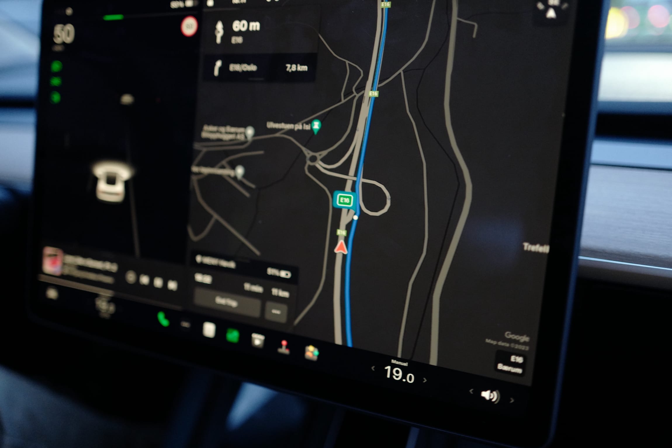
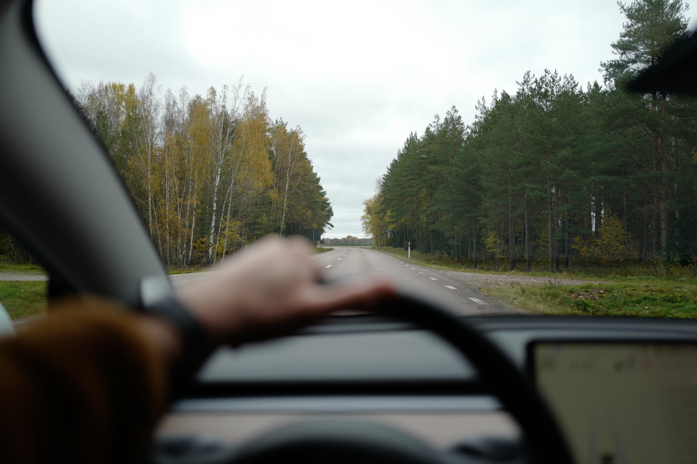
Driving “manually” was a joy in this car. With the uncertainties of the system out of the way, we could cruise the mostly empty roads of Norway and Sweden. On long stretches, we could judge the simplicity of the road and engage Autopilot. Double tapping the driving mode stalk on the steering wheel enables the feature, flicking it up disengages it. It’s a little strange to “change gears” while driving, but we quickly got used to it, as well as its placement on the wheel as opposed to the traditional placement of the driving mode selector in the center console.
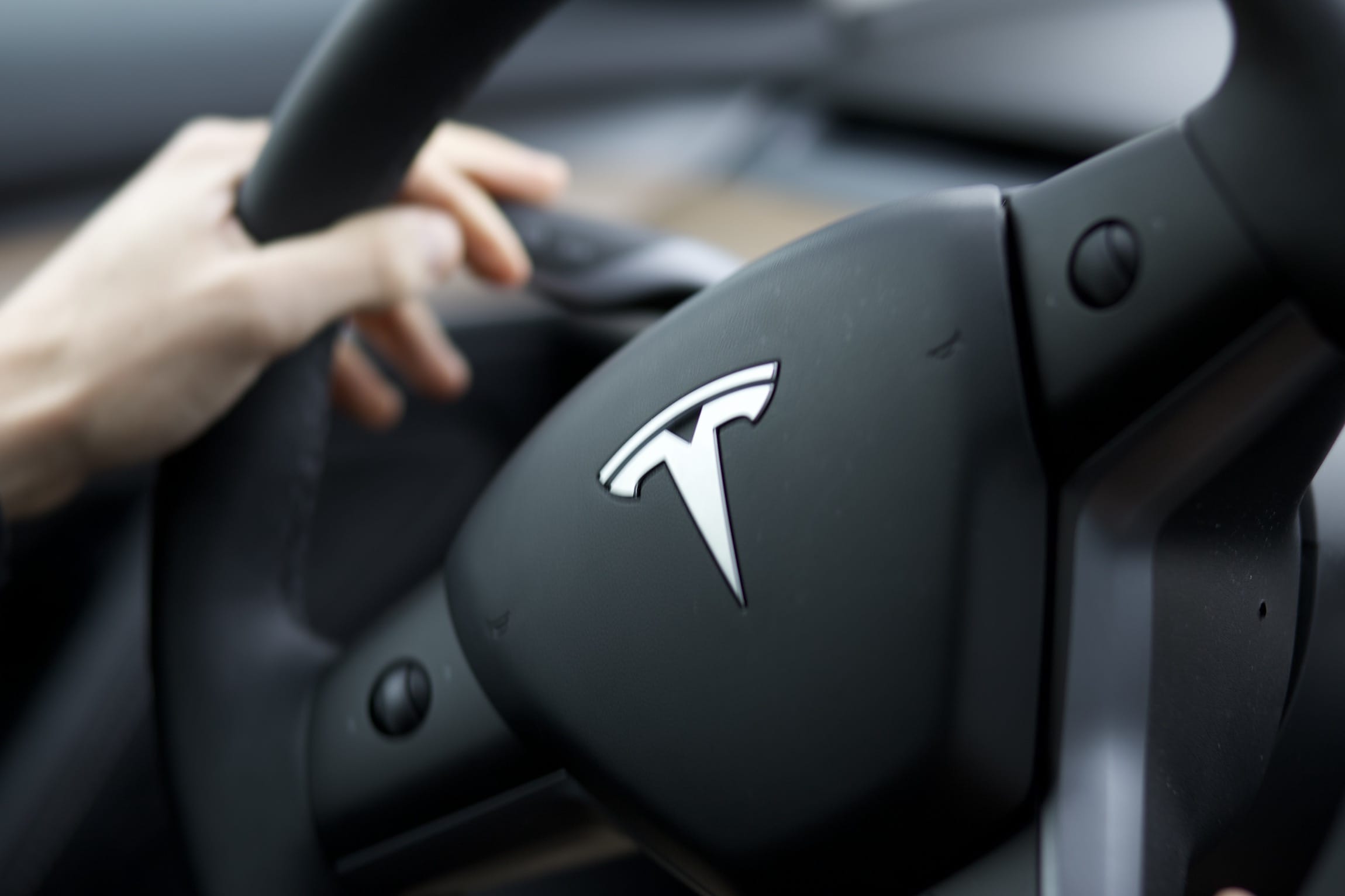
The indicator stalk also exists. We believe this is worth mentioning, as opening the glove box in this car only works by finding the right button in a nested menu. The habitual interaction of flicking the indicator in a curve can be maintained.
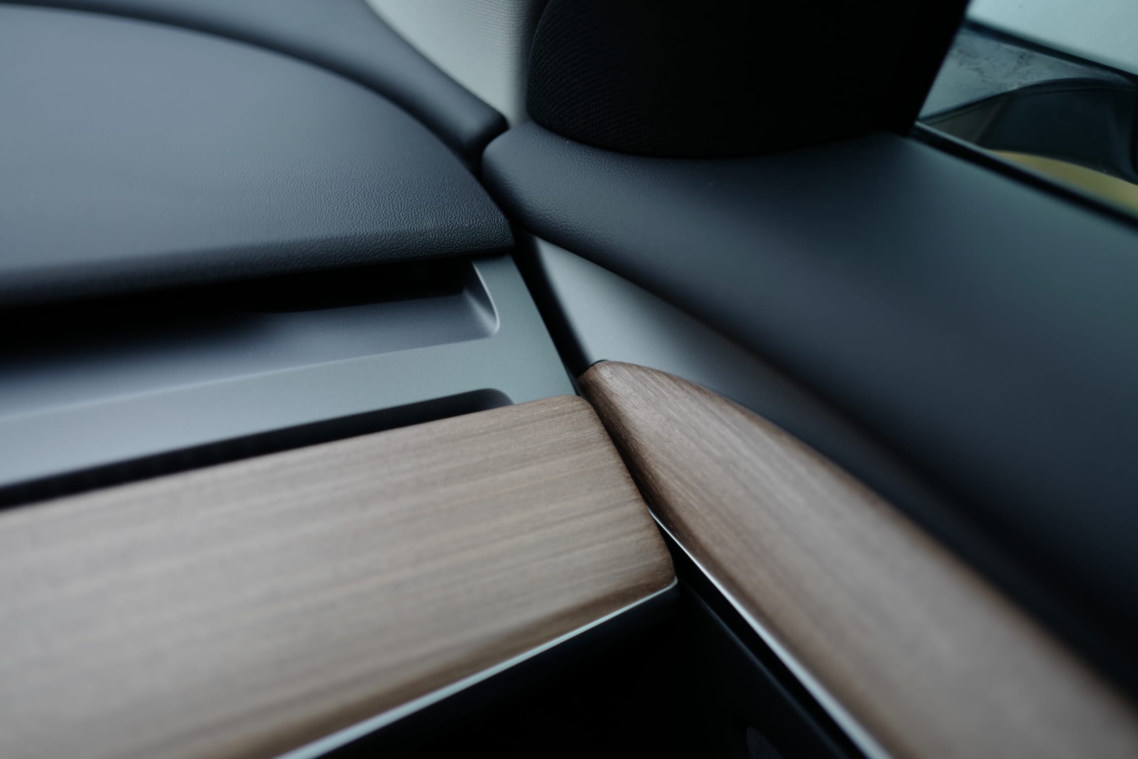
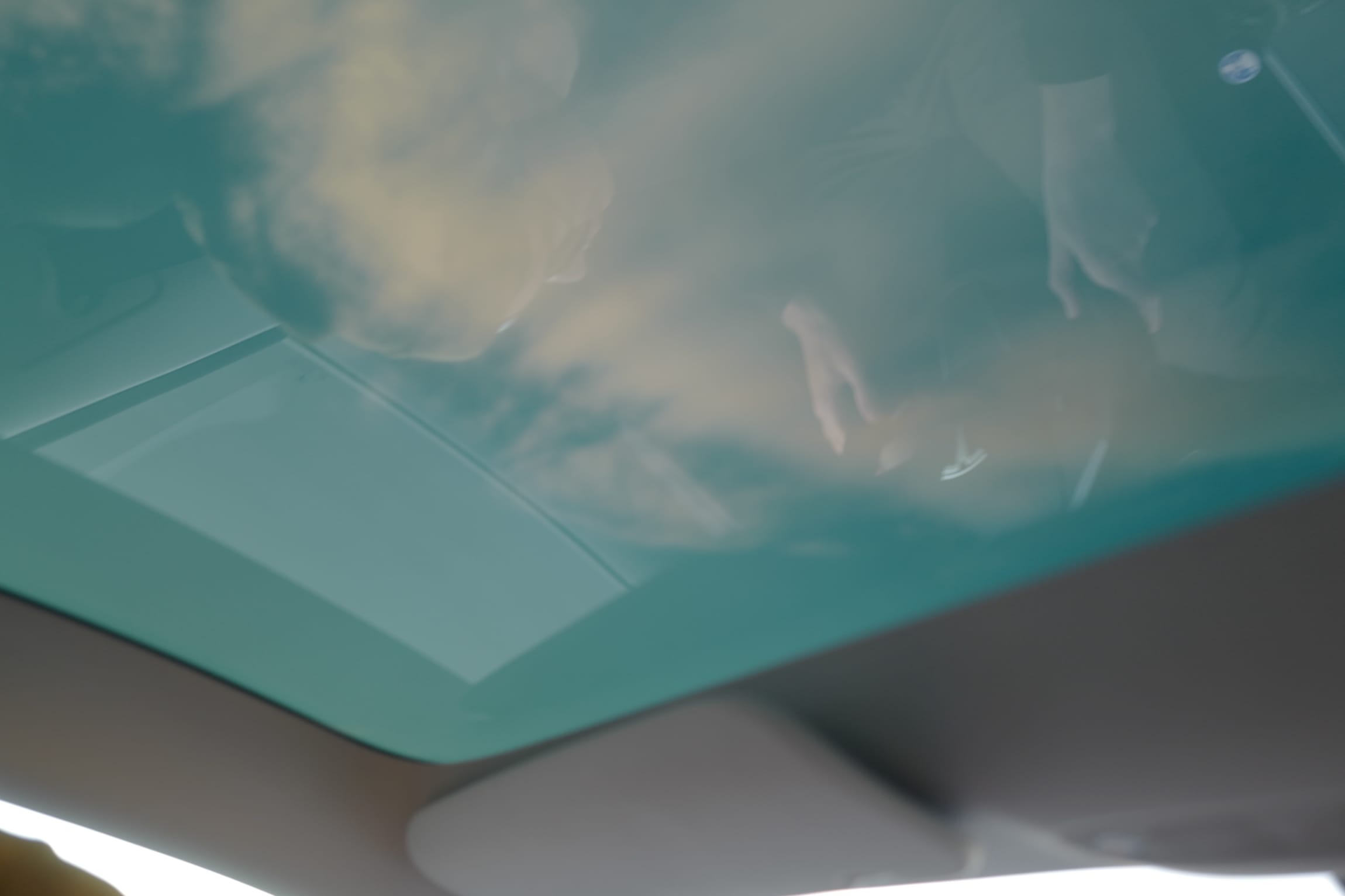
Minimal, with accents in a wood aesthetic, the interior design blended into the Scandinavian surroundings. The large glass roof, continuing from the windscreen to the rear window, made us feel immersed and more connected to the road. Parts didn’t always align, and the plastic elements didn’t feel good, but the interior is nice to at least look at, the seats are comfortable, and in its context, this is one of the cheaper cars.
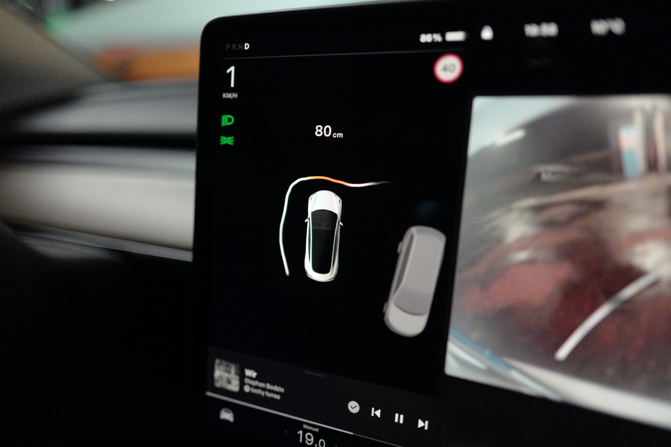
When parking, or driving slowly through complex terrain, the main display view switches to a 360º perspective, and the car info shows the distance to objects. A moving, squiggly line suggests the system is uncertain about its surroundings, which made us more vigilant — a welcome behaviour in tight spots.
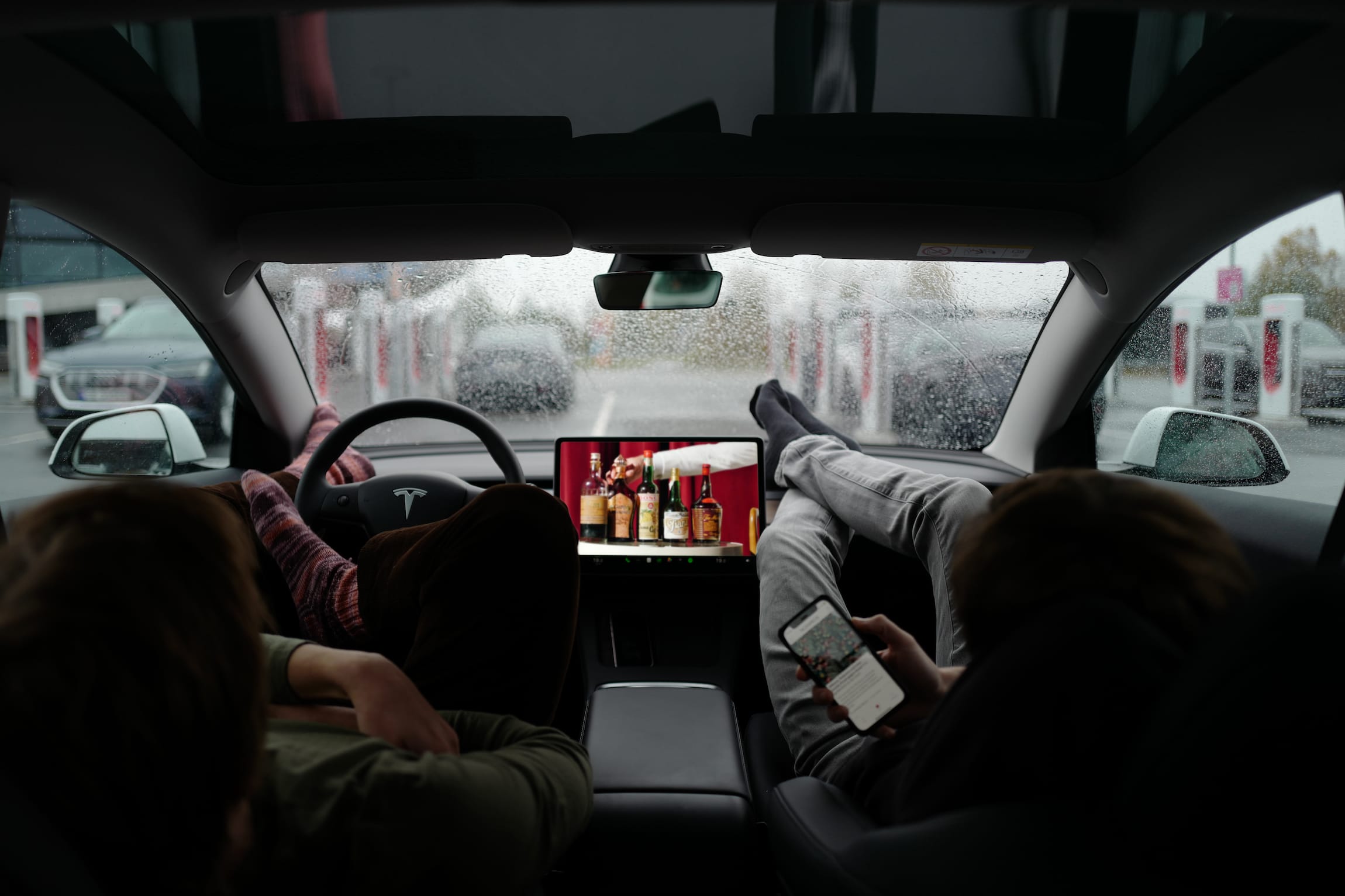
I don’t like the exterior of this car, but I understand it. It’s aerodynamic, and therefore gets good range. The inside feels better than I thought it would. Compared to the Polestar, there’s more room, certainly enabled by a dedicated EV platform, and passengers sit higher, as the batteries are under the car, rather than crammed inside the transmission tunnel. All seats feel roomy and comfortable. It’s a shame Europcar/Polestar/Volvo don’t provide a better model for their rentals. The Tesla had electric seats and a panoramic roof, and this was nice. As much as a manually-adjustable seat might be more natural than buttons, an electric seat is easier to adjust, and driver profiles remember the preferred seating position, and automatically switch to it as you change drivers. This makes the car feel more accommodating to the driver, and is not something I could test in the Polestar.
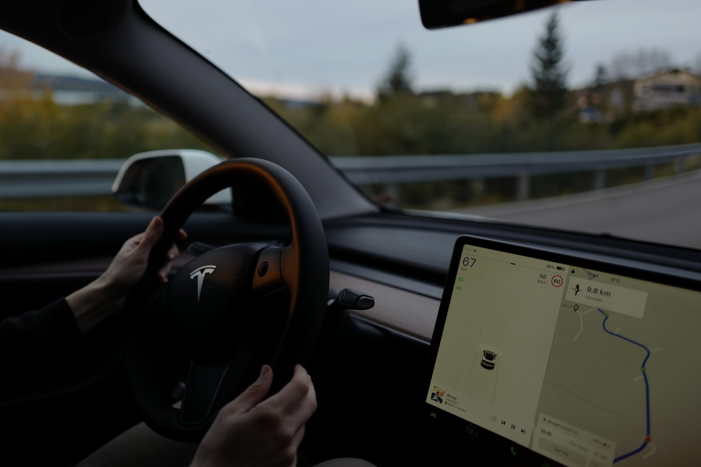
Driving a Tesla means having to trust the system. Most of the time, it did a good job. But when you’re cruising at highway speeds and all of a sudden the car slams on the brakes, it’s startling. In an emergency, this behaviour can change lives, but if it’s inexplicable, it will infuriate the driver behind you and make you, as driver, use the ADAS features less. I enjoyed the car most when it was merely in cruise control, meaning it only kept the current speed, leaving the steering to me, and in winding Norwegian woods I naturally switched modes to take over control.
It’s worth contemplating the existence of features you don’t like using. I guess it’s nice that they’re there, just in case I change my mind. I’m glad the Model 3 exists. For many happy owners, it’s their contribution to a more sustainable future. It’s not a bad baseline.