Microlino (2023) Impressions
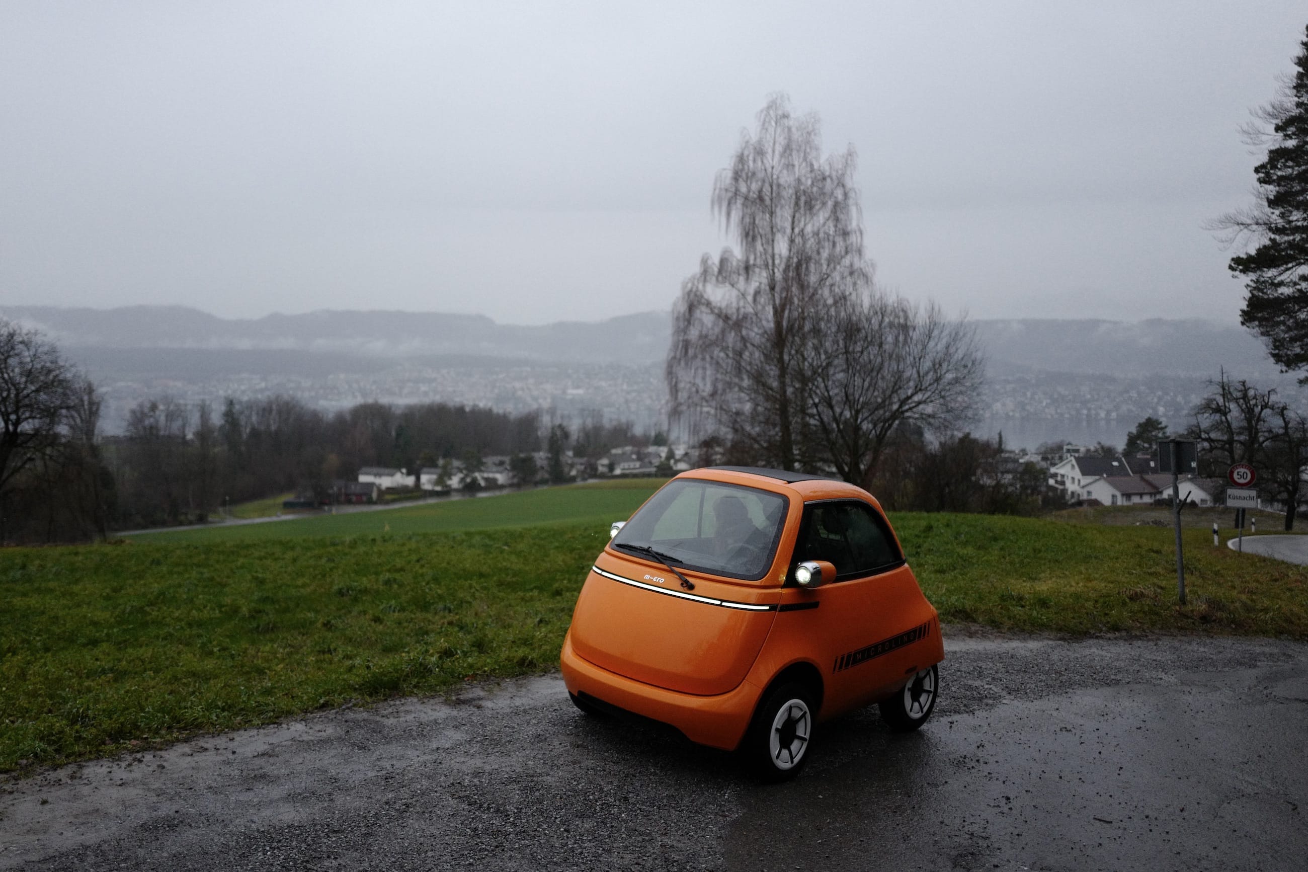
The steering wheel feels like something I’d connect to a PlayStation 2. The absence of a rearview mirror accentuates the poor placement of the side mirrors. The suspension is virtually nonexistent. And yes, opening the door when it rains will get the entire interior wet. But I don’t care, I love this little bubble thing.
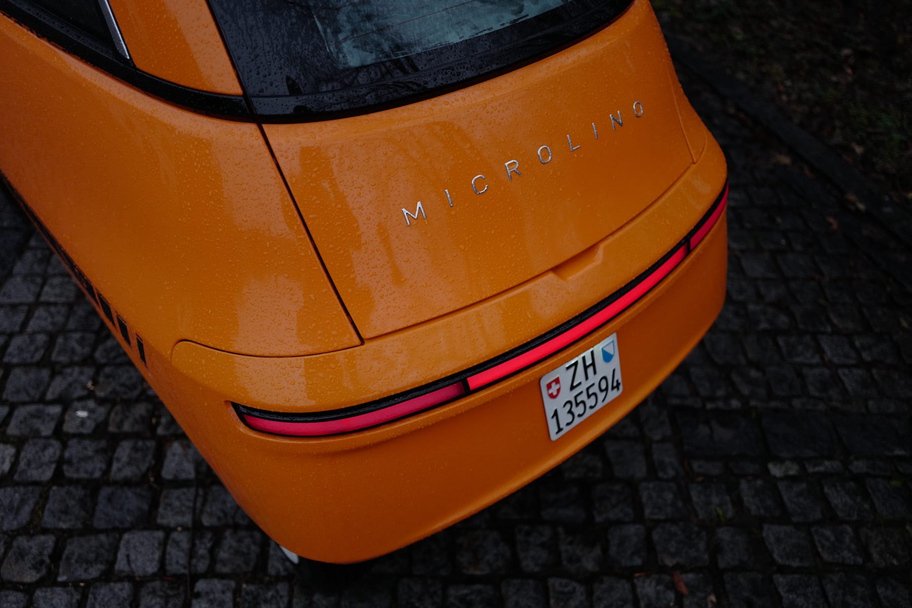
This is not, unfortunately, a multi-day review. I only had about an hour with the Microlino during my test ride. It’s enough for first impressions, but now I’m left with more questions than before. Questions like: Why does this thing have a screen, let alone two? How do I open the trunk? How do I open the door from the inside? What about the outside? What if it rains?
I was able to answer some of these questions myself, and others, I’m confident, could have been answered if I’d had more time with the vehicle.
In 2020, during the concept stage, the Microlino 2.0 had a cluster screen, complete with navigation. Additionally, on the door handle, it had an array of physical buttons for the windshield heating or warning lights, in lieu of the narrow display found on the release model. To the right of the buttons was (and is today) a phone holder, and finally, the pull strap.
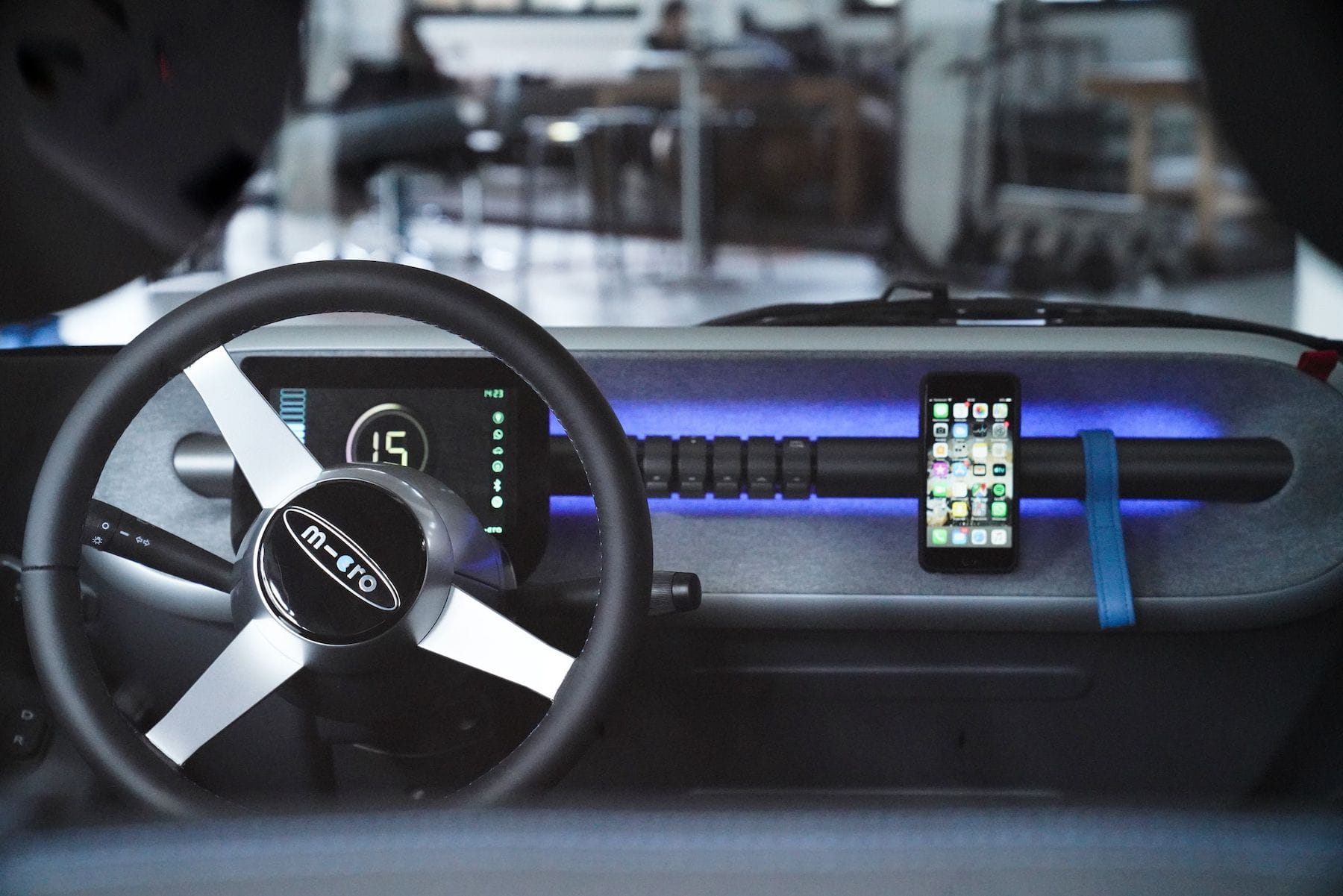
But today, the main display is more rudimentary, and I applaud the choice of simply relying on the phone for navigation, and the bubbly EV comes with a bluetooth speaker for media playback. Like the Citroën Ami, Micro trusts us to bring better hardware than they could integrate at that price. However, I condemn the little touchscreen strip that replaced those pleasantly tactile buttons.
The continuity of the handlebar found on the concept fits the character so much more than cheap screen. On the concept as well as the production model: a hidden button to open the door from the inside, awkwardly placed near the phone mount, without enough clearance for an ergonomic press.
The door opens not with the protruding black latch on the right of the logo, but with the press of a faraway button. It took me a long time to figure this out. Granted, now I know, and that’s where the lock is (physical key!). Opening the door would not be an issue next time, but to me the placement is not obvious. To make matters more confusing, it’s on the passenger side. Micro seems to have issues designing good buttons, or even positioning them in sensible ways.
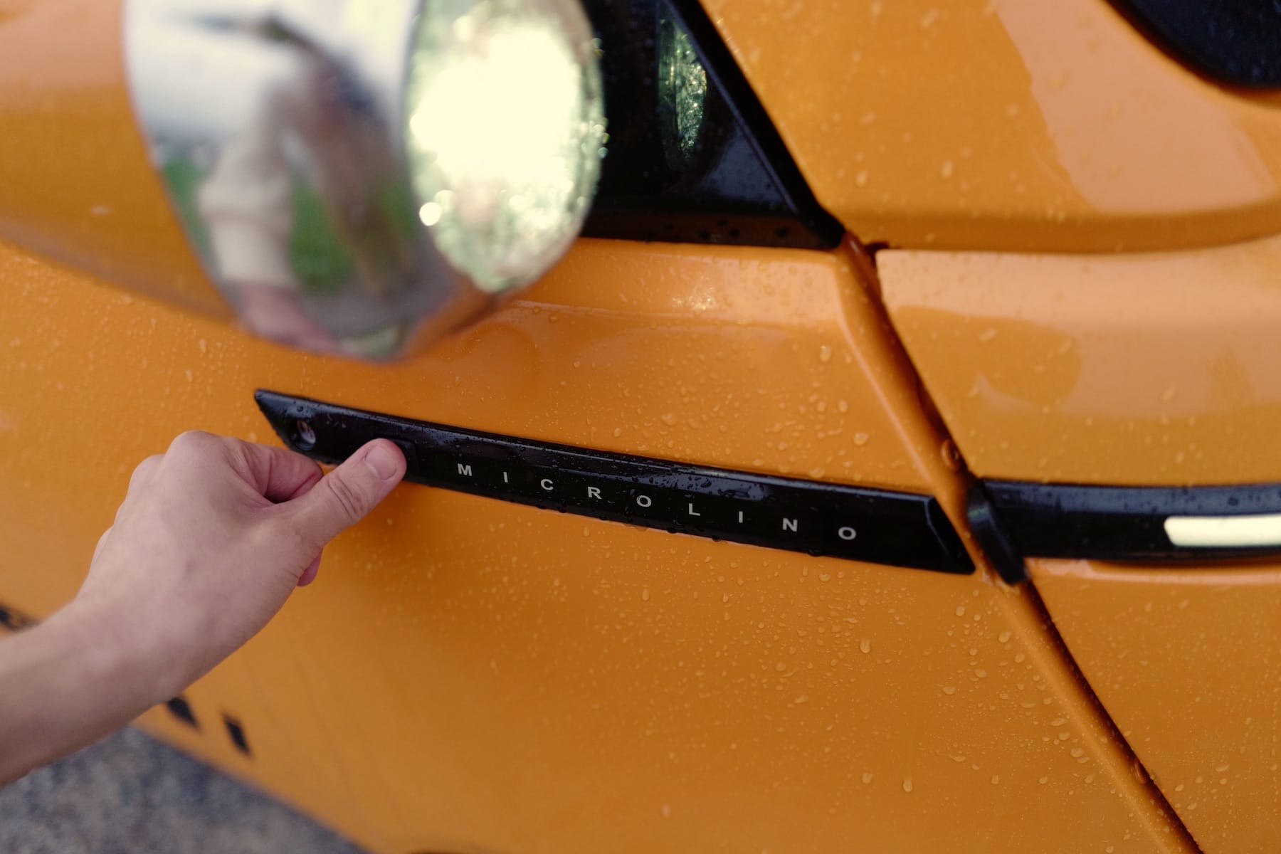
Opening the door when it rains will get the interior wet. This is a worry I had, and can confirm. The rubbery floor mats squeaked quite a bit under my boots, adding to the cacophony — wipers, windshield heater, and road noise are all loud. In day-to-day use I assume the rain will be more of a nuisance than a problem, since everything is plastic.
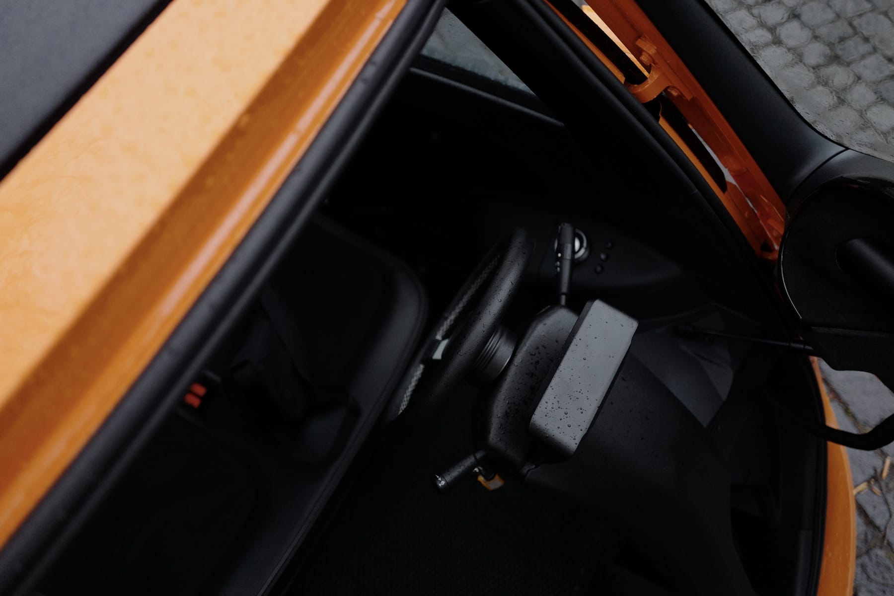
I haven’t tried parking in a garage, but in my limited testing I found it awkward to get in an out. I will have to reprogram my habit of parking the nose of the car close to the wall, as the front door needs some clearance. Again, this usability issue should be solved through repeated use.
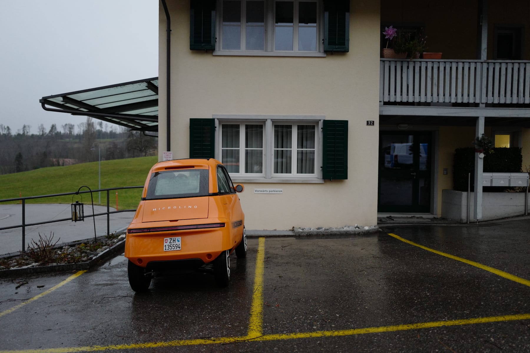
When parking, the ridiculousness of the size becomes apparent. This spot was at a slight decline. Reversing out of the spot required a handbrake start, something I haven’t done since I last drove a manual transmission car. The Microlino has no park mode.
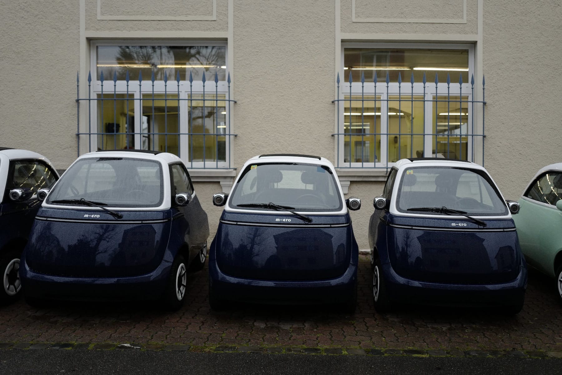
On the subject of parking, this is where the bubble shines. The manufacturer claims that three Microlino “cars” fit inside a regular parking spot. I believe it. They use the term micro mobility as the name of the company. In the European market, a Micro electric scooter is included in the purchase, for individual last-mile transport. Don’t forget that in 1999 Micro invented the modern scooter, a business which funded the development of their tiny EV.
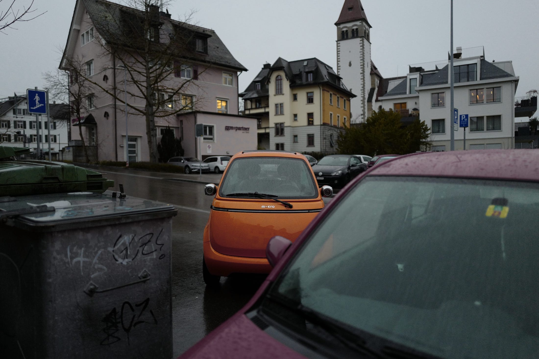
It just blends in anywhere. Okay, maybe not if you get the orange one. You’ll be forgiven to briefly stop on a sidewalk, passersby look at this bubble with joy and wonder.
The Polestar attracts gazes of admiration — it looks cool. When people see the Microlino they smile. They smile, and elbow their partner and go hey, check it out, it’s one of those little cars, do you think it’s even road legal? Yes. Yes, it is. But I’m not sure it classifies as a car.
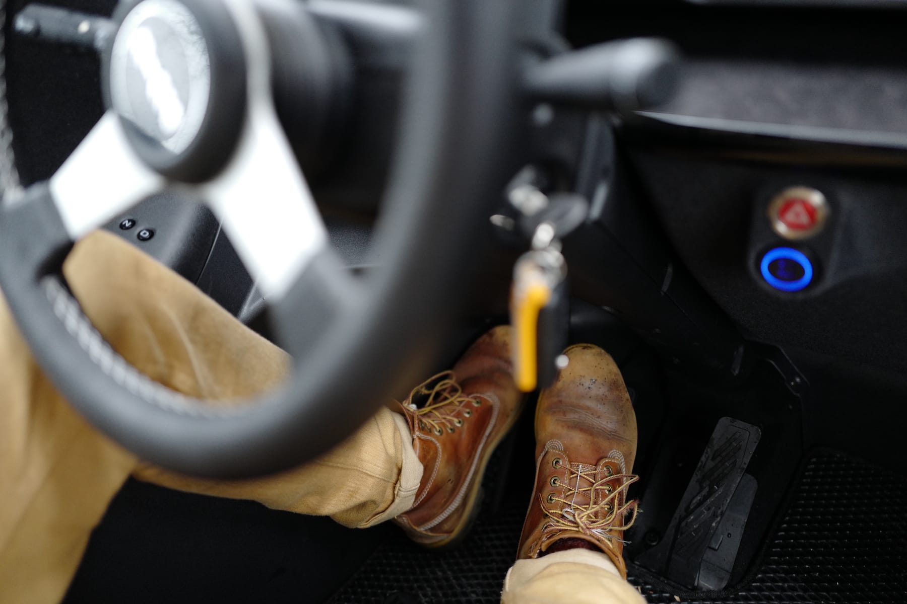
Yes, it’s small. I’m of average height for North-Western Europe, and I’d definitely explore alternative seat or leg placement next time. I also found the seating position too high. While driving, it’s fine. Overall, during my test, I couldn’t see well. All the glass fogged up, and the windshield heater did little to mitigate the opaque side windows. I had no rear visibility because I couldn’t use the side mirrors, and the Microlino has no rearview mirror. Not great for urban mobility, but fine for a rainy test drive through the cantonal scenery.
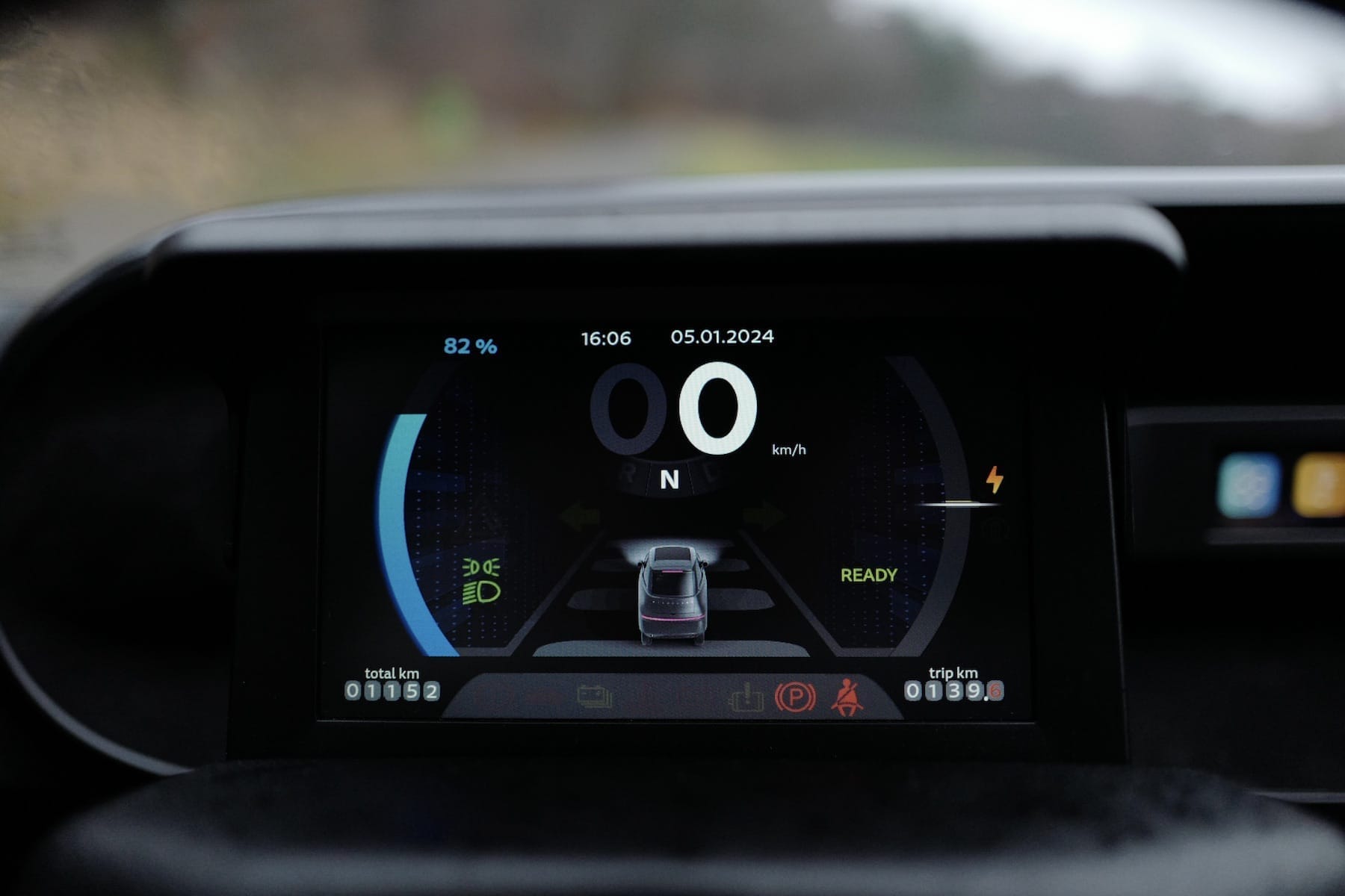
In terms of displays, the Microlino shows restraint, handing over most of the smarts to your phone. Good. The cluster screen shows current speed, state of charge, battery regeneration level, indicators, lights, distance, and a little icon of the Microlino (not colour-matched). The panel is crap, and the layout is a mess. It could be better, but at least the screen’s placement is ergonomic and the speed is within the driver’s line of sight.
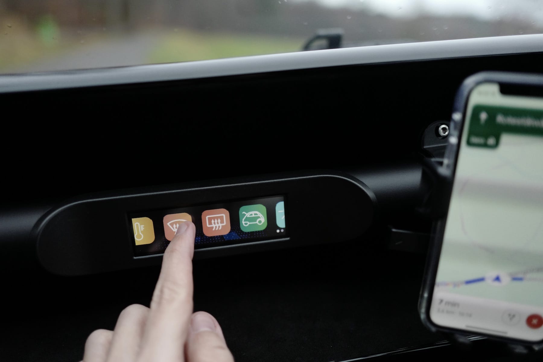
This thing though? It should not be there. An hour of testing didn’t justify its existence. There are no settings for the temperature and windshield headers besides on and off. A simple physical toggle switch, like on the concept, would have been preferable. There is a settings menu I didn’t explore, but I’d argue that anything more complicated than a toggle should exist within a companion app rather than this tiny LCD panel.
I wish Micro had solved this differently. An e-ink screen would have been better, or one of these monochrome displays found on 3D printers. The current implementation is trying, and failing, to be fancy. If the reason was to save money, they should have gone the other way, and used a charming low-cost, low-res, low-tech screen.
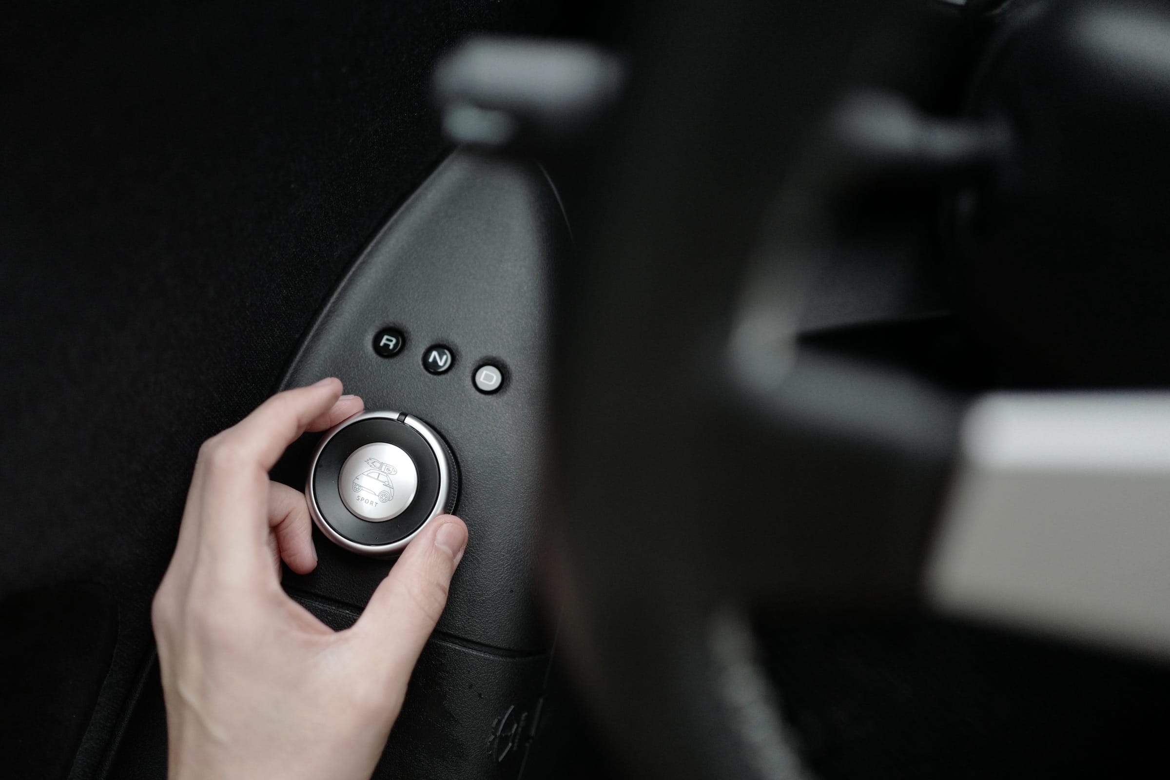
And yet, there are romantic quirks: the Banzai Bill on the Sport button of the driving mode knob, the stretchy pockets for storage, the simple mechanical key, and of course the whole exterior.
The dial feels great, and is easily within reach. Should this prime location be occupied by such a rarely-used feature? I miss a park mode. It’s a nice dial. I shouldn’t complain.
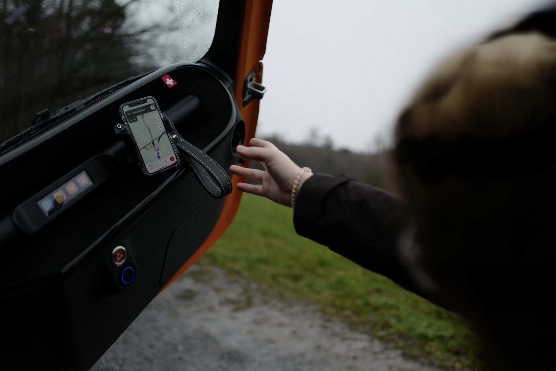
It’s anatomically impossible to close the door with the seatbelt fastend. The vegan leather pull strap is a nice idea, contrasting the understated interior with a premium-looking affordance. The execution could be improved upon. Why no Swiss Pantone 485C accent colour here? And the proportions of the flag are wrong, the cross should have more white space around it.
The phone clamp has a tight grip but it too could be better. The construction is flimsy and the placement seems like an afterthought. Judging by the 2020 concept version, it’s everything but an afterthought, it’s central to the driver experience.
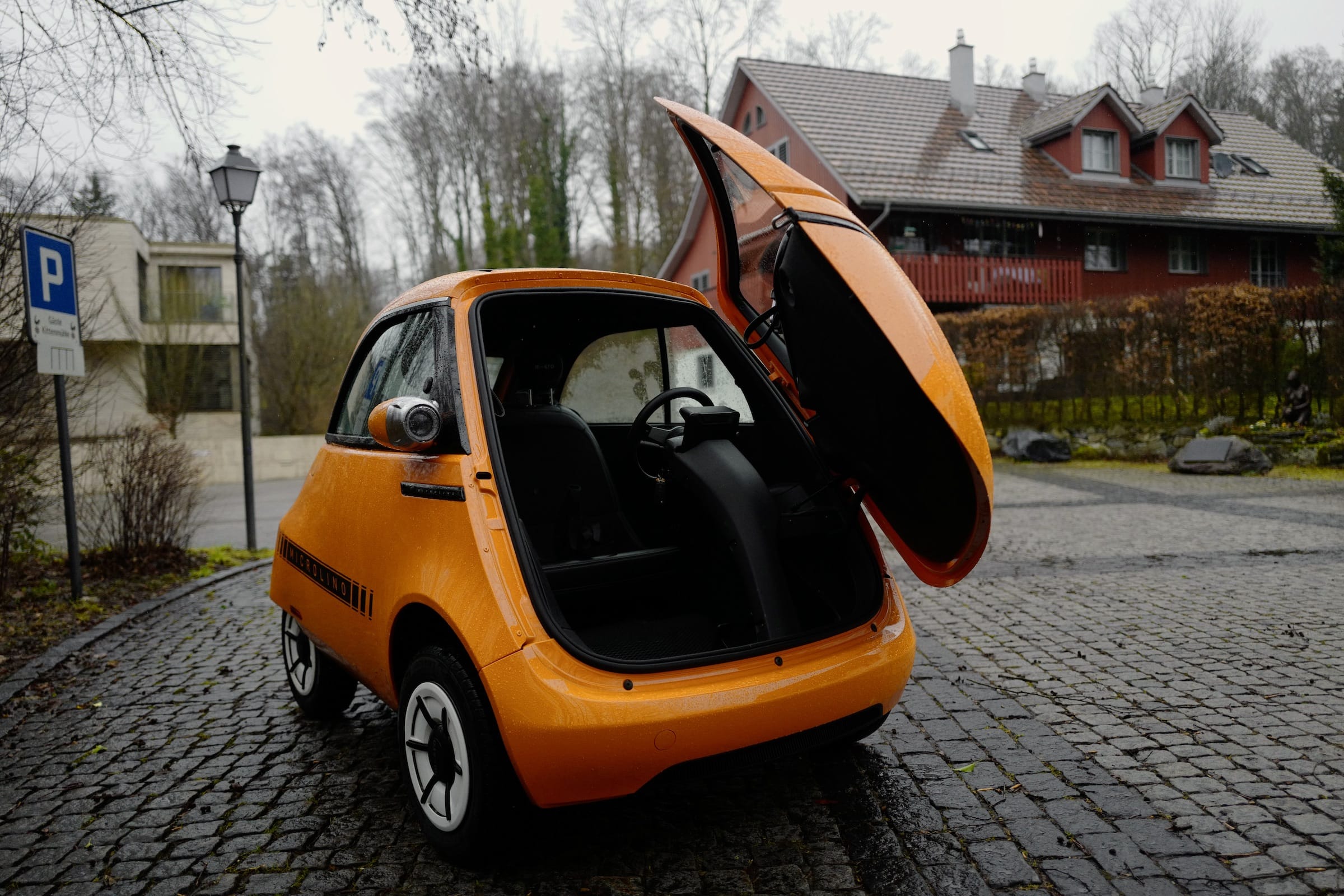
There are no luxuries here. No power steering. The screens are low-resolution LCD panels. No airbags. No seat heating, no electric windows, no automatic remote opening of anything, poor cabin isolation, inconsistent interfaces, suboptimal ergonomics. It’s overpriced and flawed.
But none of that really matters when you zip this thing through an ancient, winding town, up meandering vineyards. Curves are fun. It feels like the Microlino will overturn in corners, but it doesn’t! It’s adorable. It’s round. It’s an urban mobility antidote, a cozy cabin of personal transportation. The Microlino brings joy to the world.